Parameters:
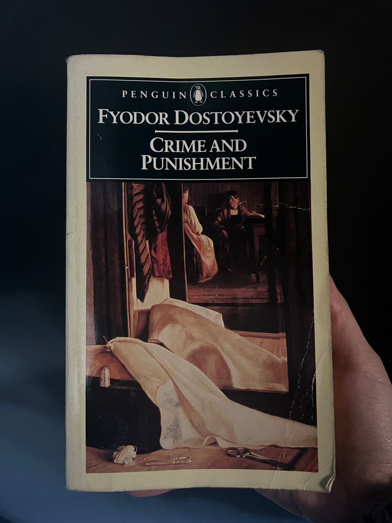
This is an 8 week project, and I'm aiming to complete 5 sample spreads, a cover, back cover and spine in that time, to act as proof of concept for a Folio Society style illustrated novel of Crime and Punishment by Fyodor Dostoyevsky.
This is an 8 week project, and I'm aiming to complete 5 sample spreads, a cover, back cover and spine in that time, to act as proof of concept for a Folio Society style illustrated novel of Crime and Punishment by Fyodor Dostoyevsky.
Initial Research
Novels I could choose
These are all classic novels I've read as I think having a better understanding of the full novel's context will help to create more on-point illustrations.
Since I'll only be providing proof of concept as the outcome, the book doesn't need to be a realistic size to print, or to be out of copyright.
Since I'll only be providing proof of concept as the outcome, the book doesn't need to be a realistic size to print, or to be out of copyright.
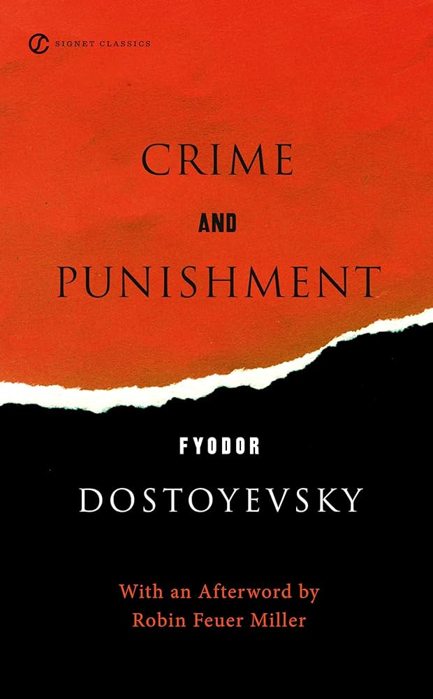
Existing Illustrated Novels

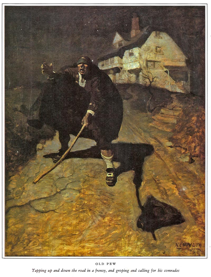
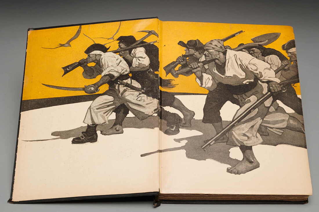

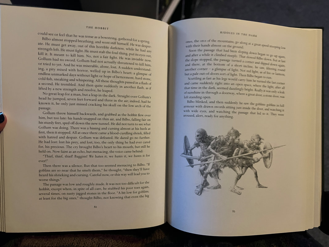
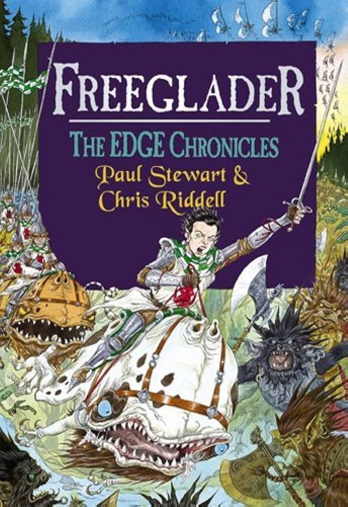
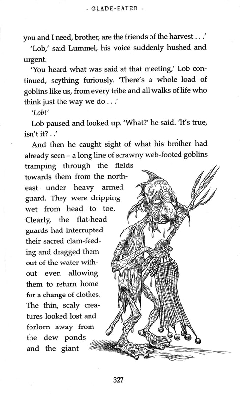
I find these layouts, uses of colour and illustrations very interesting. Though I like the illustrations merged into the text style of the Edge Chronicles, it feels more fitting to a children's book and not for a serious book like Crime and Punishment.
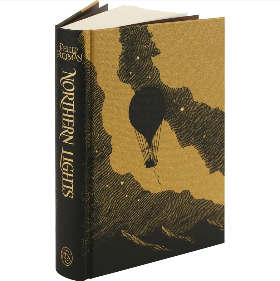
Folio Society covers and spreads
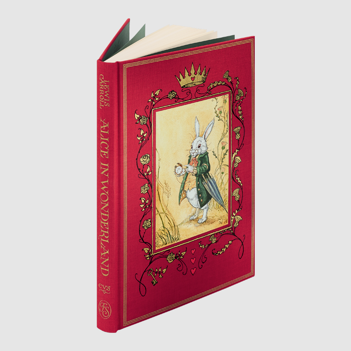
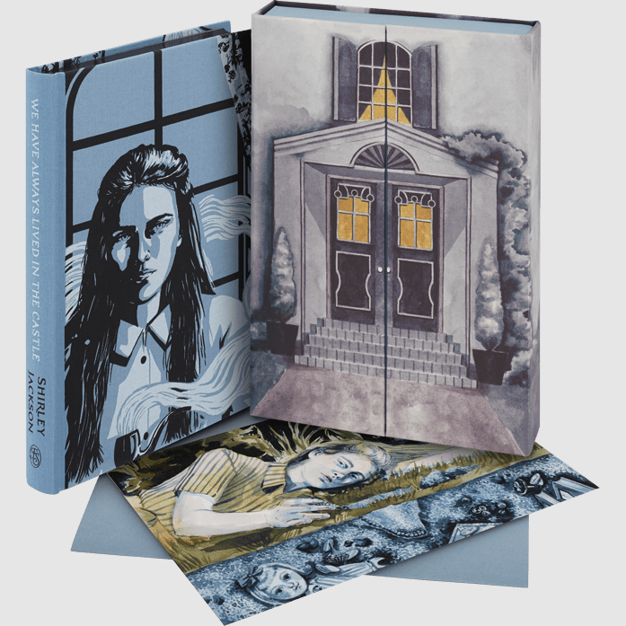


I'll likely end up doing a Folio society style book so I've got some clear parameters, but I like the less rigid style of books like the Edge Chronicles, the way the text moves around the illustrations. However, I think that's more viable for larger type. For a book like Crime and Punishment, which has lots of words, it may not work.
I especially like the wood engraved illustrations for Charterhouse of Parma by Zelma Blakely
I'm choosing Crime and Punishment as I think I could push the darker themes with my ink drawings and really start to get some drama in my illustrations. This would mean I'd choose something lighter for my other projects so I get a good range in my portfolio.
CRIME AND PUNISHMENT
Re-read Key Moments
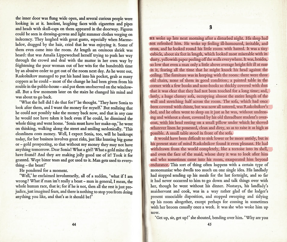
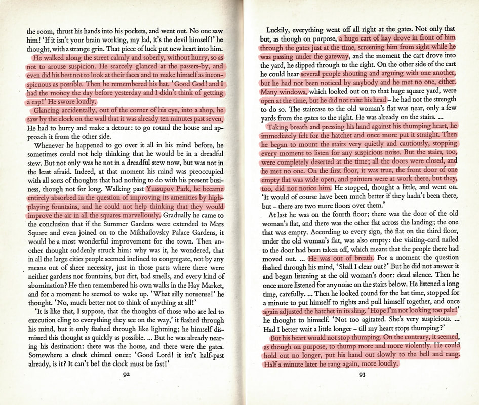
The highlighted sections represent excerpts that evoked striking visuals. These are sections that could influence parts of my drawings, details in the backgrounds, themes or emotions I want to convey.
Dimensions
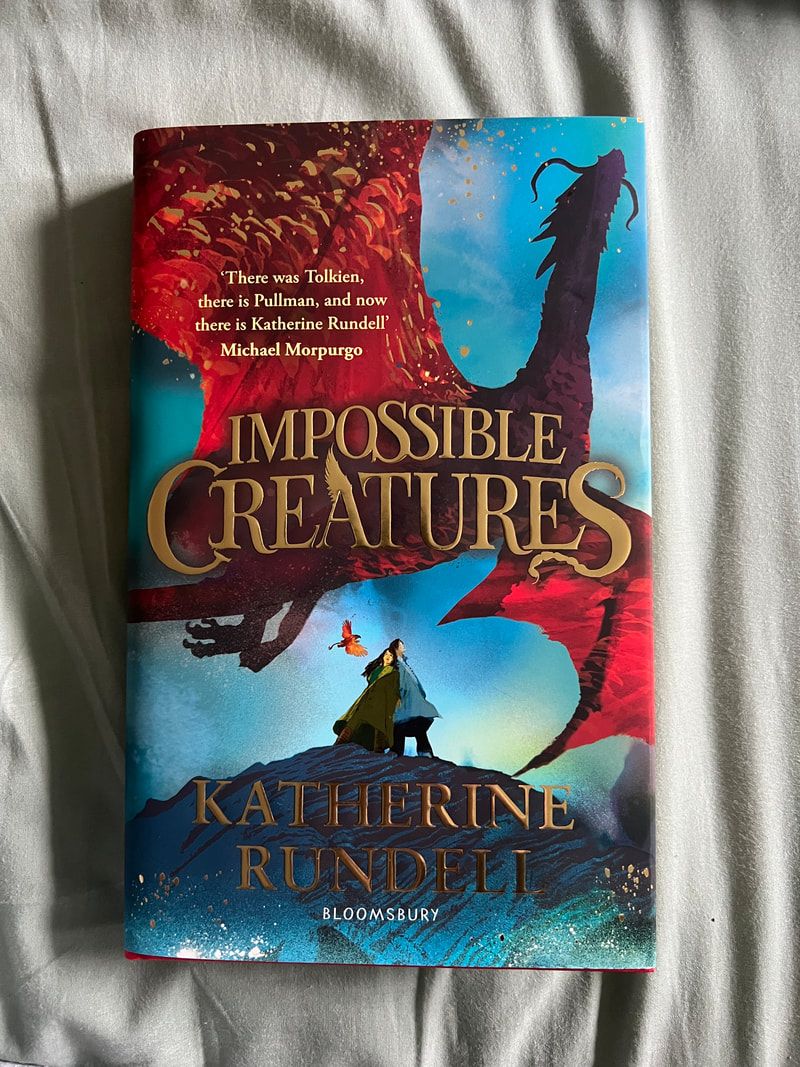
Though I want the book to feel substantial and a bit grandiose, I don’t want it to be unreadable and to sit on a shelf collecting dust. I like the format of Impossible Creatures, it feels expensive but is comfortable to hold.
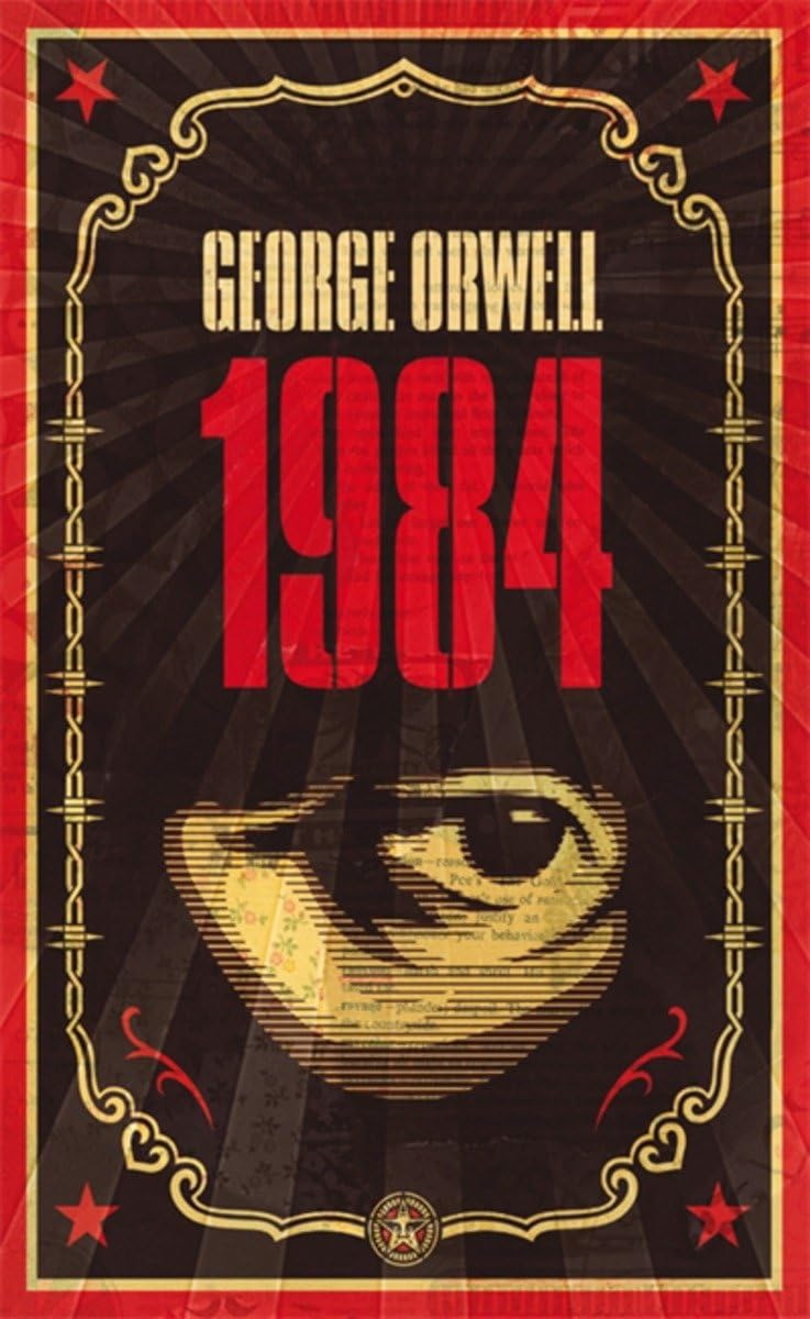
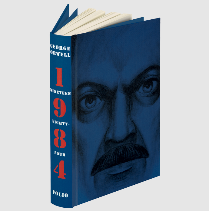
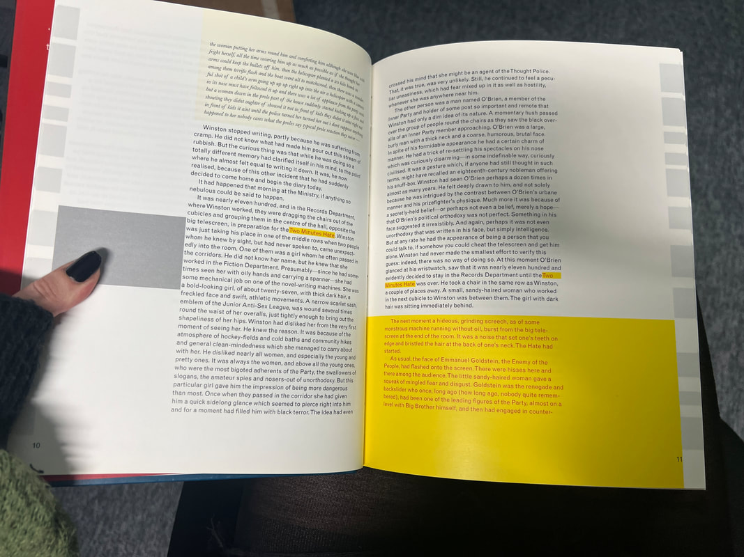
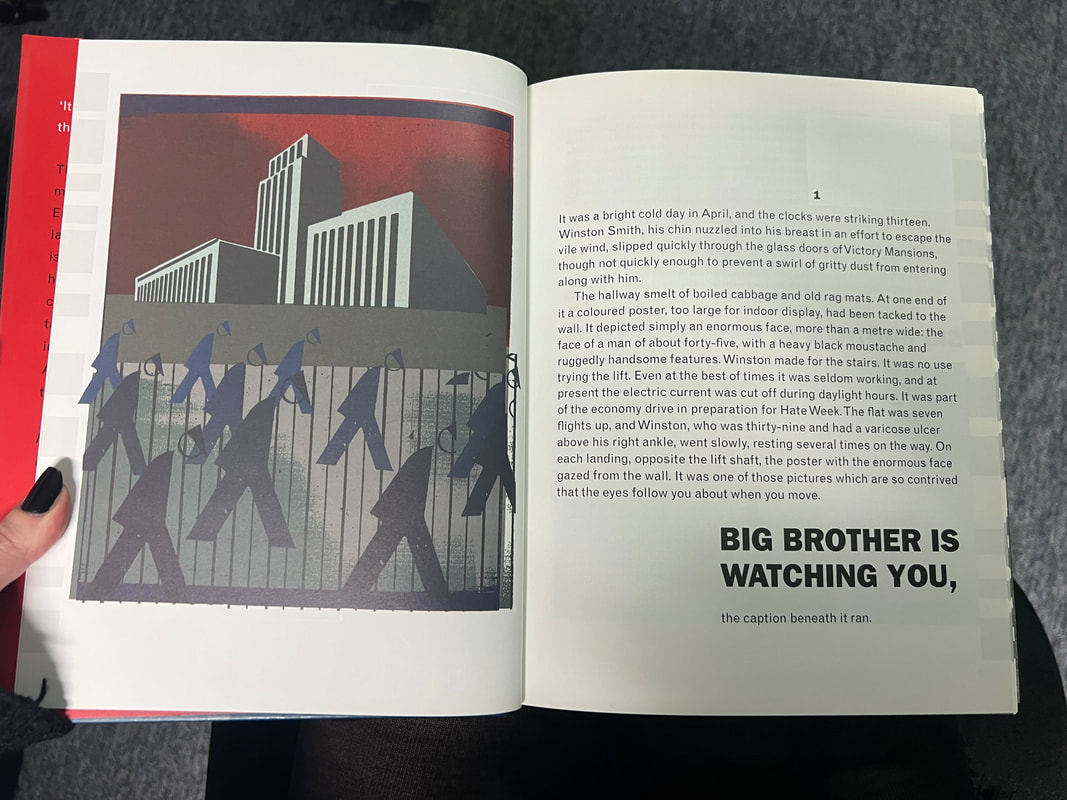
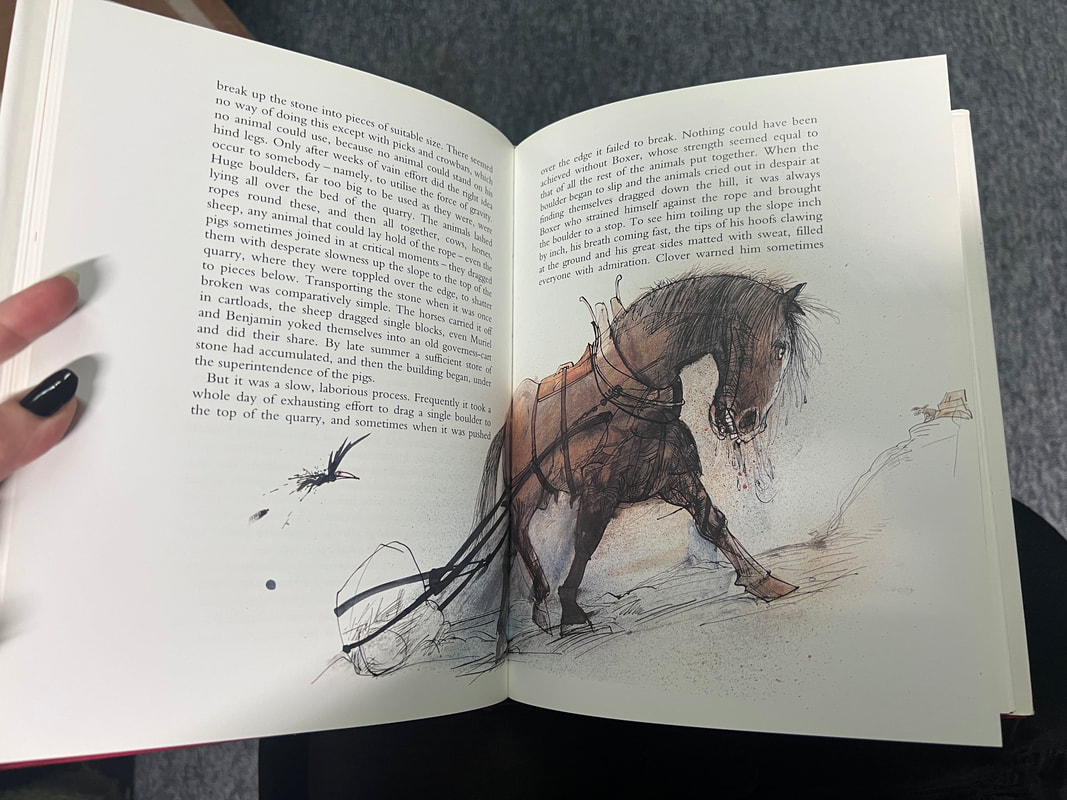
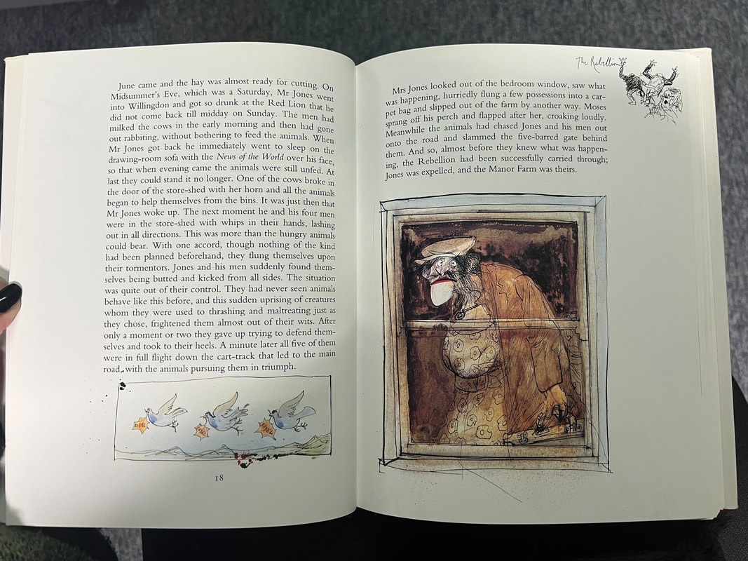
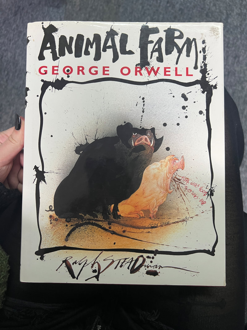
I like the interesting layouts of the Orwell books, but they (especially 1984) feel like artworks more than books and they don’t seem comfortable to read.
I like the interesting layouts of the Orwell books, but they (especially 1984) feel like artworks more than books and they don’t seem comfortable to read.
First Pinterest Board
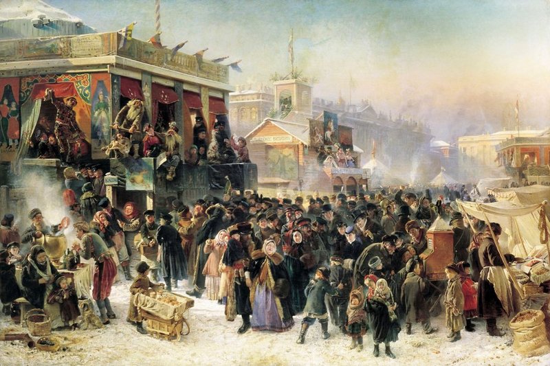
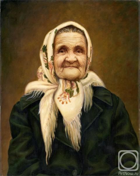
D. Shmarinov for Crime and Punishment
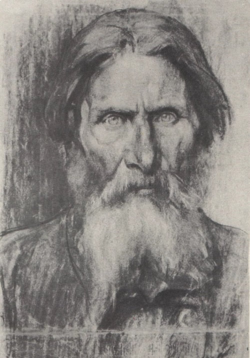
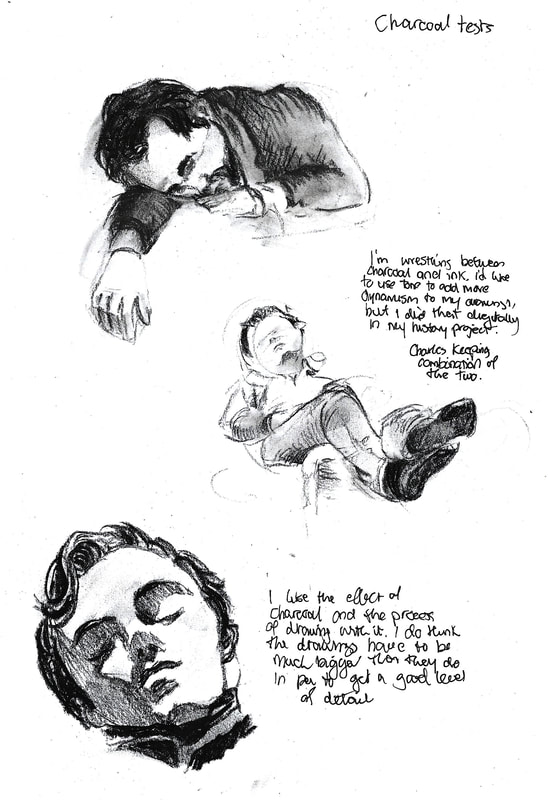
Charcoal Experimentation
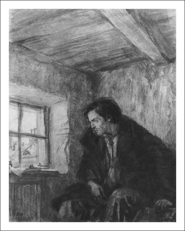
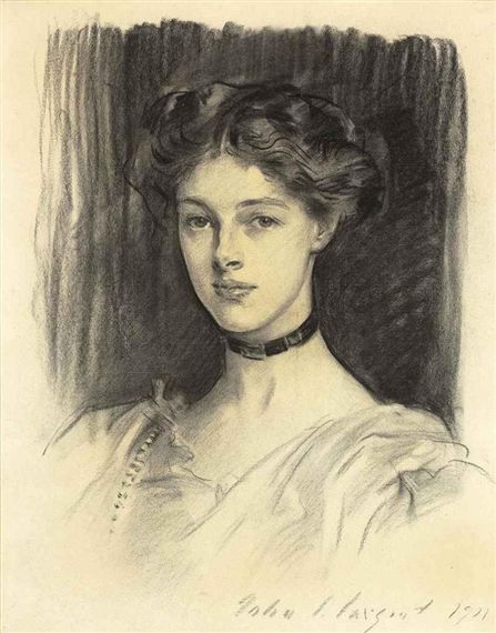
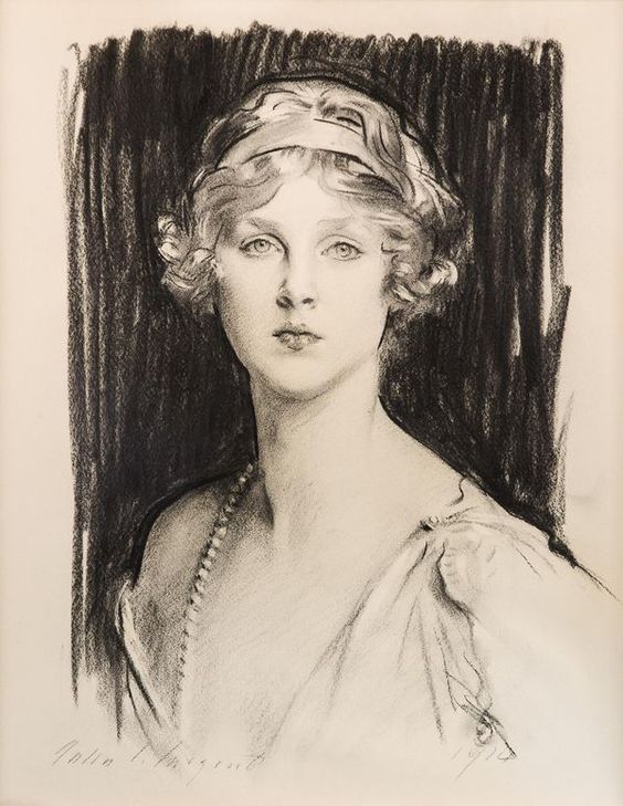
John Singer-Sargent charcoal drawings
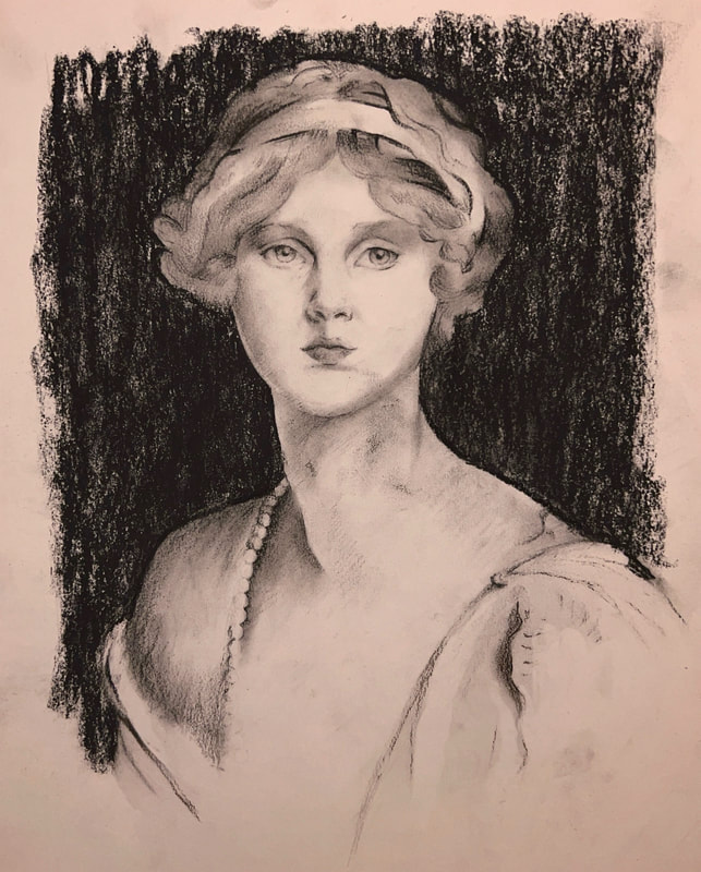
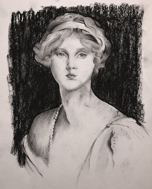
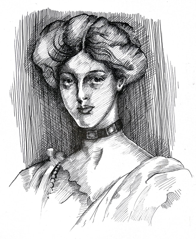
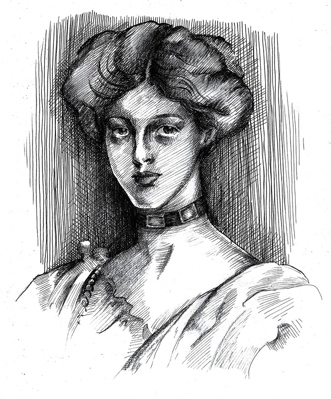
Artist copies
Initial Visuals
|
|
|
These seem like quite large drawings as they're fairly detailed and the lines are small. I'm going to try A3 size for a copy of one of these.
I find the lines for the dress confusing and don't understand how they work. They're very accurate and readable in the original but not in mine. I'm also not used to not making a mess with charcoal and I keep ruining my work with smudges.
Layout Research


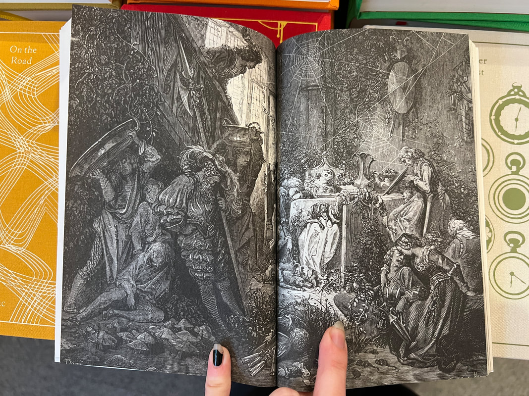

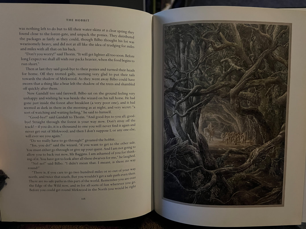
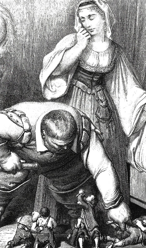
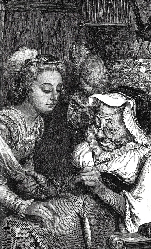
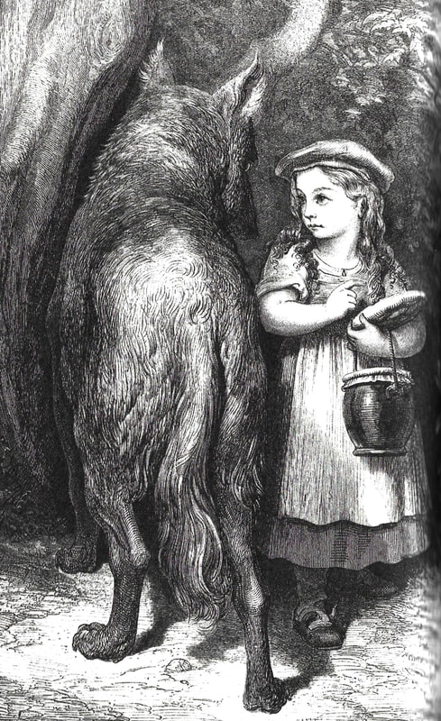
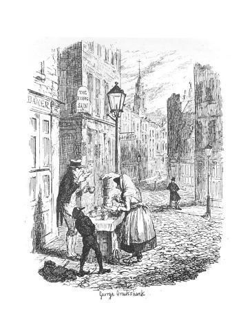
I love the illustrations and layouts of these books and I find the use of colour very interesting. Though I don't think my digital drawing style goes well with my ink drawings, I could do something like this to add bursts of colour to my illustrations. I also think these illustrations by Gustave Doré are fantastic.
Gustave Doré
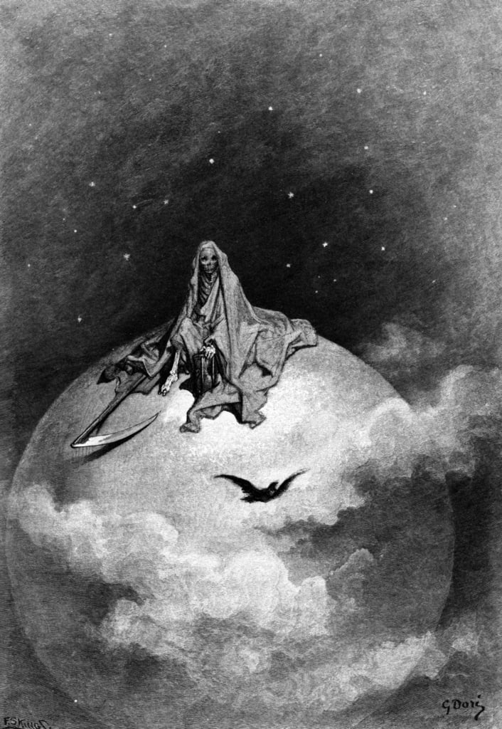

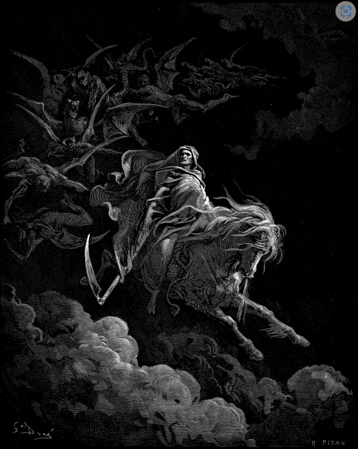
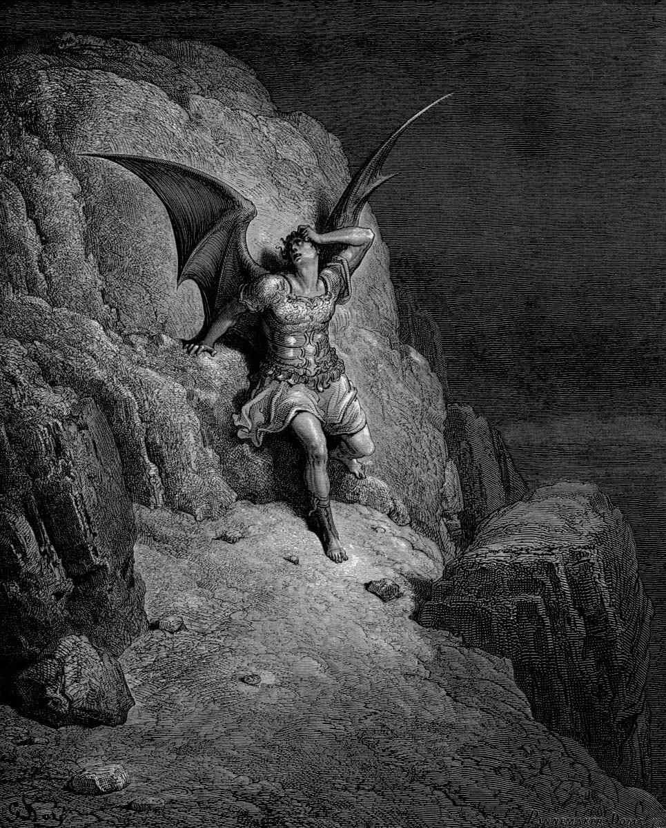
I love the intricacy of these, how accurate the lines are and the way he makes up forms.
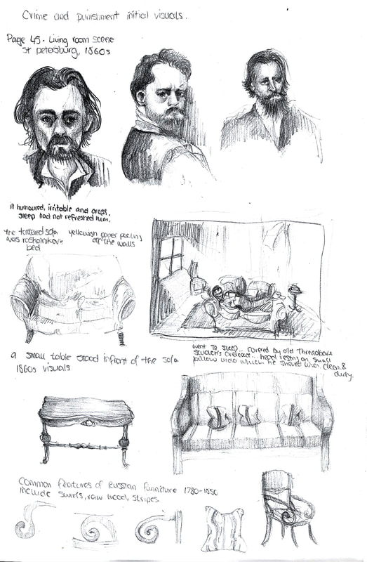
Context Research
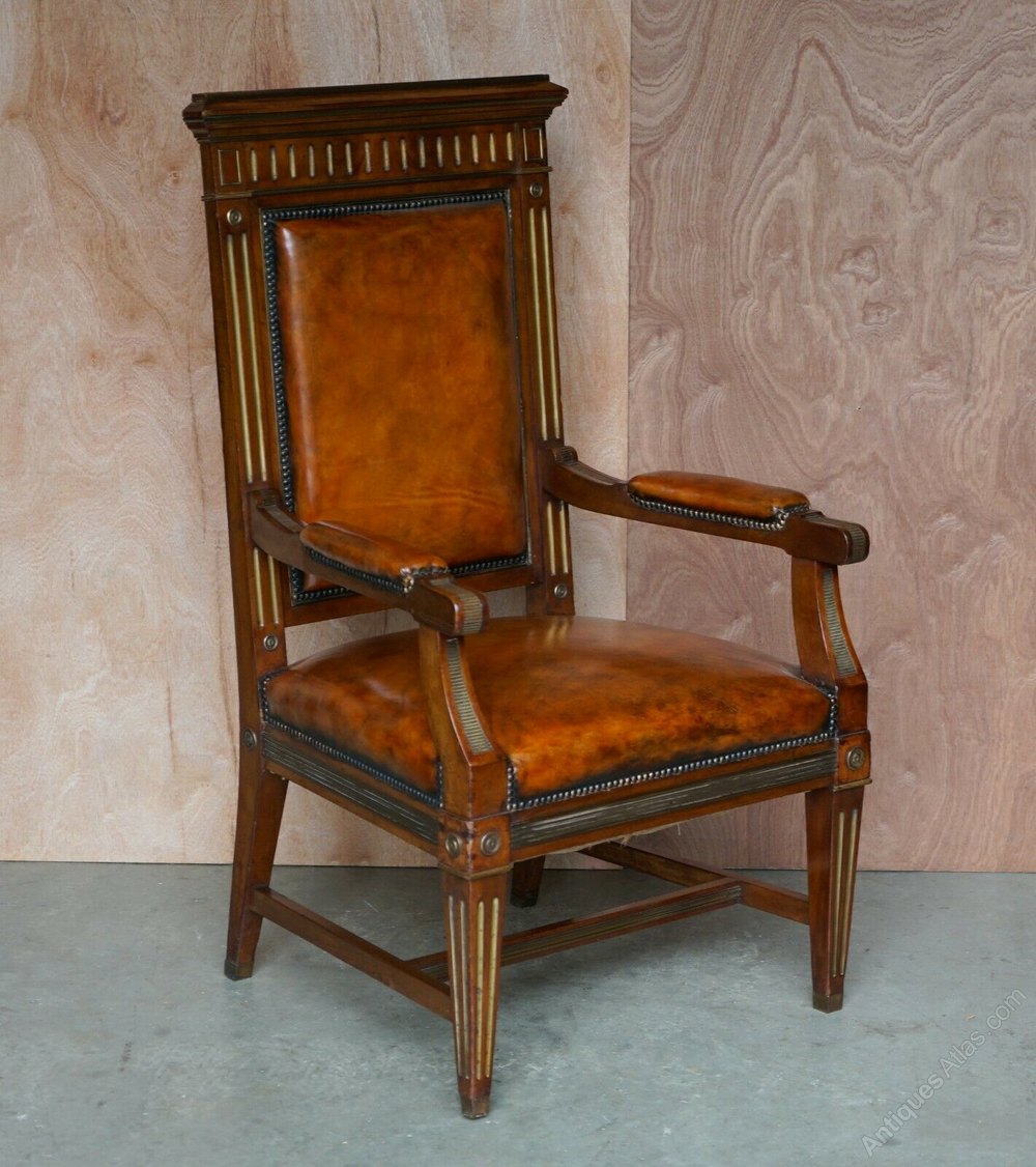
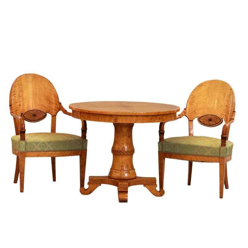
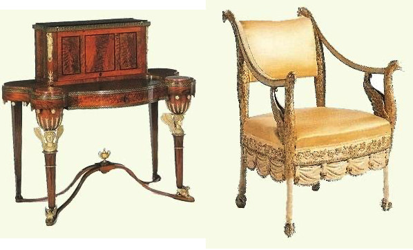
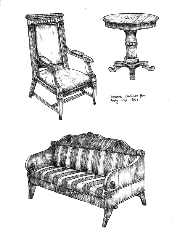
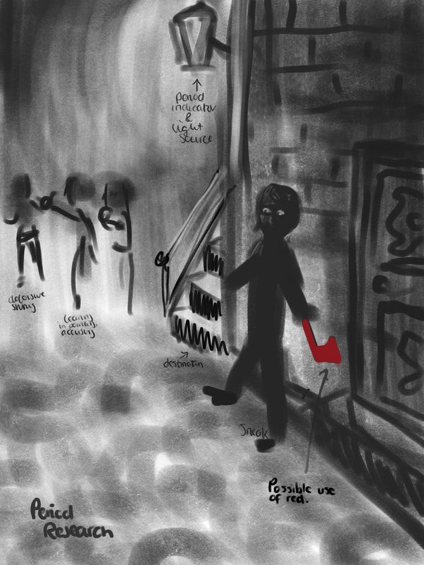
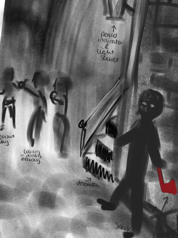
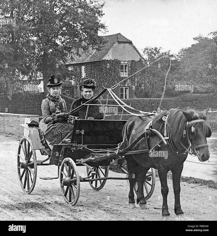
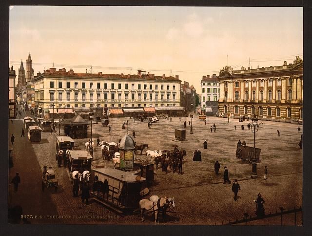
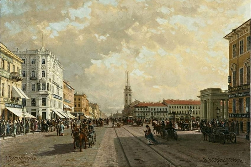
Russian period furniture

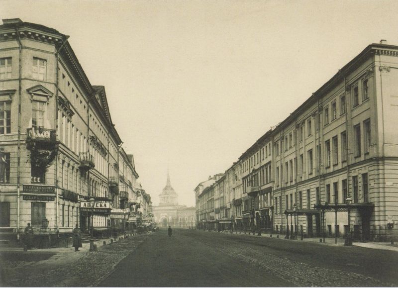
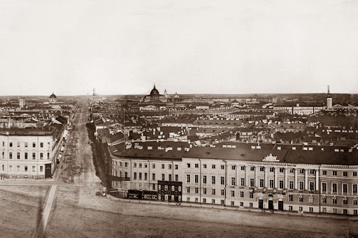
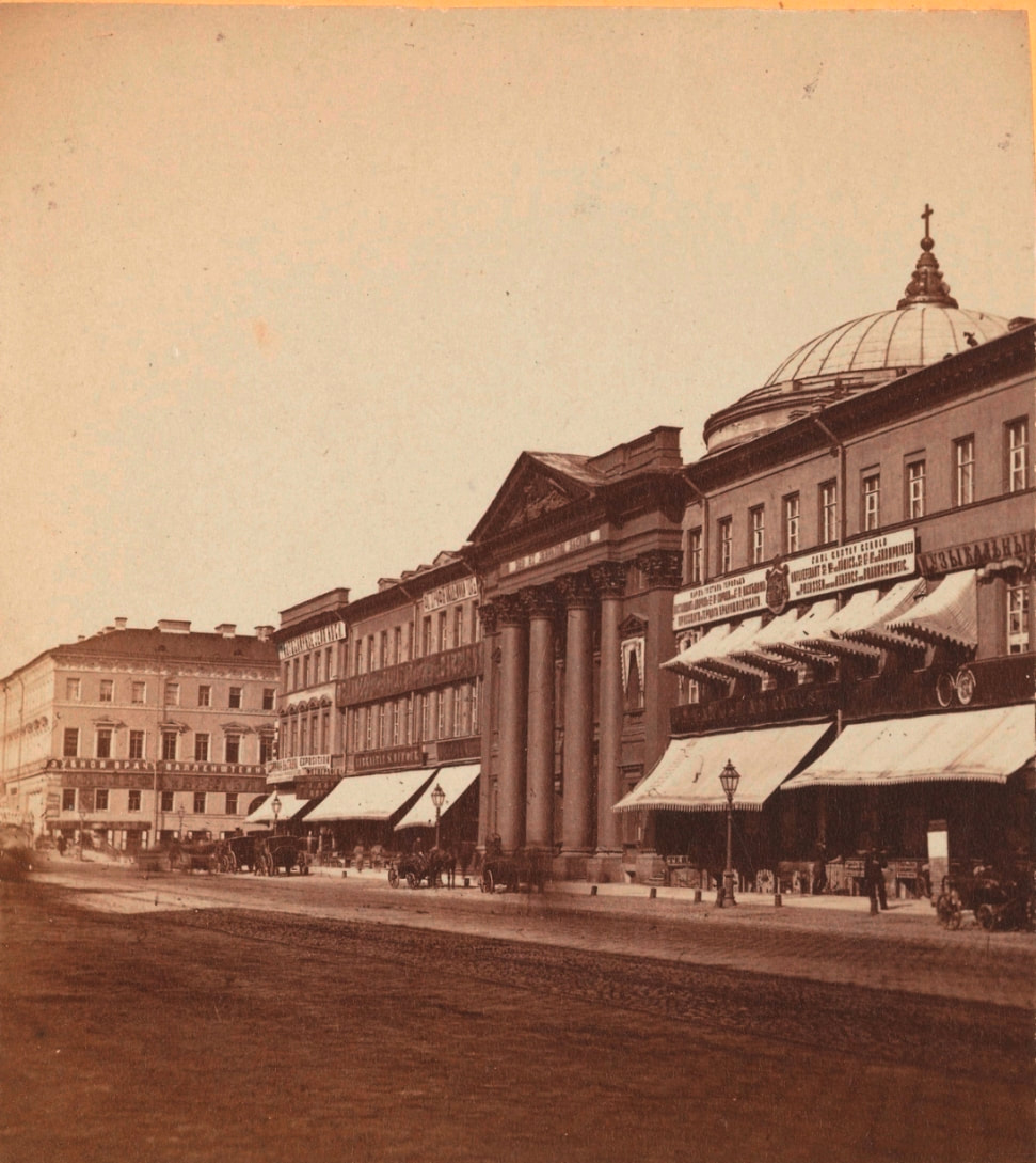
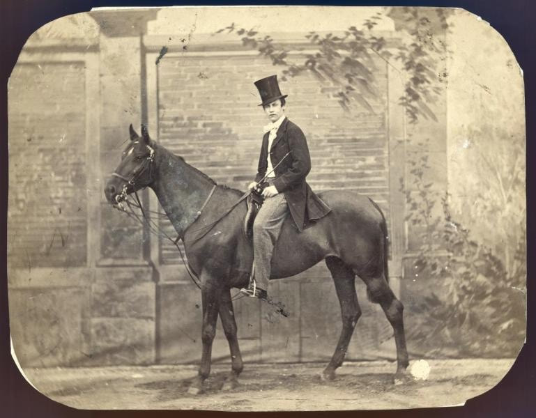
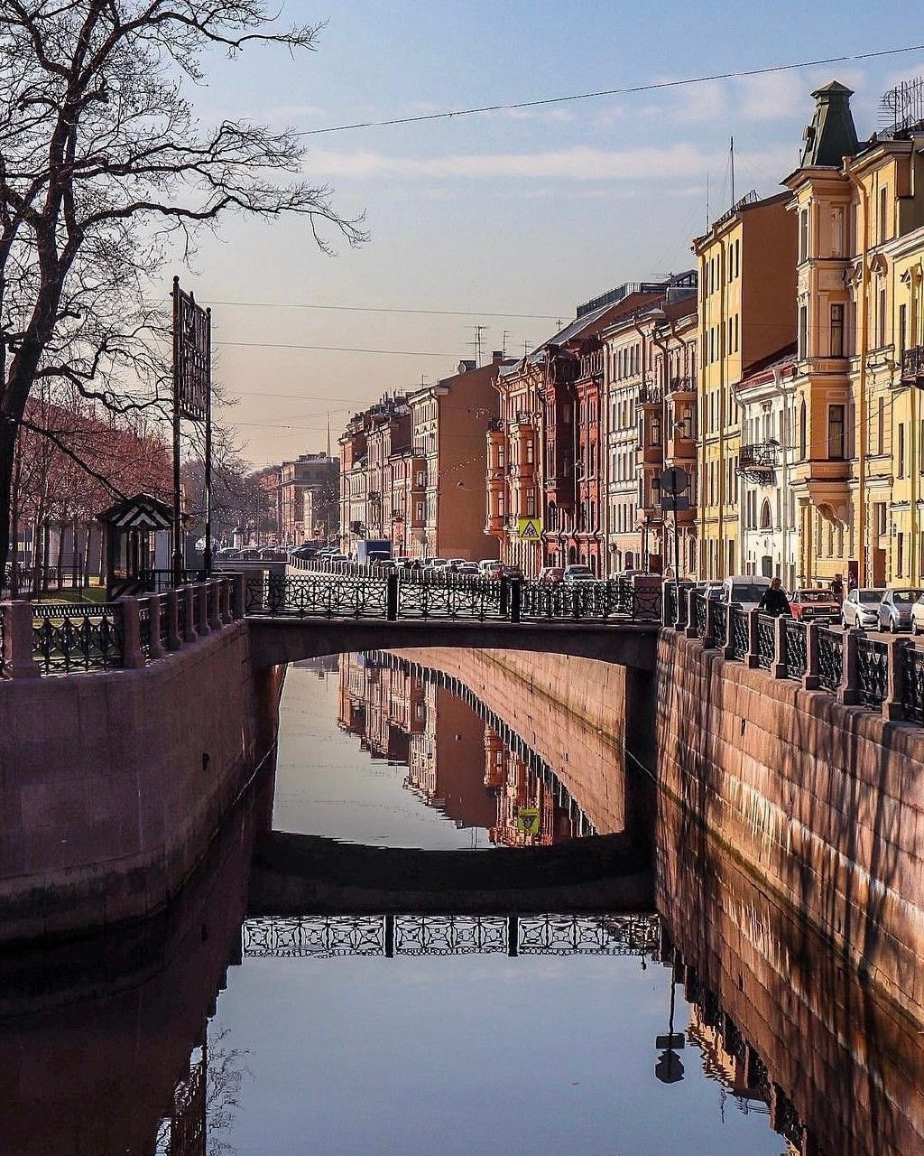
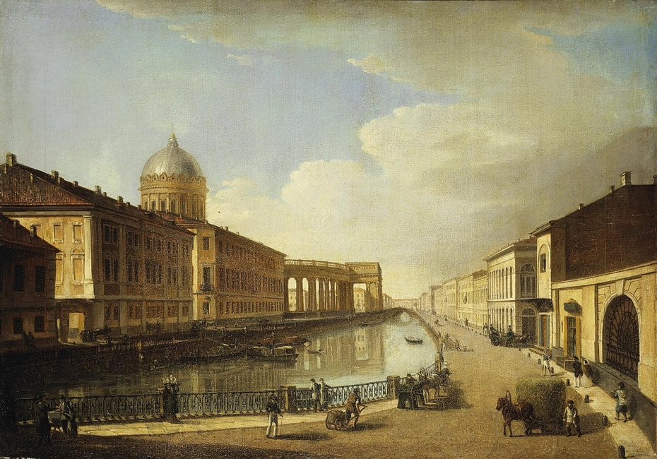
St Petersburg in the 1860s

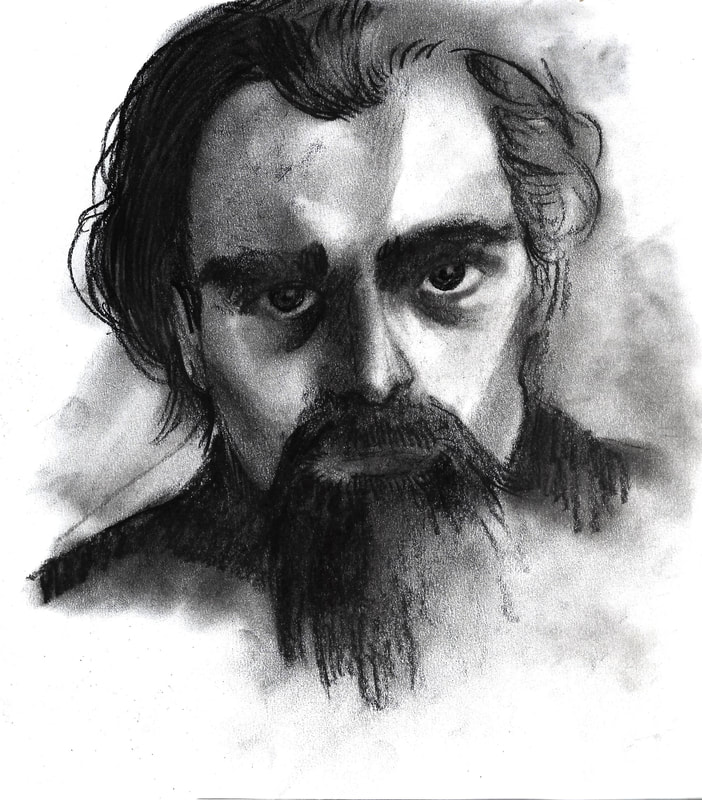
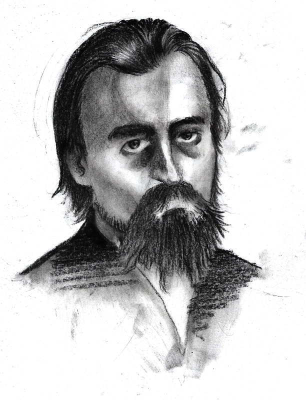
Drawings
|
|
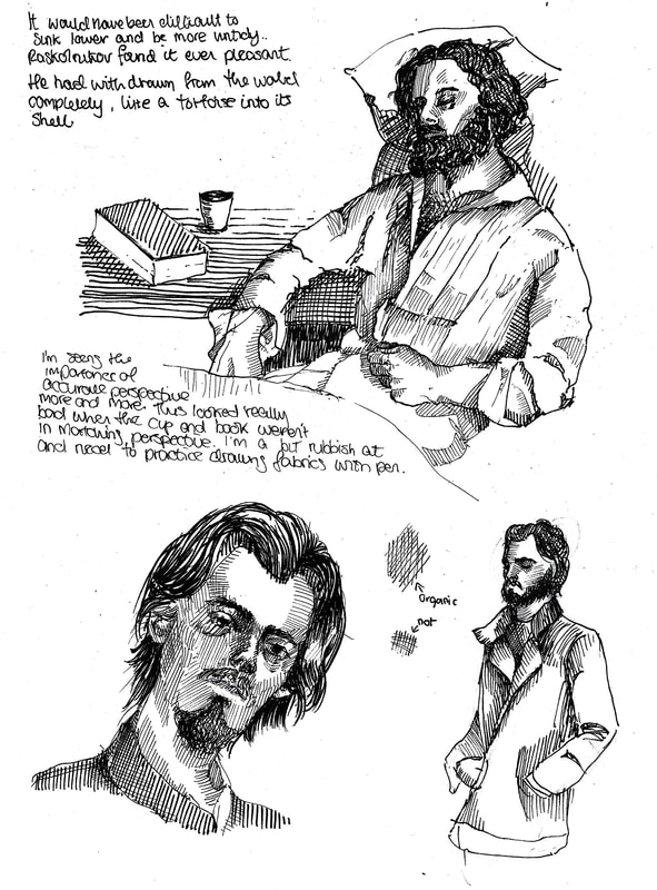
Gustave Doré studies
Focusing on drawing fabric with line.
|

|
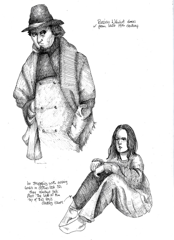
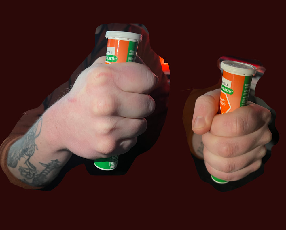
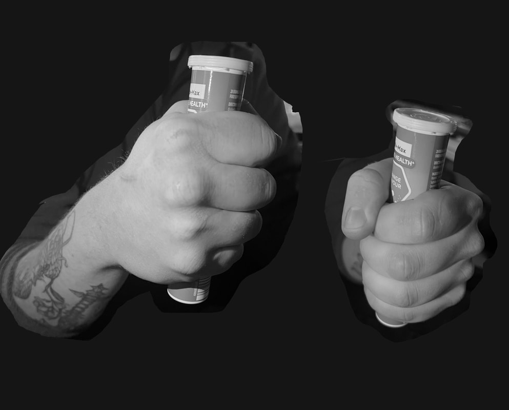
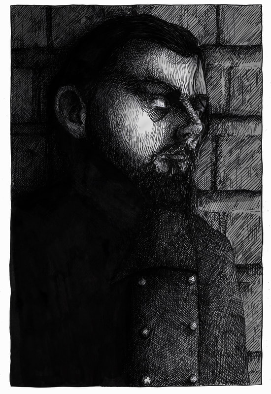
Nihilism

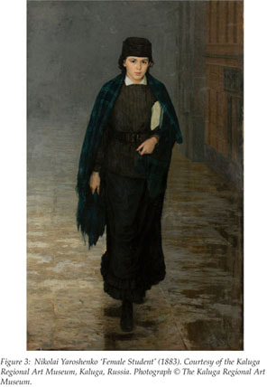
The Russian Nihilist movement was especially prevalent in 1860s Russia. Its supporters attacked and moved against traditional society, religion and morality. They believed that morality, philosophy, religion, aesthetics and social institutions that were in place were worthless and meaningless. The group engaged in revolutionary arson and a number of assassination attempts, resulting in the death of Tsar Alexander ii in 1881.
There are many connections between this movement and the protagonist of Crime and Punishment.
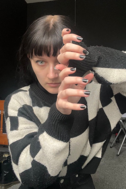
Young nihilist men dressed in ill-fitting dark coats, aspiring to look like unpolished workers, let their hair grow bushy and often wore blue-tinted glasses.
The Russian Nihilist movement was especially prevalent in 1860s Russia. Its supporters attacked and moved against traditional society, religion and morality. They believed that morality, philosophy, religion, aesthetics and social institutions that were in place were worthless and meaningless. The group engaged in revolutionary arson and a number of assassination attempts, resulting in the death of Tsar Alexander ii in 1881.
There are many connections between this movement and the protagonist of Crime and Punishment.
Young nihilist men dressed in ill-fitting dark coats, aspiring to look like unpolished workers, let their hair grow bushy and often wore blue-tinted glasses.
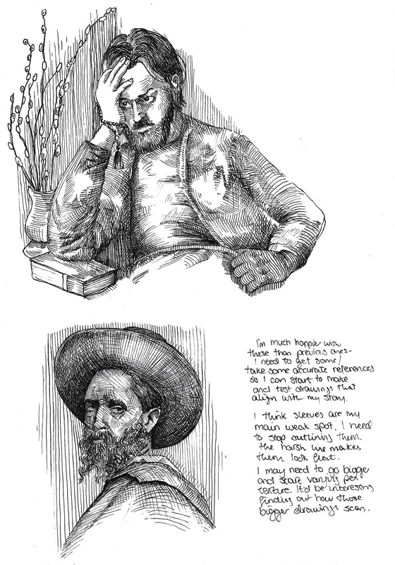
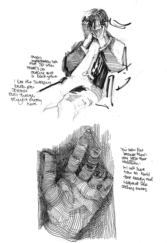
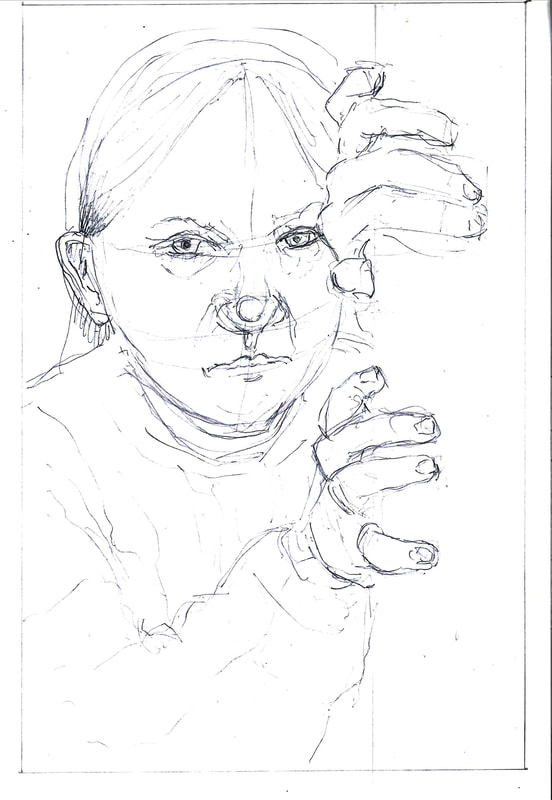
Test Drawings
|
|
|
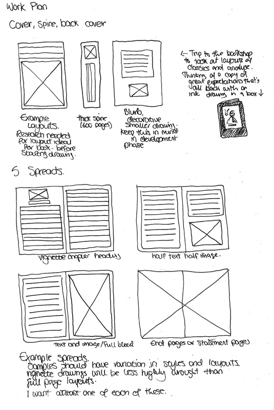
Work plan/outcomes
|
|
|
|

|
|
For my final outcomes, I'm aiming for 1 double page illustration, 4 single page illustrations, 2 vignettes, a cover, back cover and spine.
Development
|
|
I want to dedicate weeks 4 and 5 to development and style experiments, so weeks 6-8 can be dedicated to illustrations, mock-ups and prints.
|
|
|
|
|
|
|

|
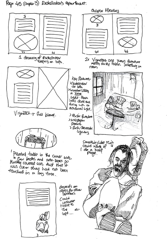
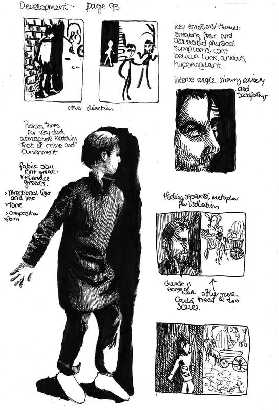
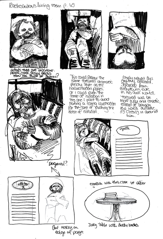
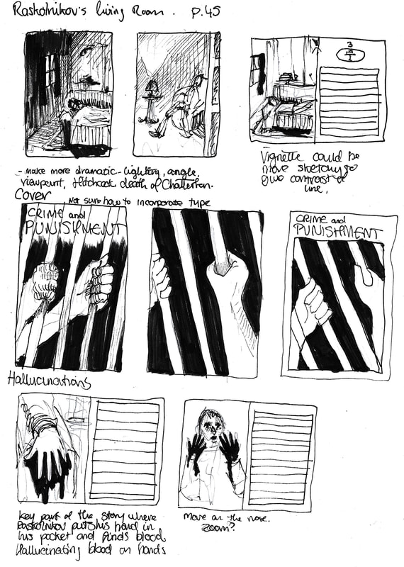
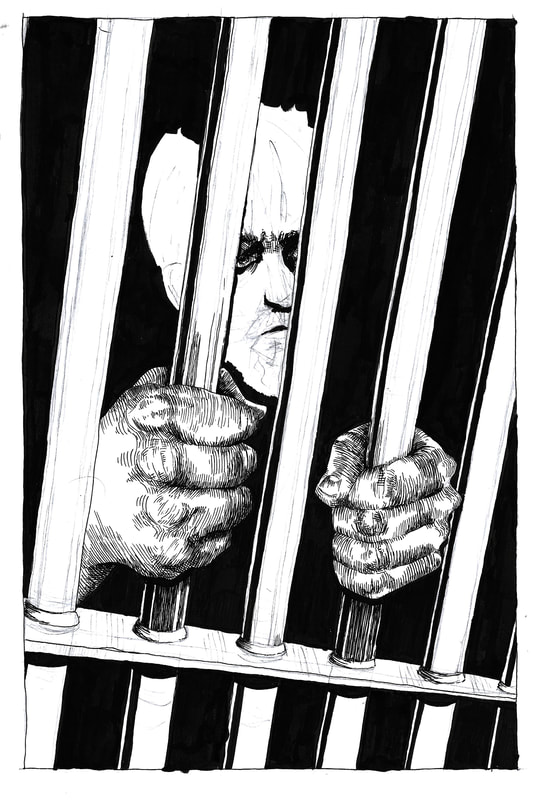
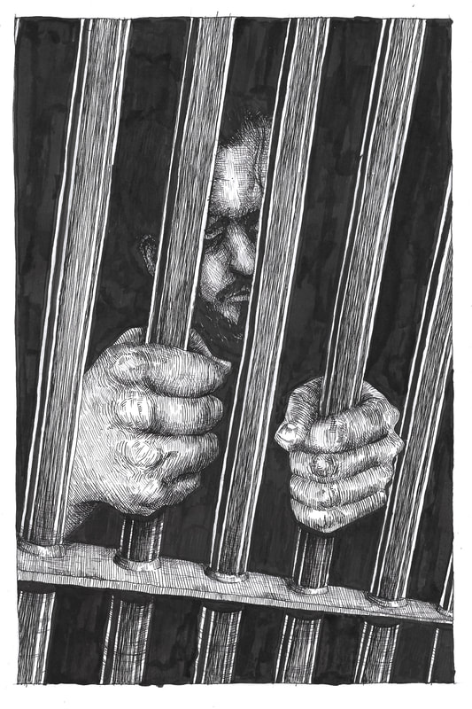
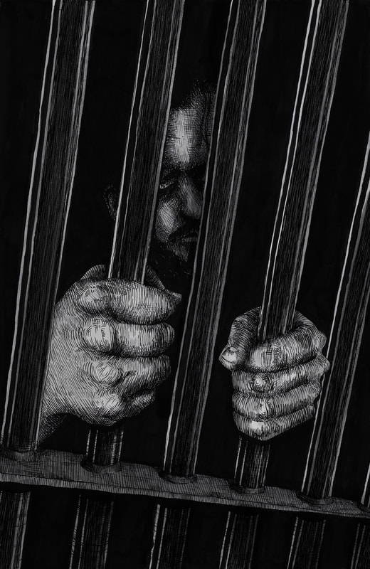
I want to really push the sense of isolation in this book, using graphic elements to separate Raskolnikov from the rest of the world. In scenes with other people a wall is a harsh line diving them, or on a double page spread the centre fold is separating them, or someone's back is turned, or he's just depicted alone.
Type
The font's used are mainly clean, newspapery old timey serif fonts for the title, and sons serif blocky fonts for the author's name. I want to put DOSTOYEVSKY in big letters on the spine.
|
|
Inspiration
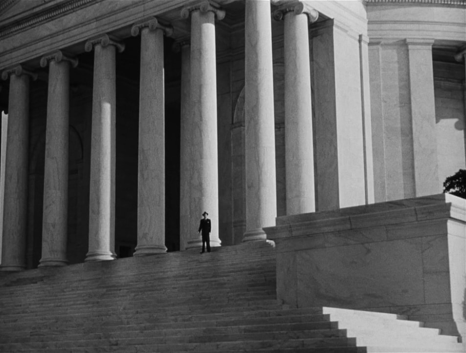
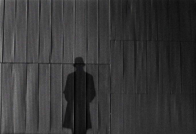
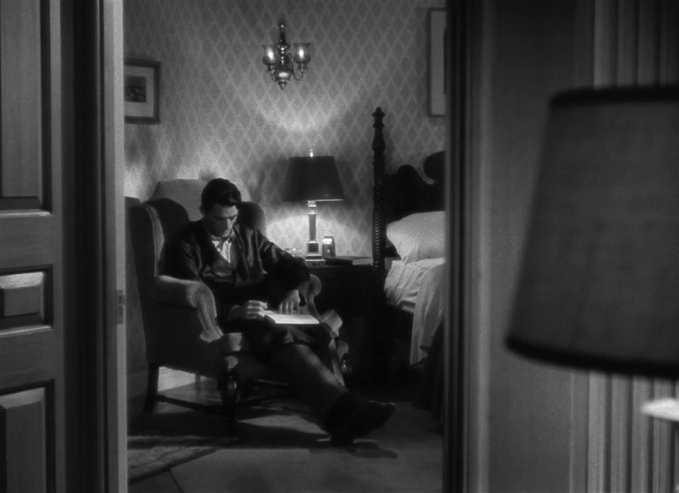
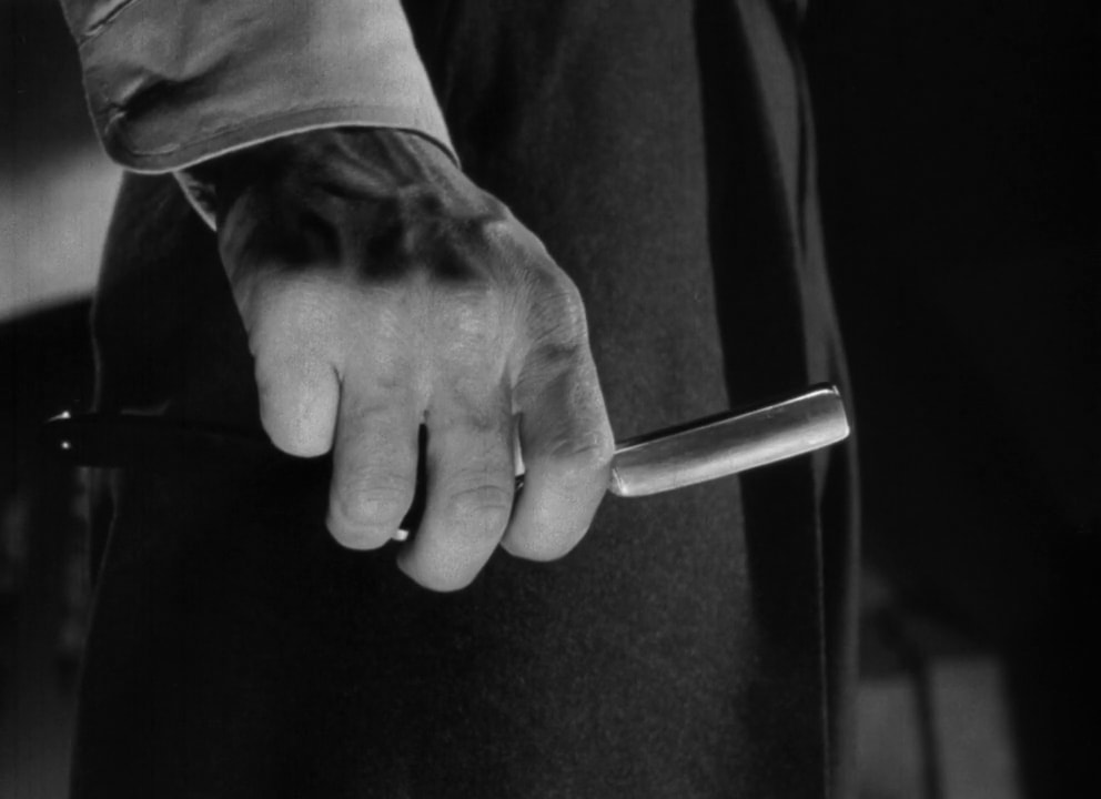
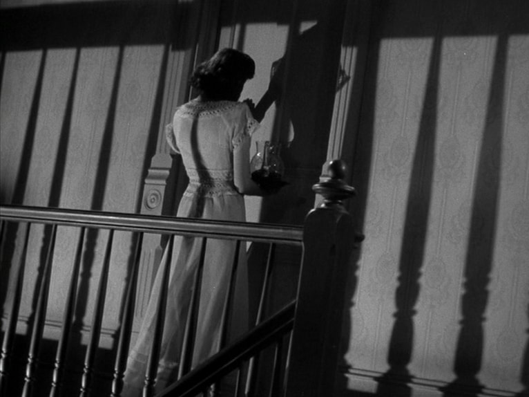


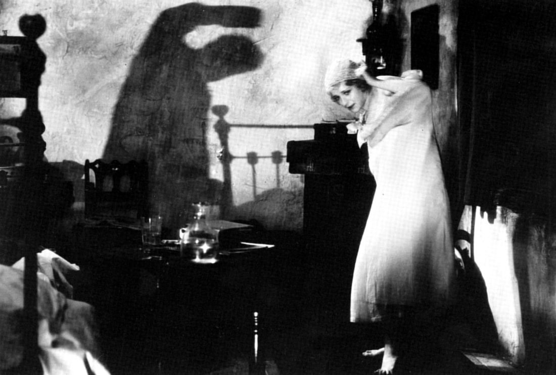
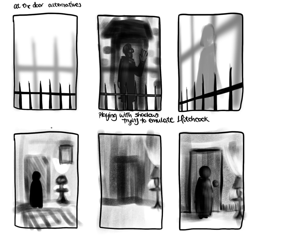
Shots from Hitchcock films, 'The Spiral Staircase', and Kafka's 'It's a wonderful life' . Looking at shadows, angles, framing, shot distance, tone contrast.

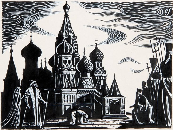
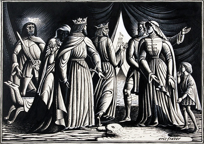
Henry Wallis, Eric Fraser
Further Development
|
|
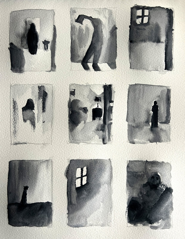
Shadow and tone experiments
|
|
Dwayne's feedback:
Start making illustrations not expecting they'll be the final illustration, but they could be. Make things that can be used, they could be layered or added to, these thumbnails can't be used.
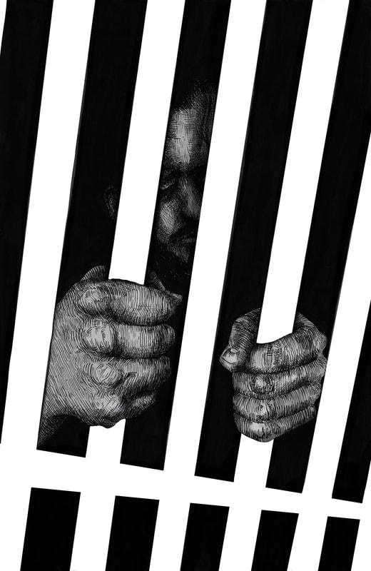
Consider having contrasting illustrations, some that have solid black areas or sketchy areas, some that are fully rendered and highly wrought.
Start making illustrations not expecting they'll be the final illustration, but they could be. Make things that can be used, they could be layered or added to, these thumbnails can't be used.
Consider having contrasting illustrations, some that have solid black areas or sketchy areas, some that are fully rendered and highly wrought.
I think I'm at the point where I need to start making illustrations, even though it's early, so I can push this project on and not get stuck.
References
               |
|
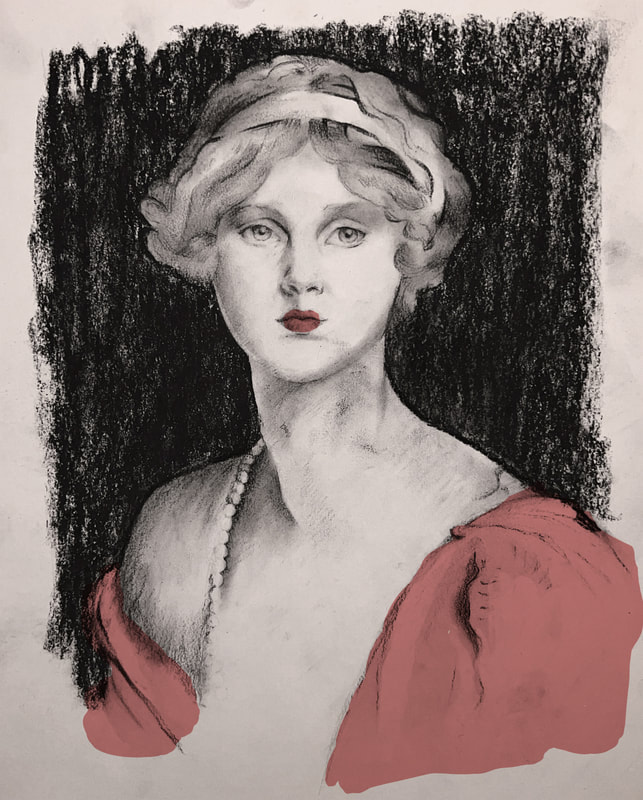
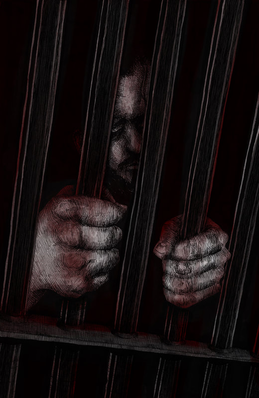
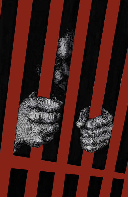
I want to find a way to incorporate this graphic brush mark-y red into my illustrations, or just sections of red to have a bold cohesive colour scheme that reflects the themes of the book.
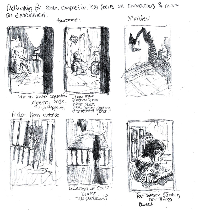
I'm going to rethink my Raskolnikov's apartment illustration, since most of my planned ones are close ups on faces or hands. I want to get some variation in viewpoints and try to have a more wide composition.
Illustrations
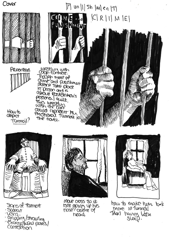
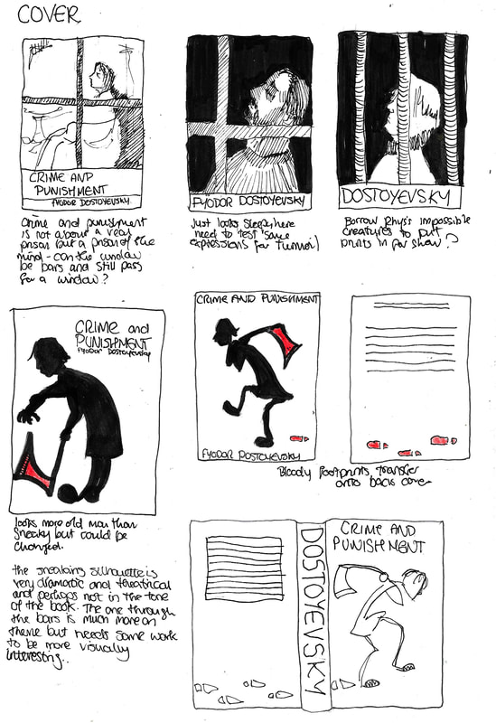
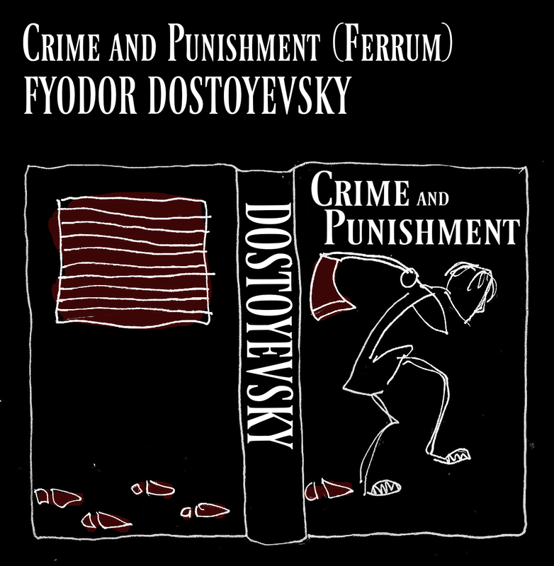
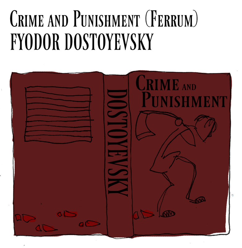
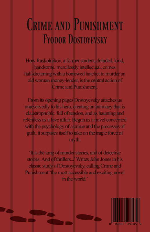
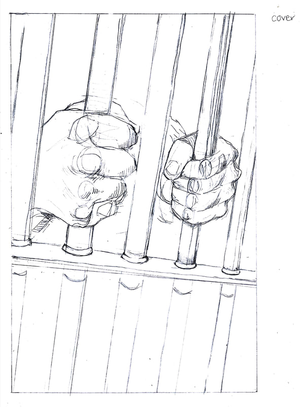
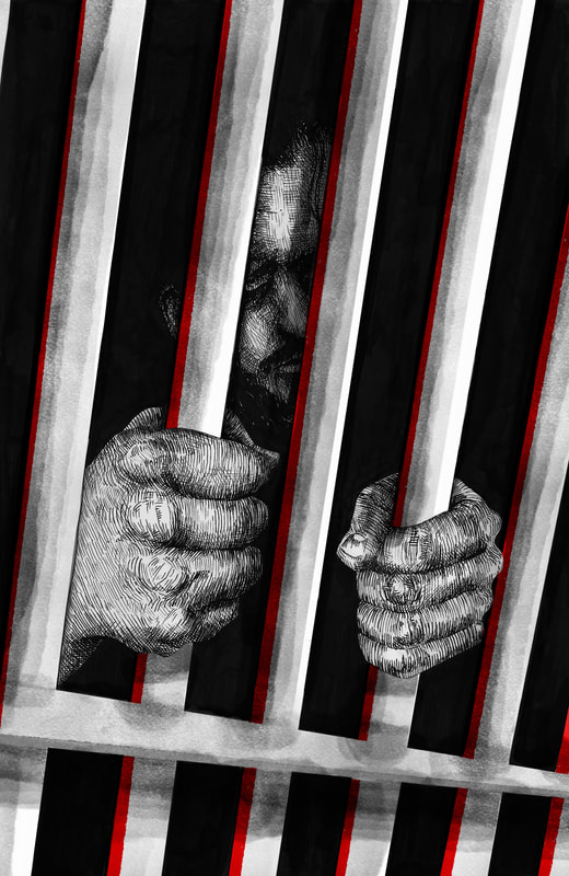
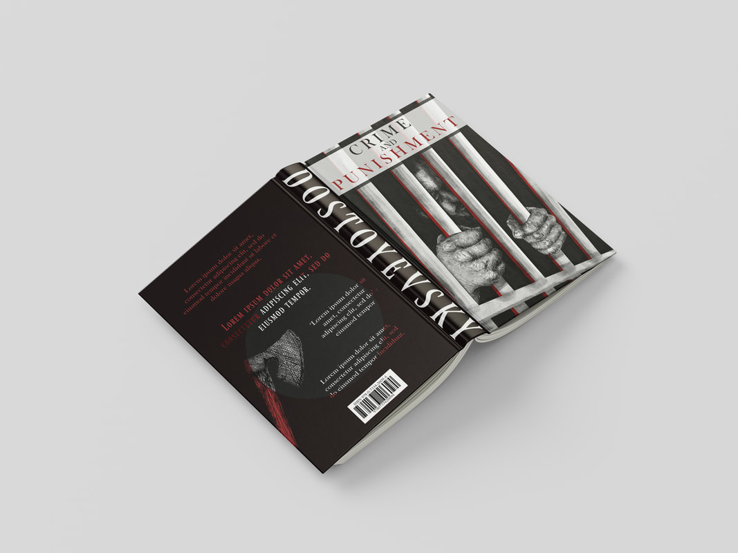
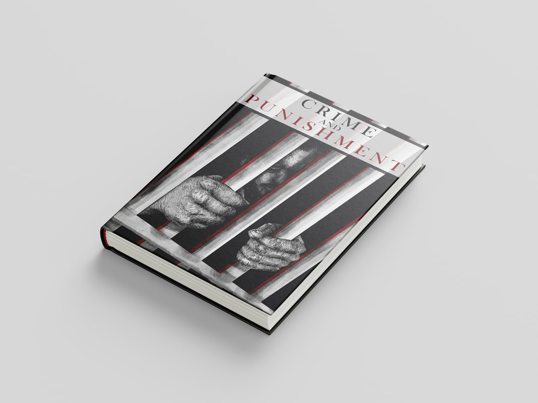
Front Cover
|

|
Initial version and second version with the bar moved down so I can include hints of a tortured face, and have more room for the title at the top.
|
|
|
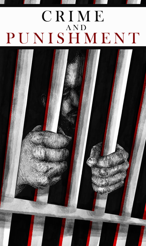
Type mockup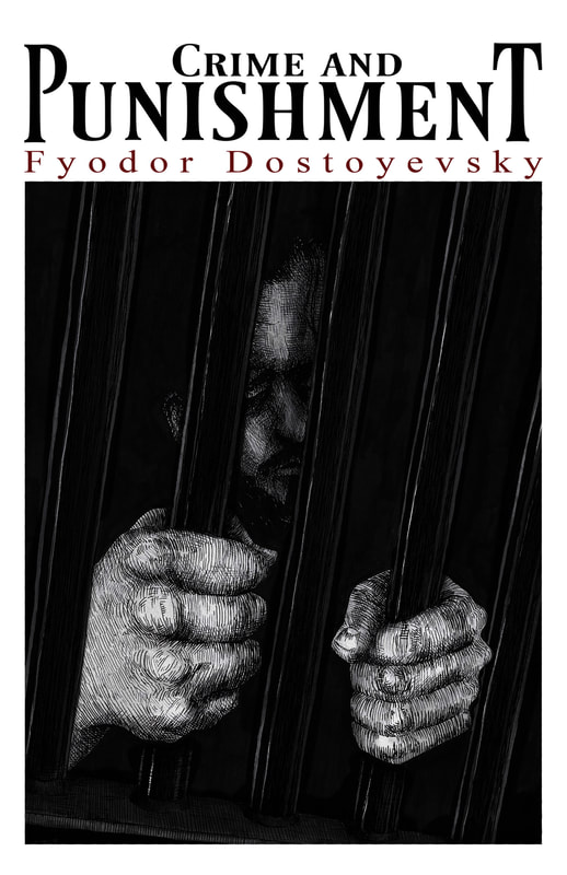
|
Very quick type mockup, want to use some red, finding it difficult to fit 'crime and' in with 'punishment'
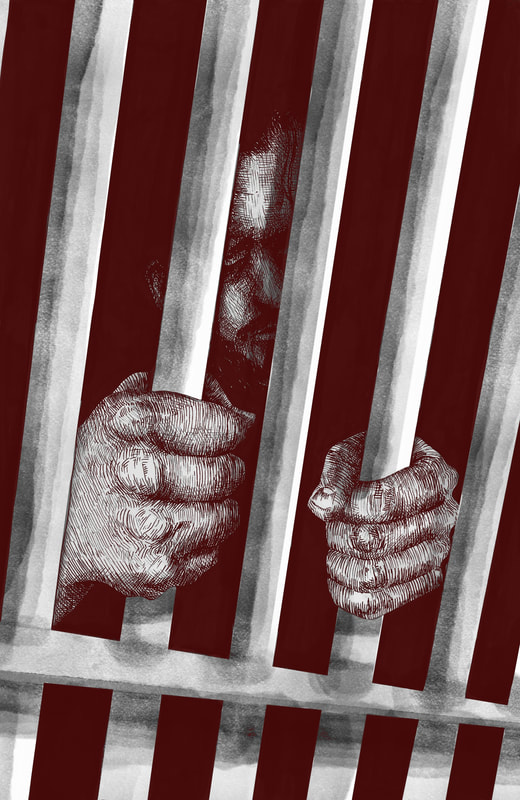
Experiments
|
|
|

Finished Front Cover
Book Jacket

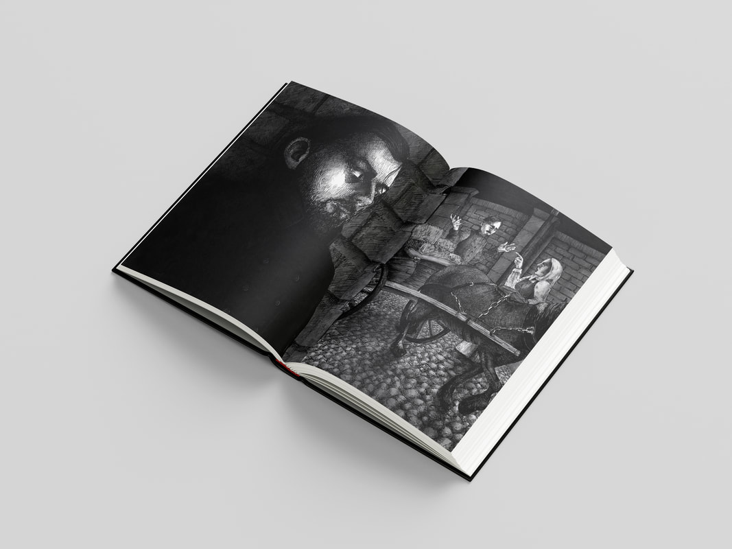
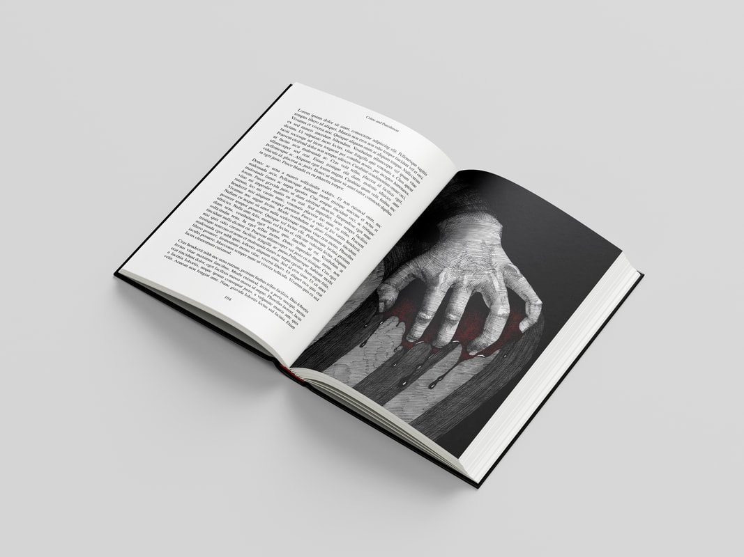
Physical Book Mock-up
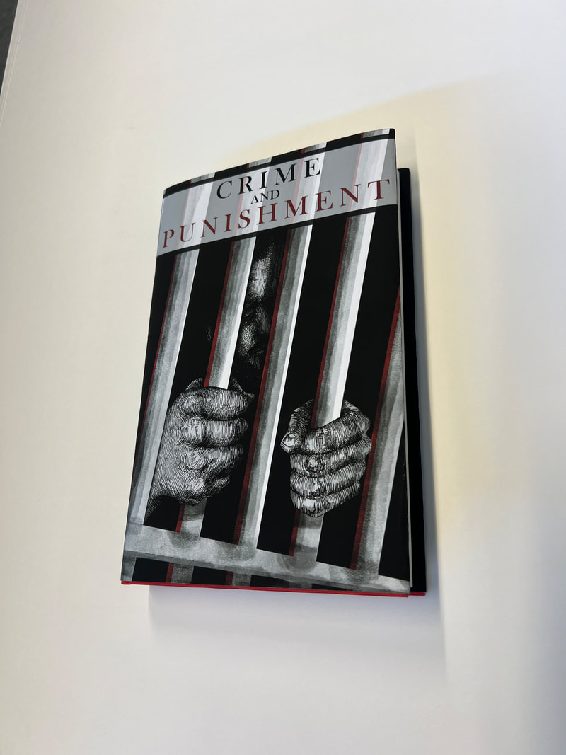
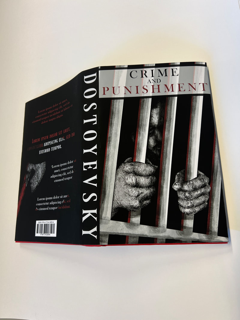
This is the book mockup I made physically and will display in the exhibition.
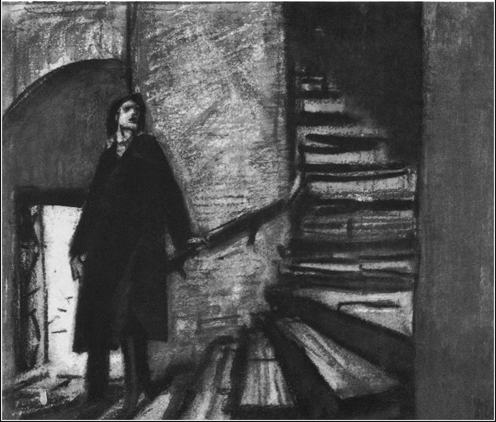
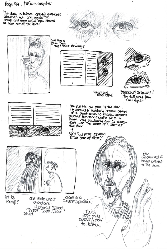
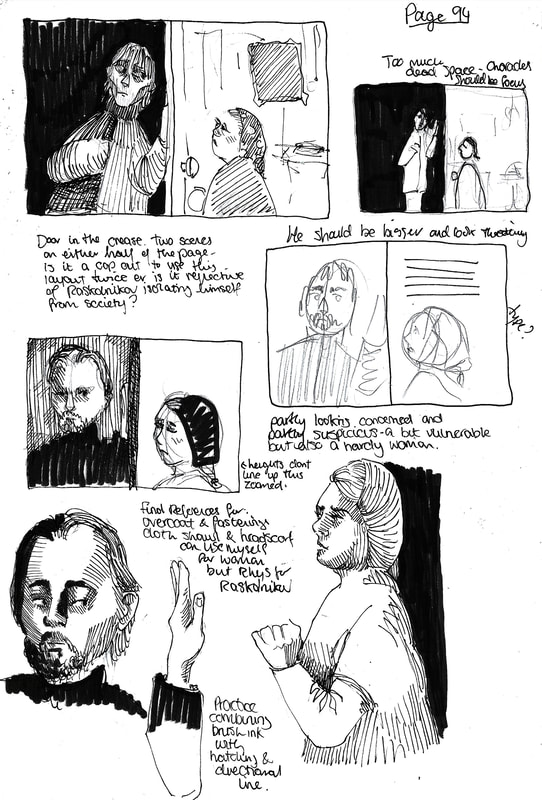
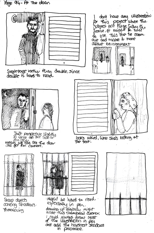
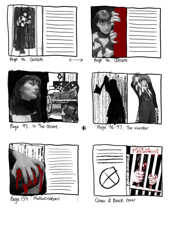
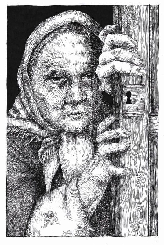
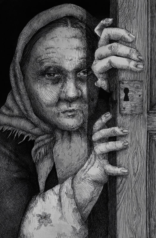
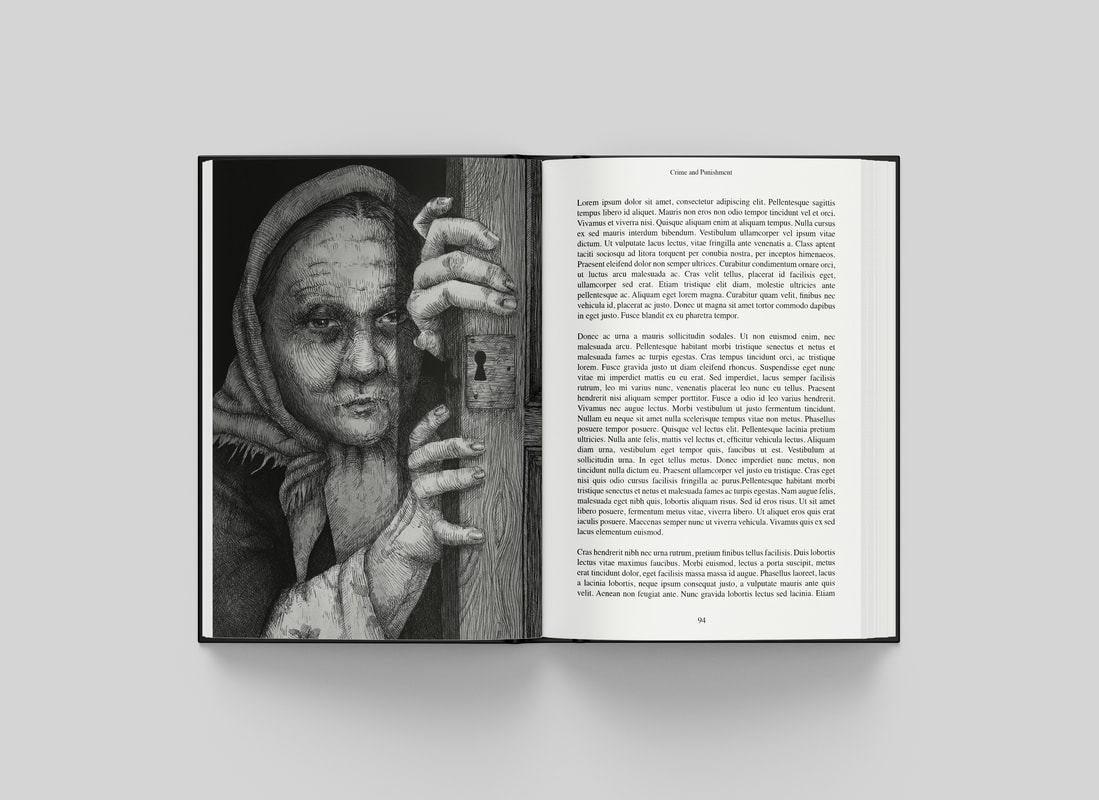
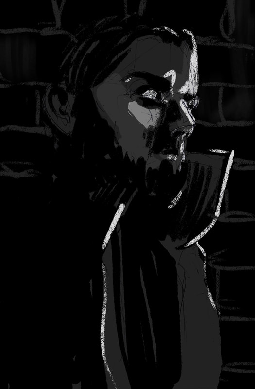
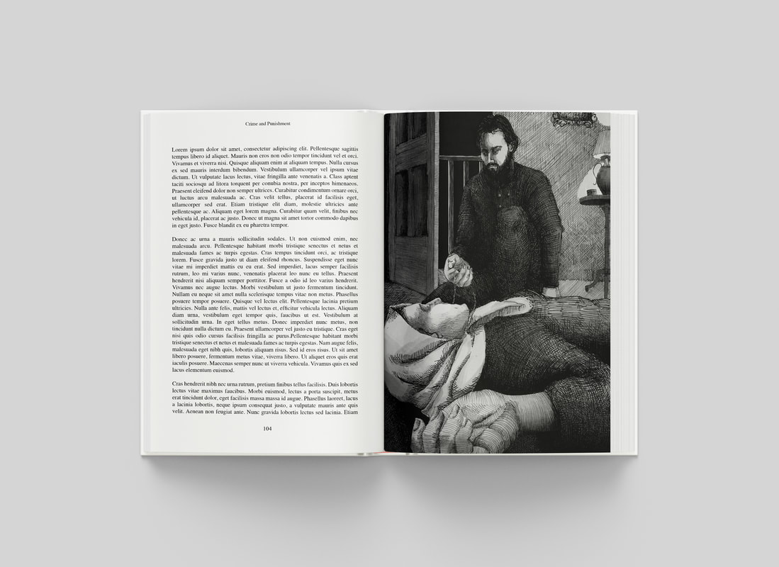
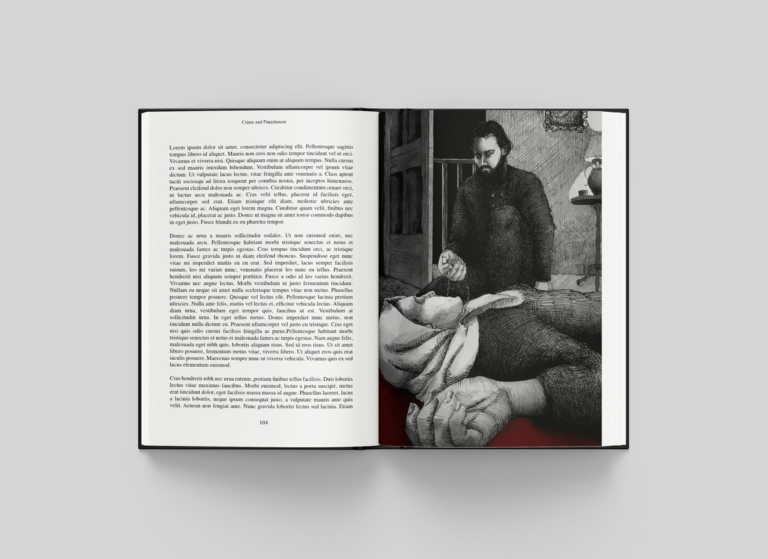
Page 94. At the door
Excerpt

Development
|
|
Finished Illustration
With Type
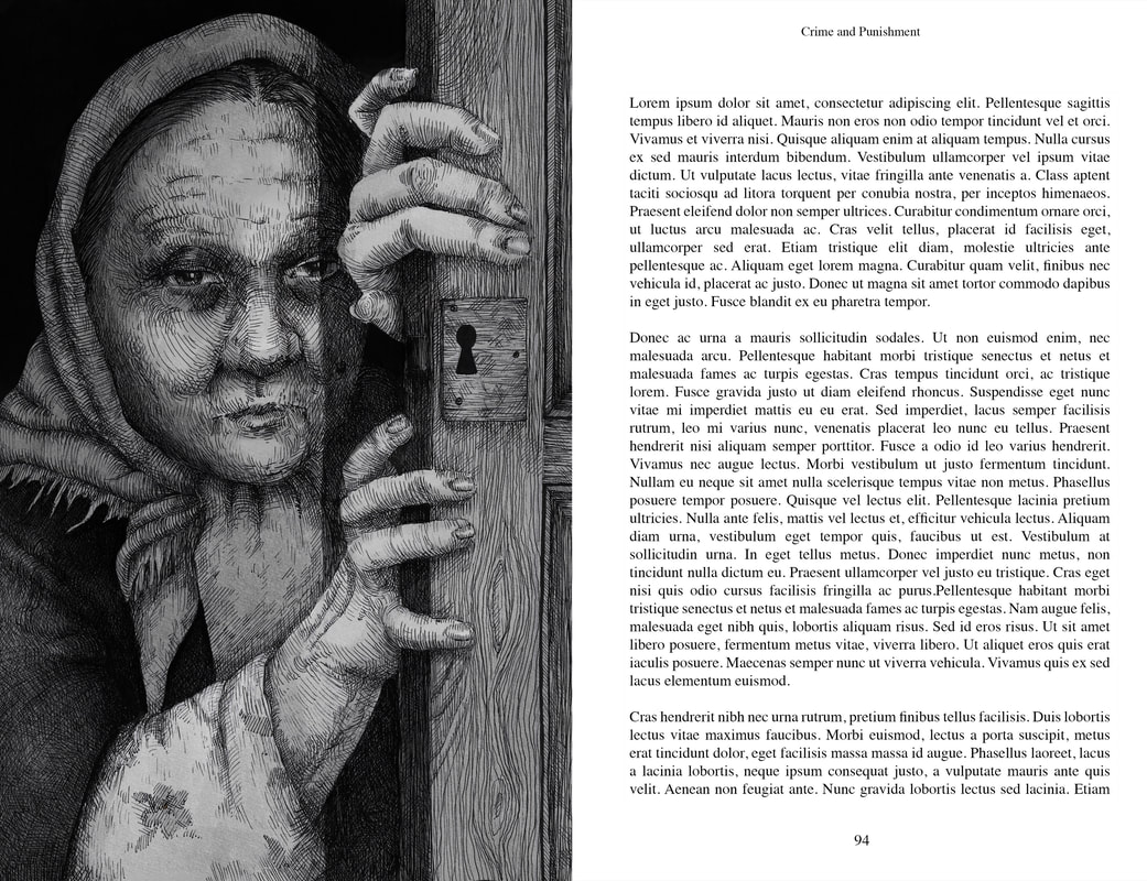
Mock-up
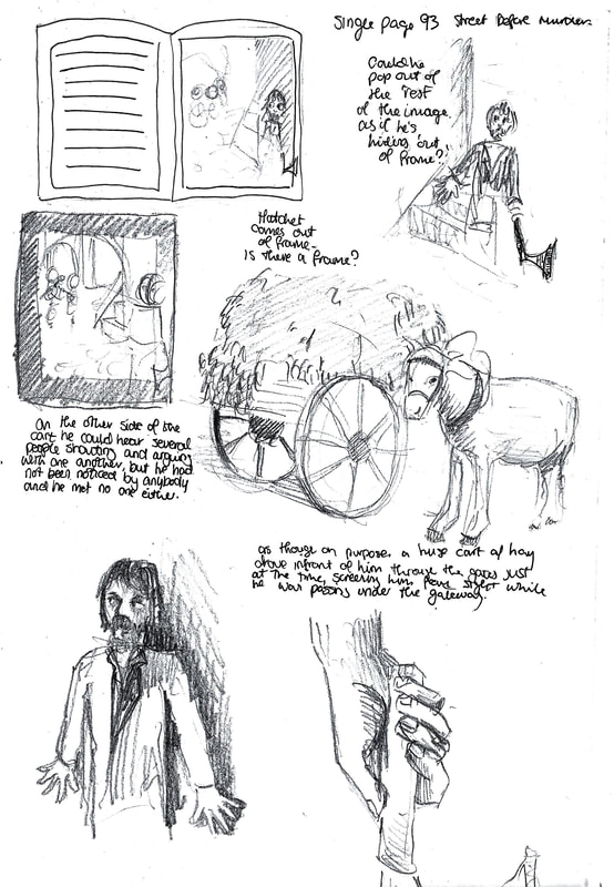
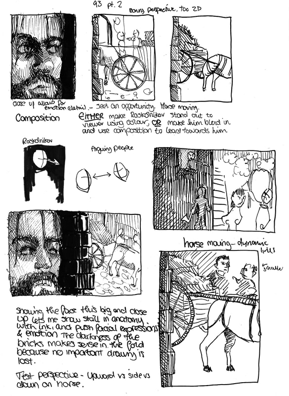
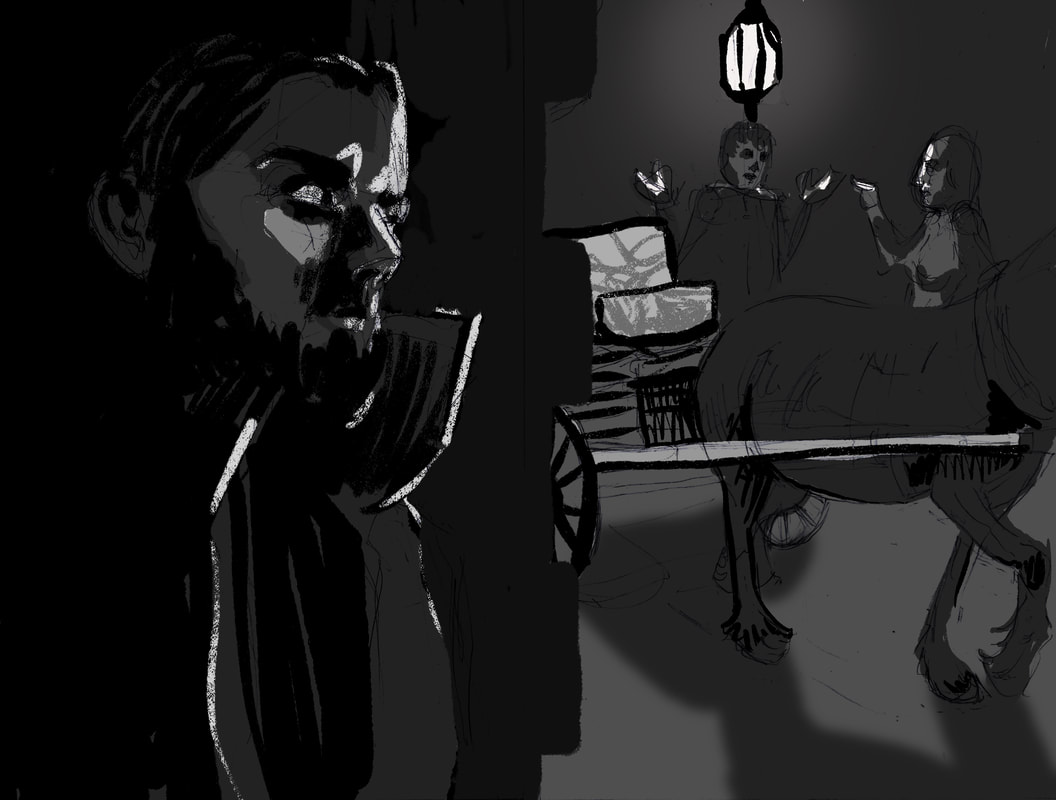
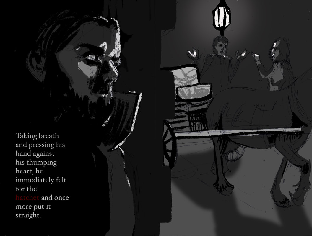
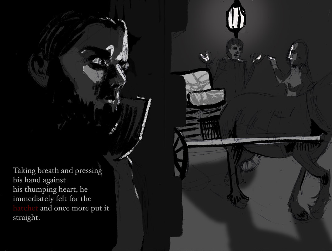
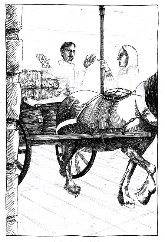
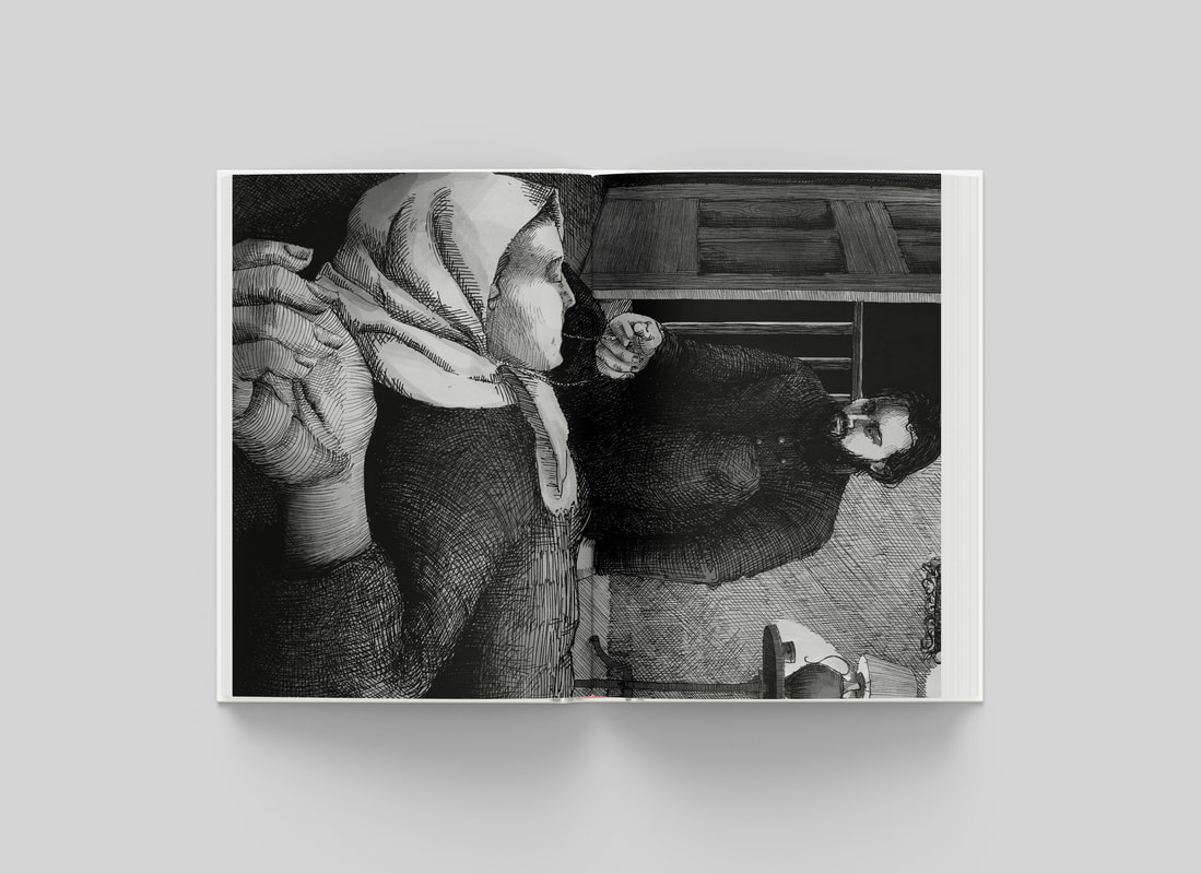
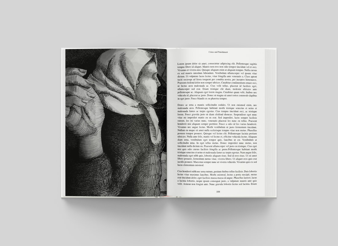
Page 93. In the Street
Excerpt

Development
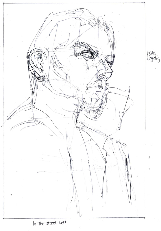
|
|
Digital Tone Mockup
|
|
|
Rough double page spread layouts, and a version where I include a segment of type. I wanted to get a rough idea of where my darks and lights would be before I go in with the pen.

|
|
|
|
Not happy with the anatomy and I think the black is a bit heavy handed. Hopefully it will balance out with the other half of the illustration, and I can go back and fix if not.


|
|
|
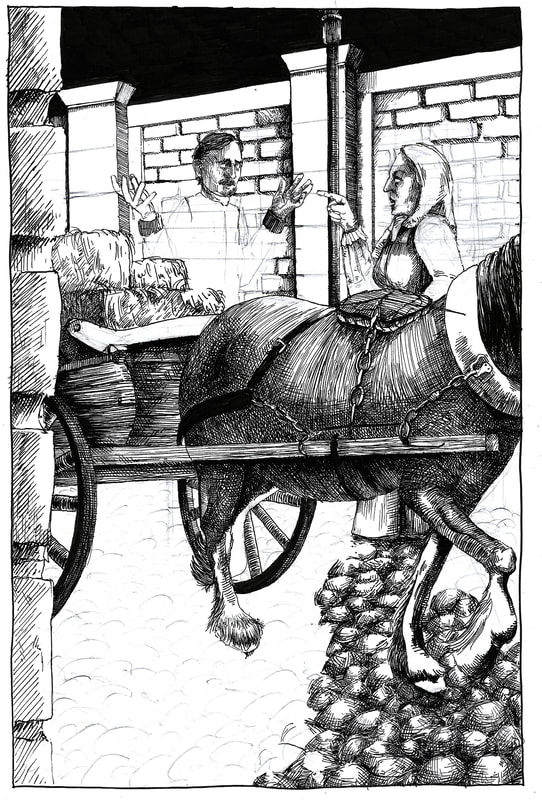
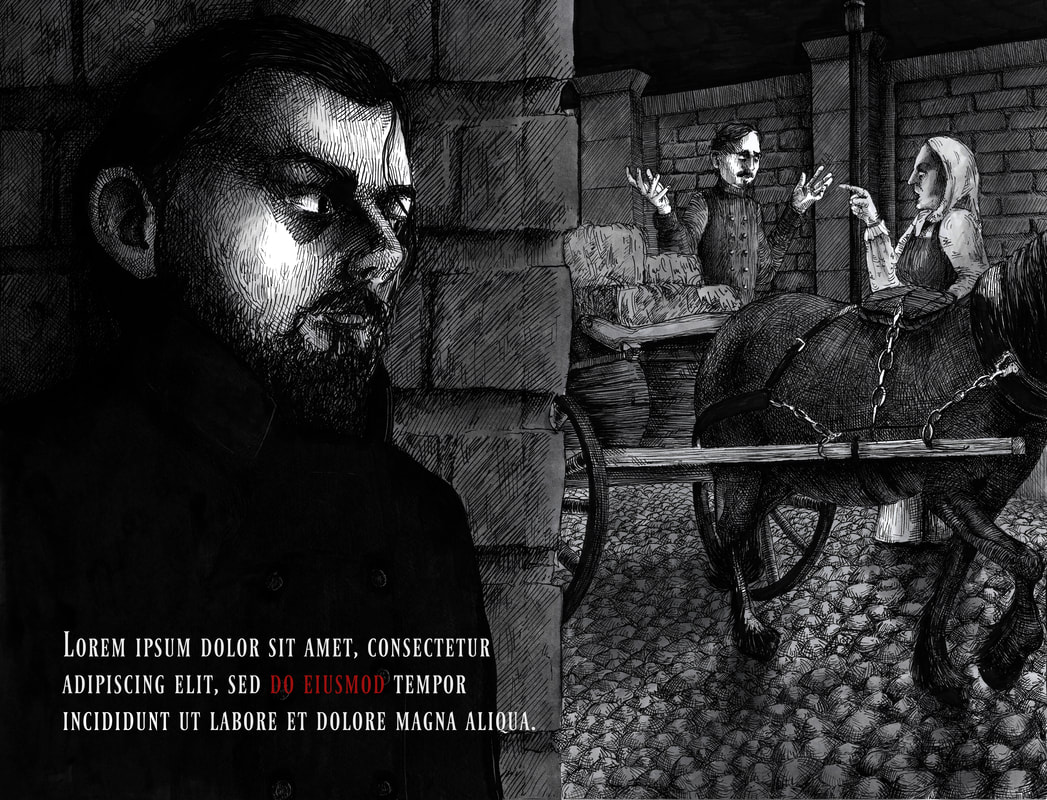
Unedited full spread. Will blend the edges together in procreate so it's more seamless, and shade everything together so it looks less disconnected. Add highlights to the jacket to give it more of a sense of form, and make the bricks darker than the background as the left side is much closer to the viewer.
Feedback: we lose the other two characters because they're very similar tonally to the rest of the illustration. The viewer should go from Raskolnikov first, to the other two characters, but get distracted by the hay on the way because it's so bright.
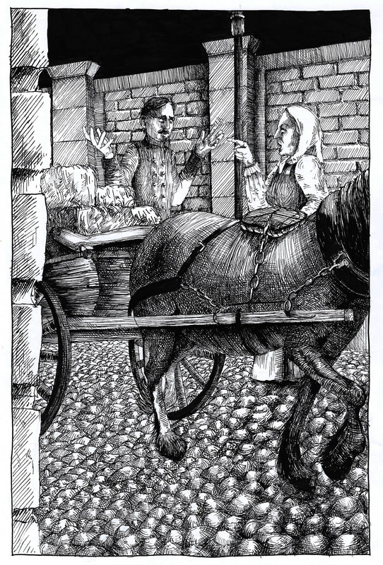
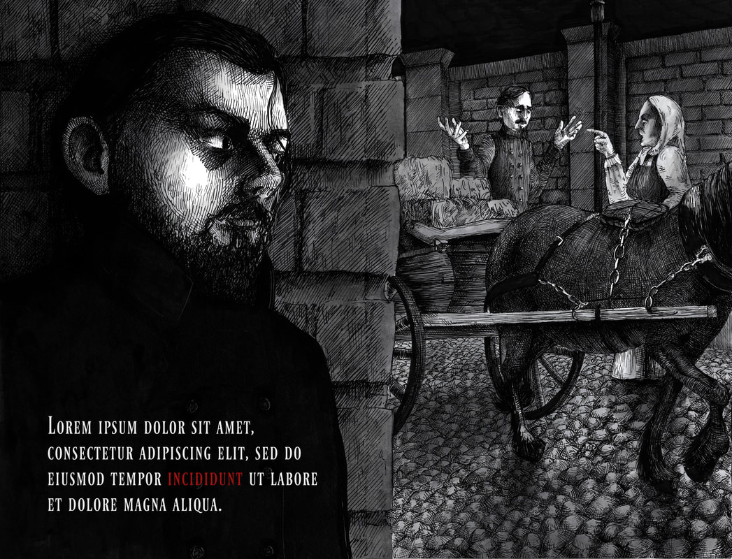
Altered version with more focus on the characters on the right.
|
|
I did want to make a version where I included a section of text, but haven't been able to find a way to make it work without the text feeling awkward.
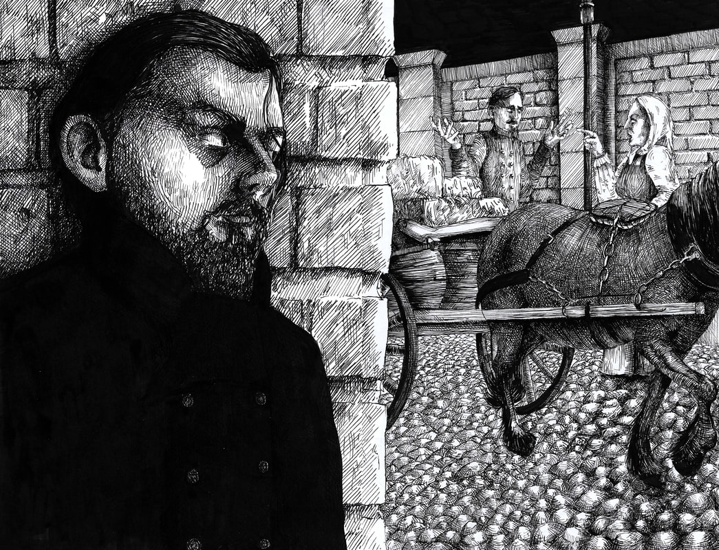
Final Illustration
I'm happy with this overall, though I don't like the way it joins, as I drew it on two separate sheets of A4 and did my best to blend them together. When they're in a mockup it works because the join is in the seam.
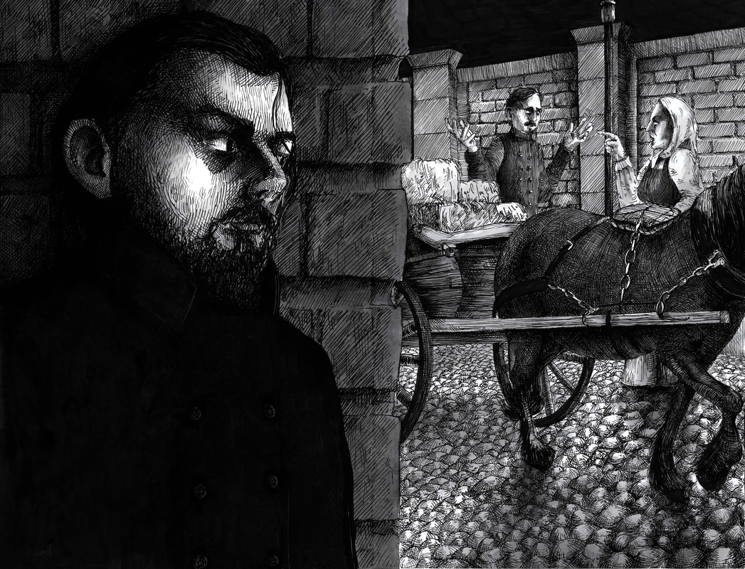
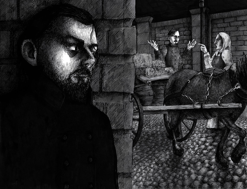
Mock-up
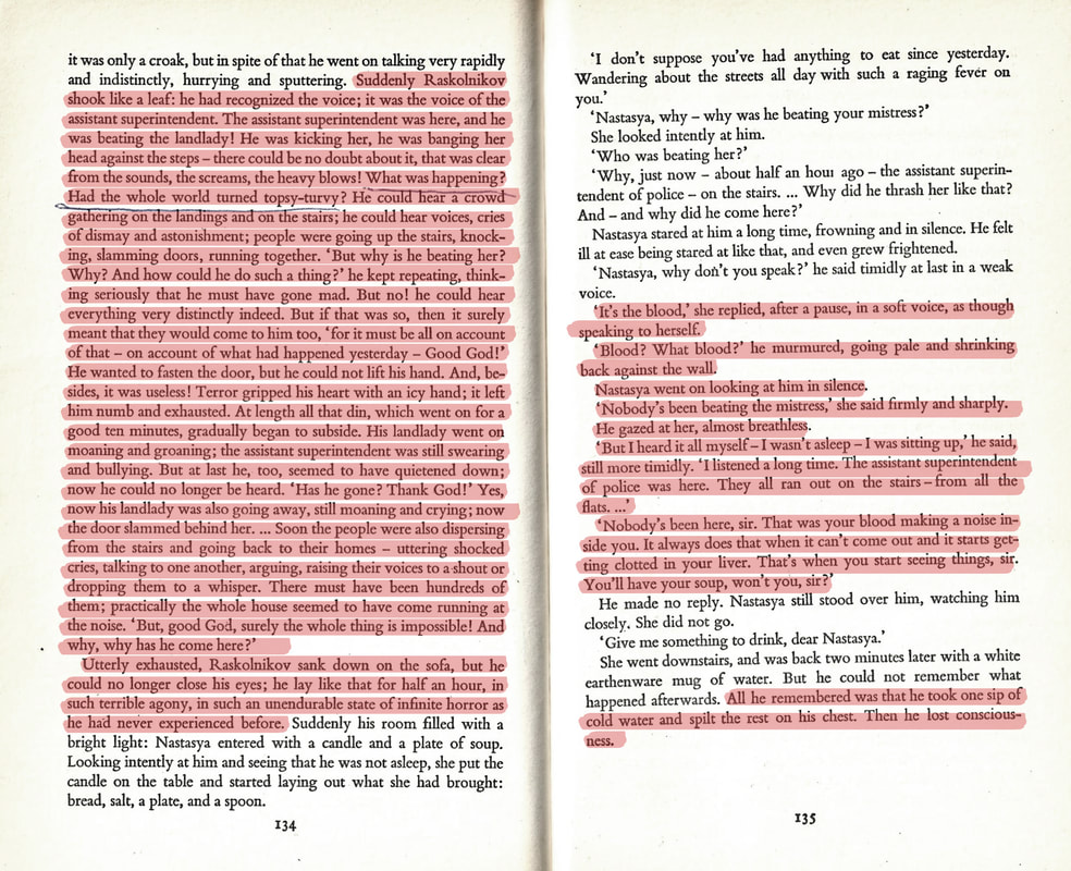
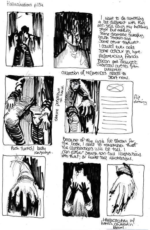
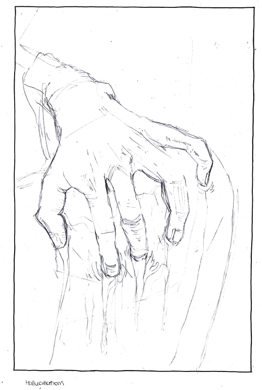
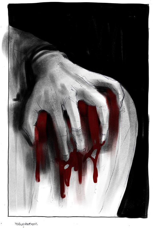
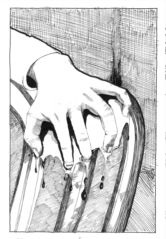
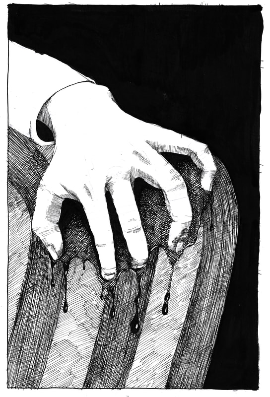
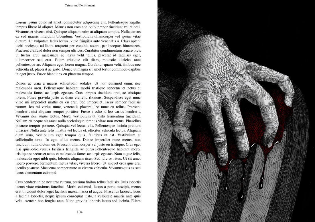
Pages 134-135. Hallucinations
Excerpt

Development
|
|
|
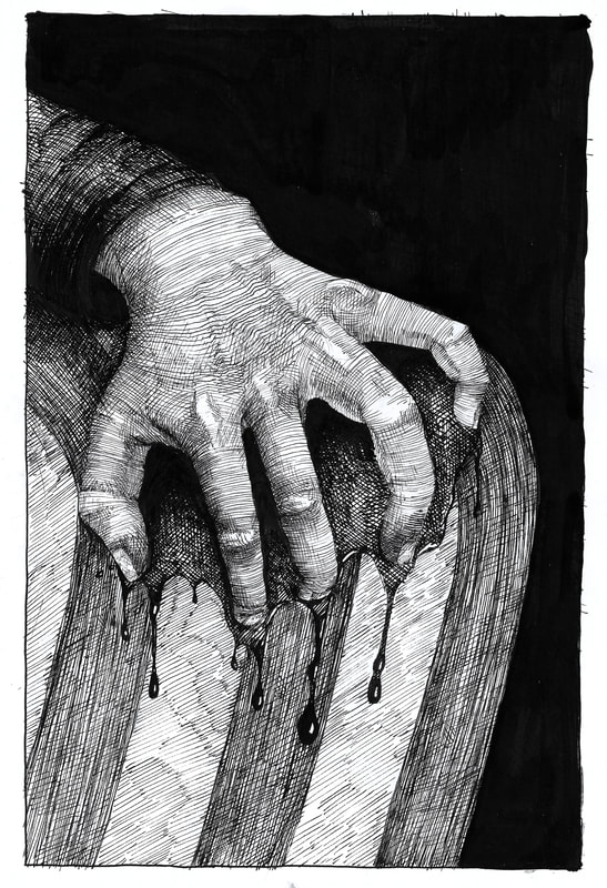
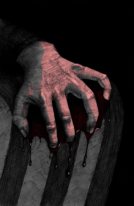
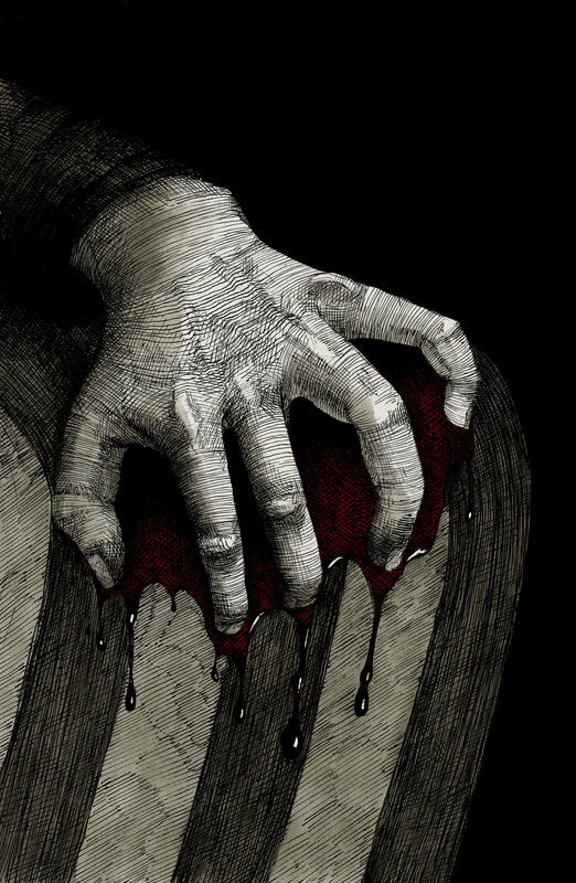
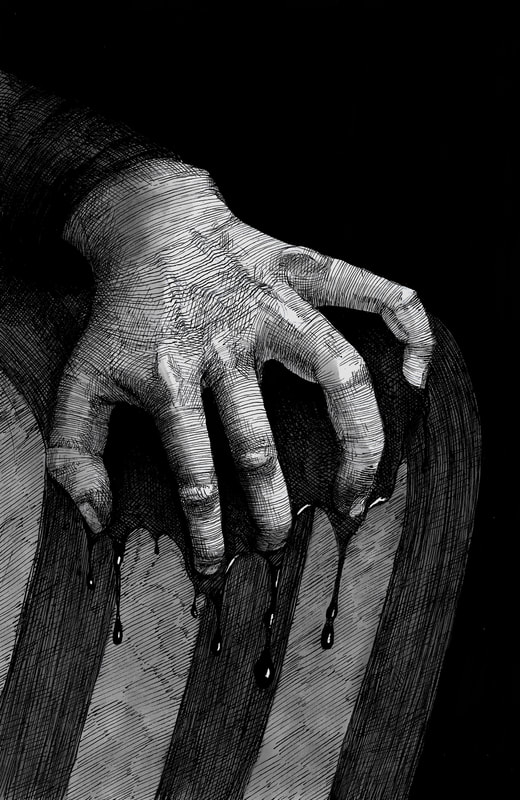
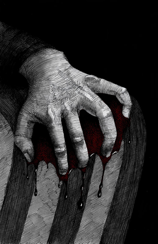
Want to do something different with this one - use big brush strokes for the blood, can overlay it with a dark red. Or I could do it digitally and make it look more graphic.
|
Quick digital mockup.
|
|
|
|
Experiments
|
|
Final Versions
|
|
With Type
Mock-up
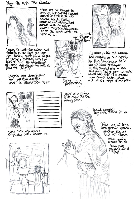
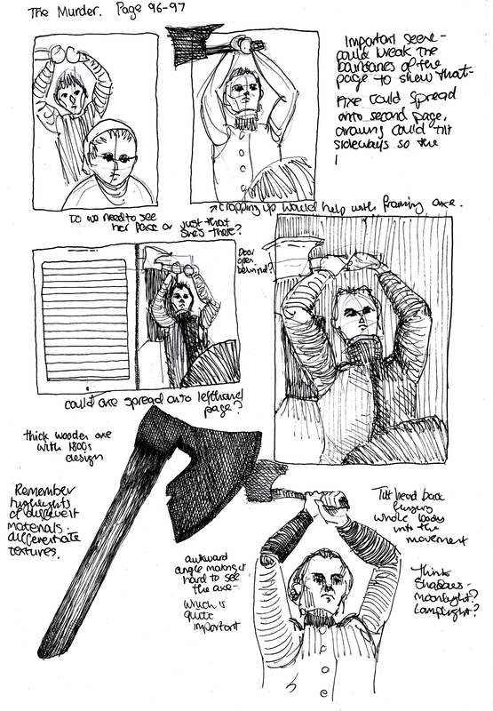
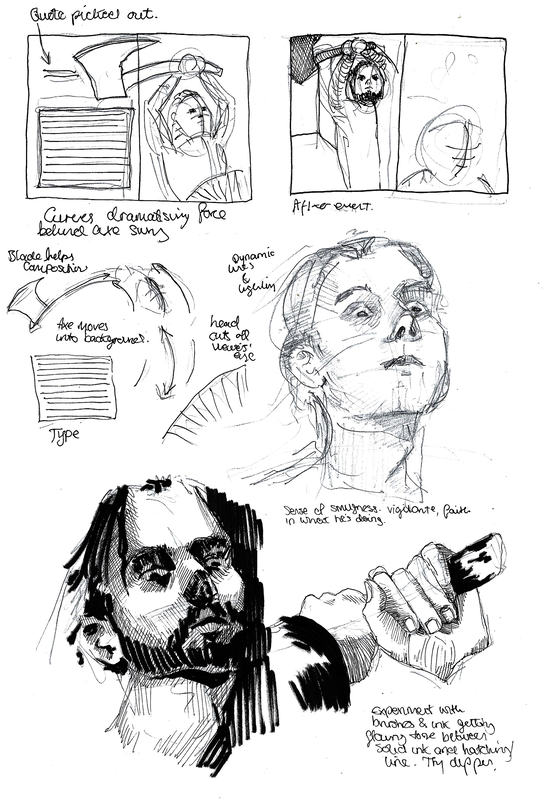
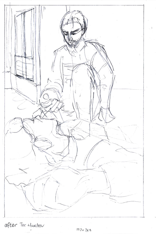
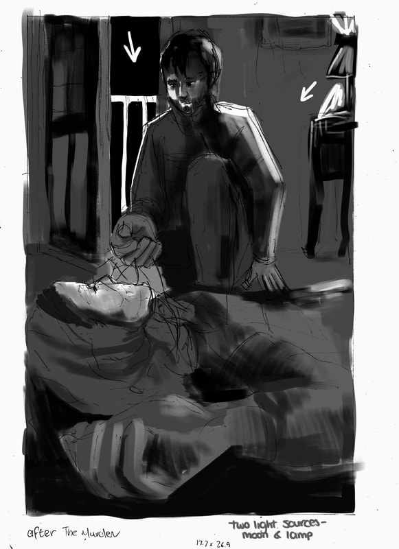
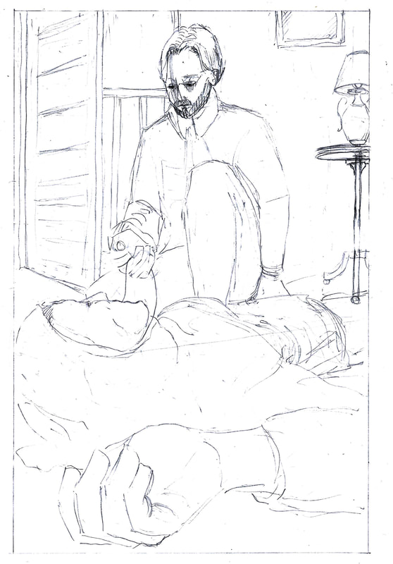
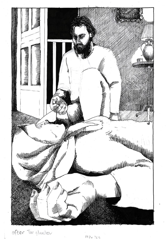
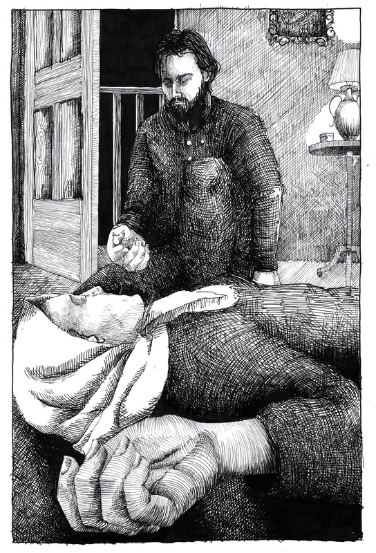
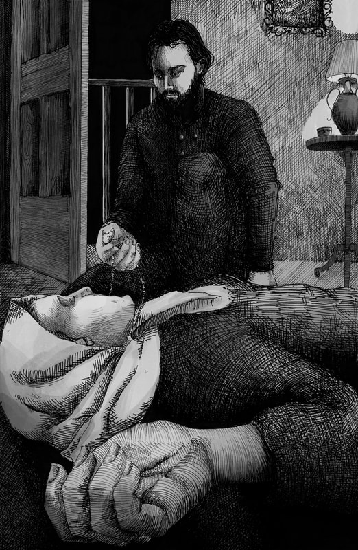
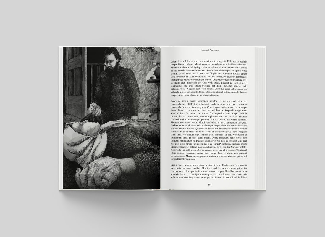
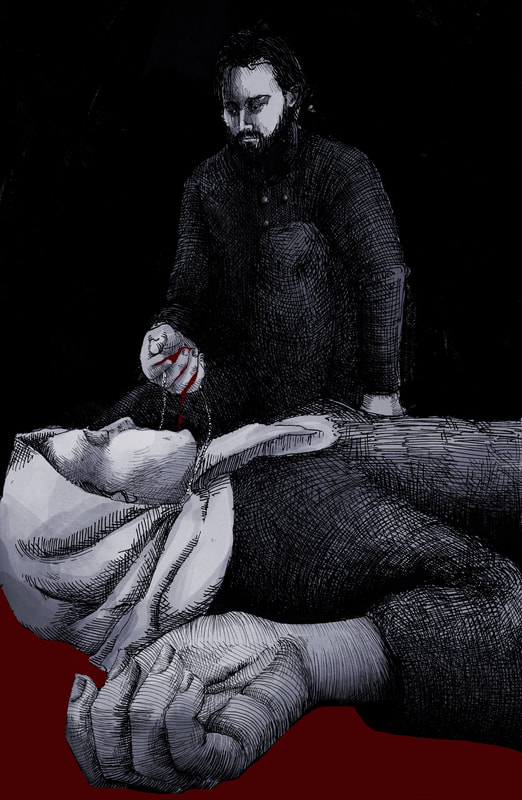
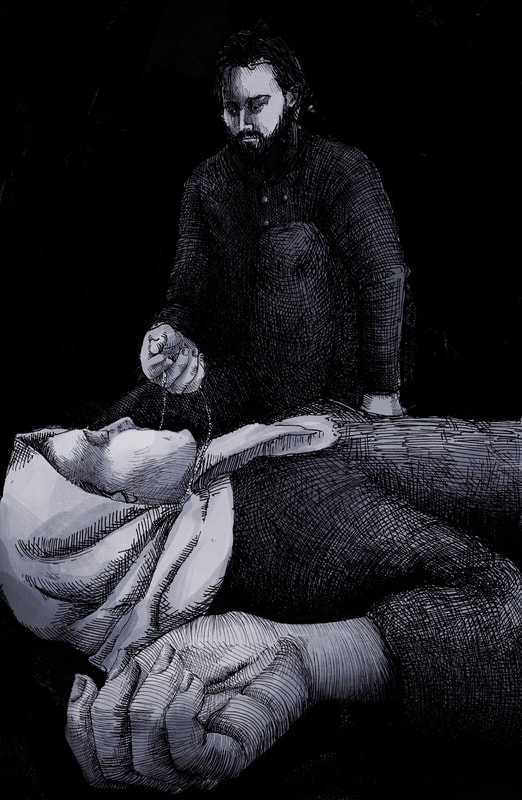
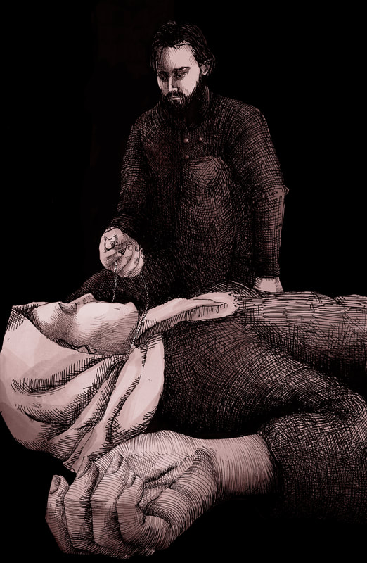
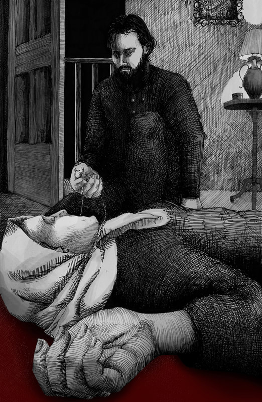
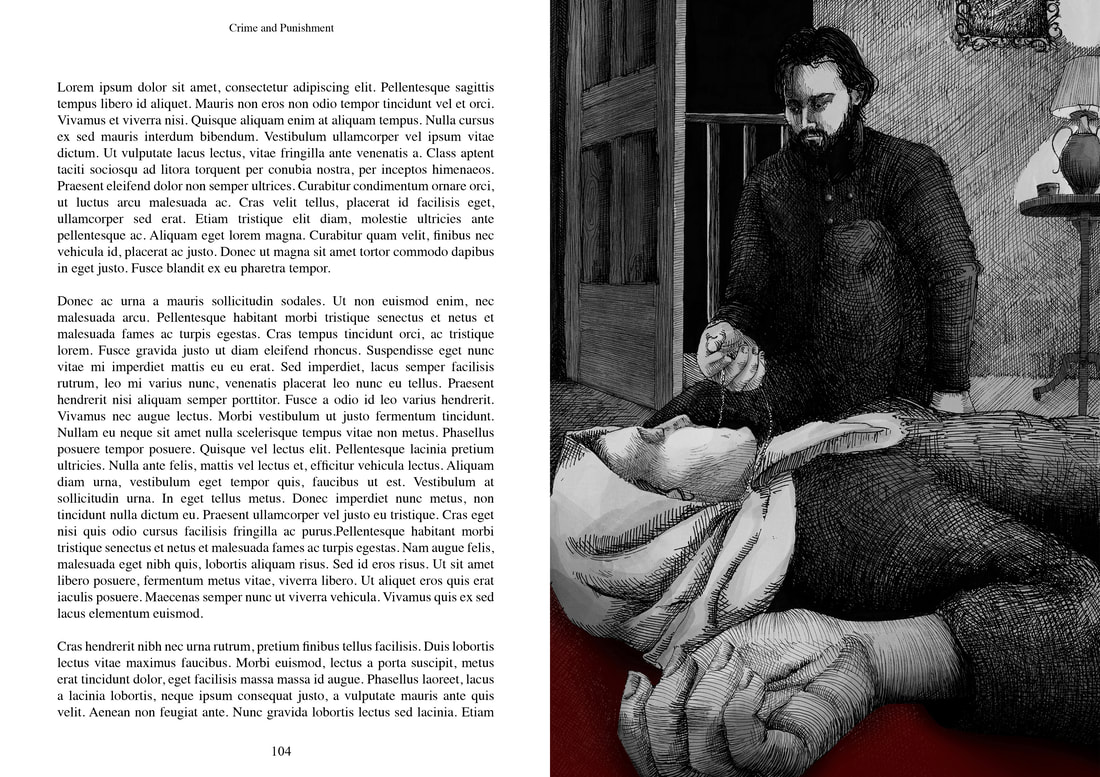
Page 96-97. The Murder
Excerpt

Unconvinced by my ideas thus far for the moment of the murder, I'm trying a relatively new idea to show the moment after the murder as Raskolnikov is looting the old woman he's just killed.
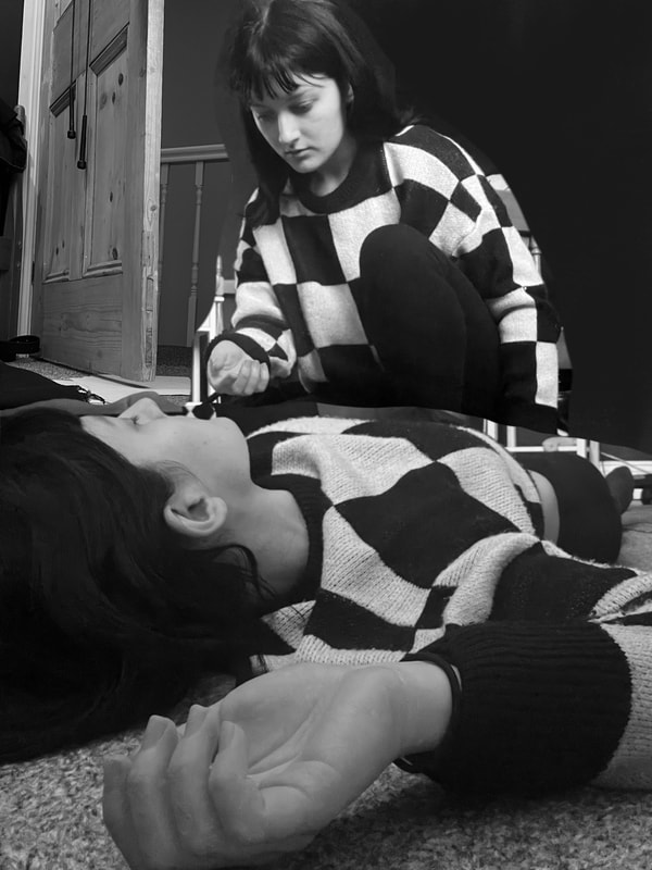
Raskolnikov's 'necklace holding hand' needs to be closer to the body if it's going to be believable that she's still wearing the necklace.
|
|
|
|
Raskolnikov too upright, perspective not quite right. Face rotate a little bit, door down.
|
Add hatchet in the background as if he's just dropped it?
|
|
|
Finished Drawing with Digital Shading
Alternative Mock-up Versions
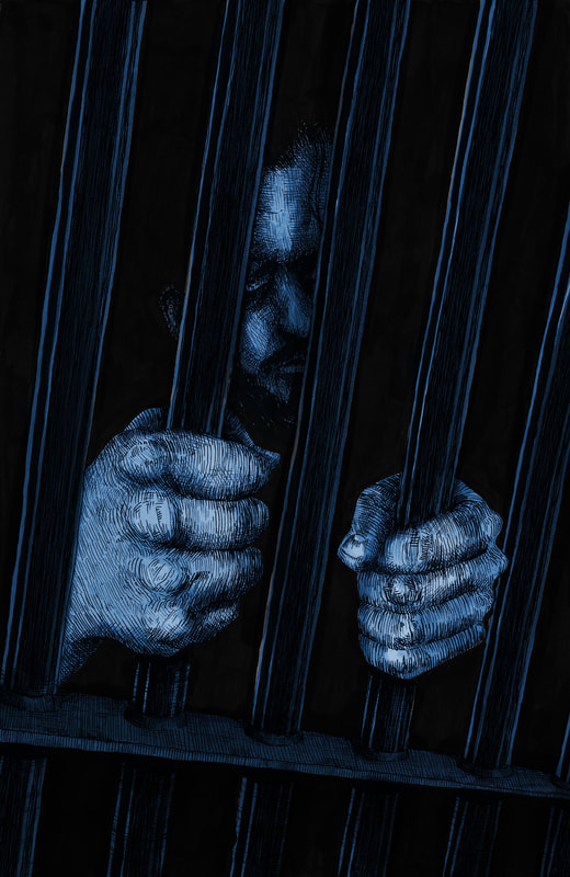
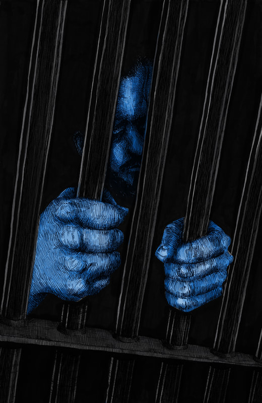
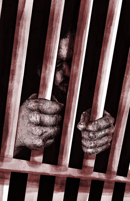
Experiments

|

|
|
|

|
|
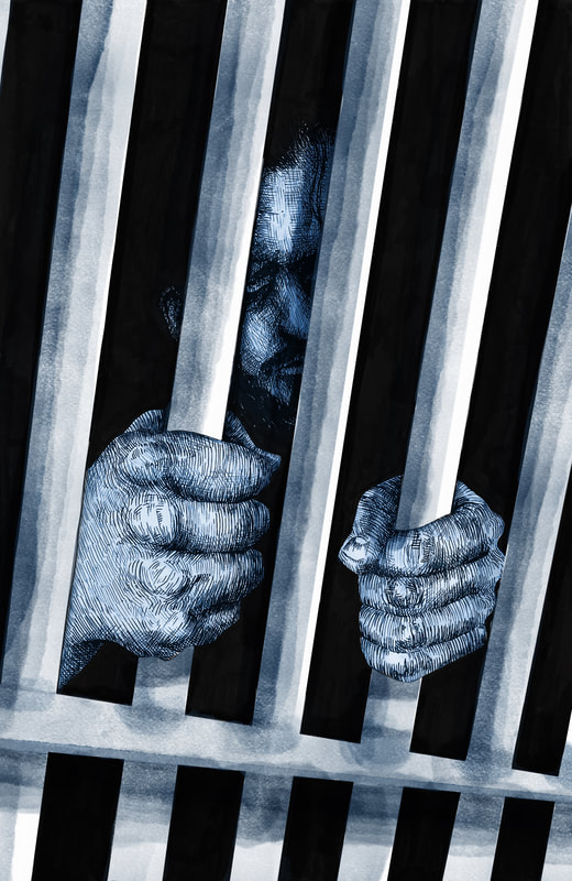
Final Version
With Type
Mock-up
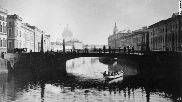
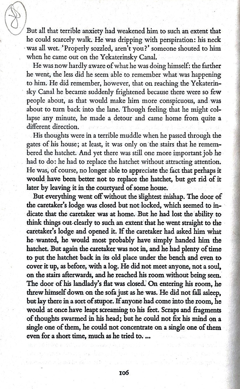
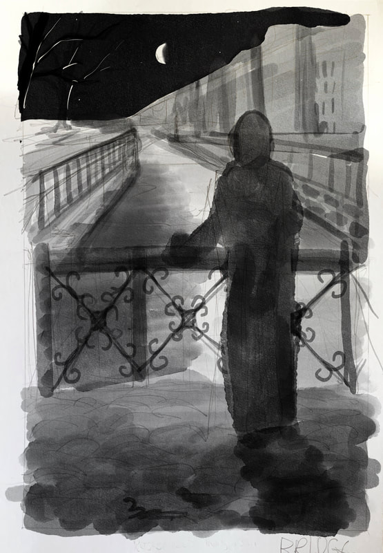
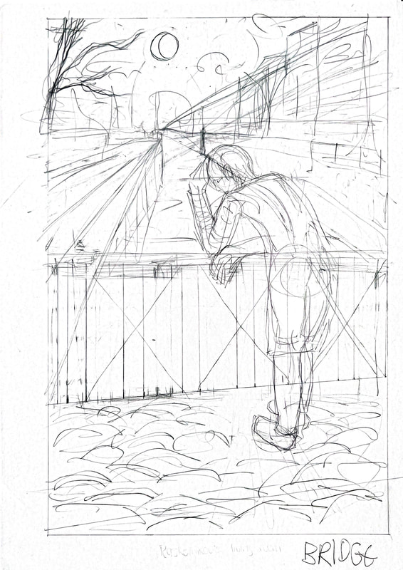
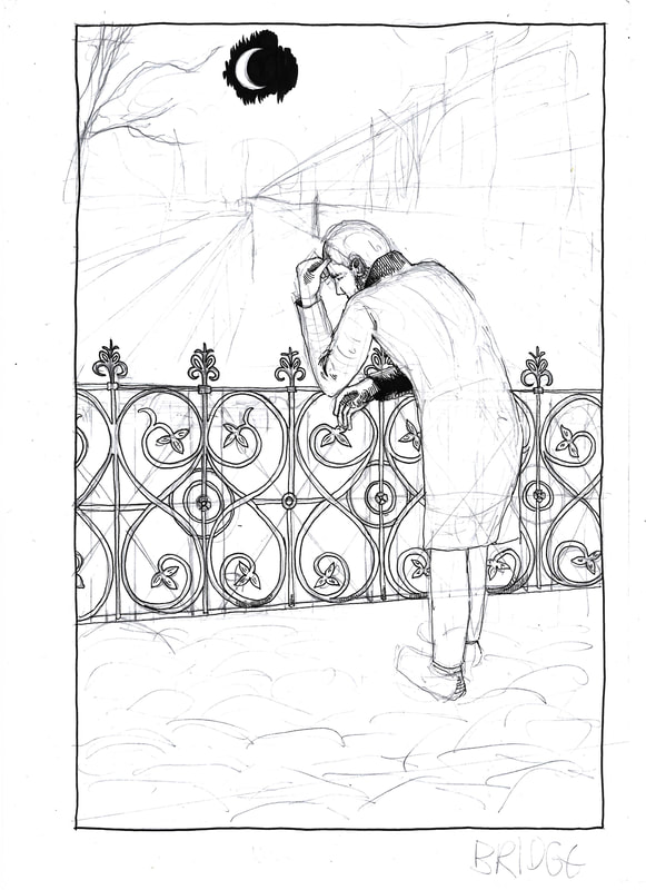
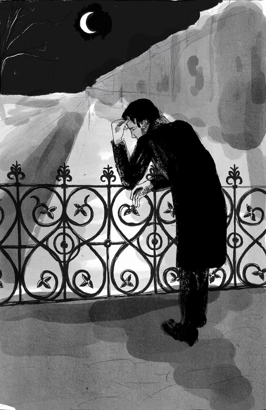
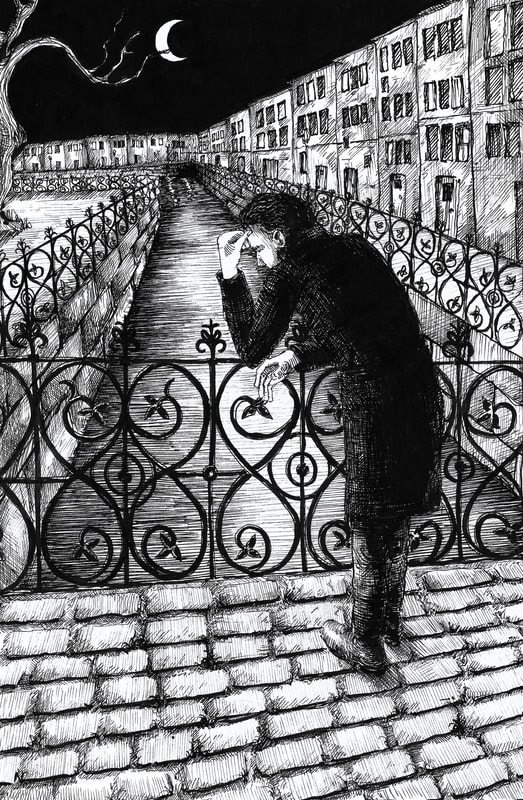
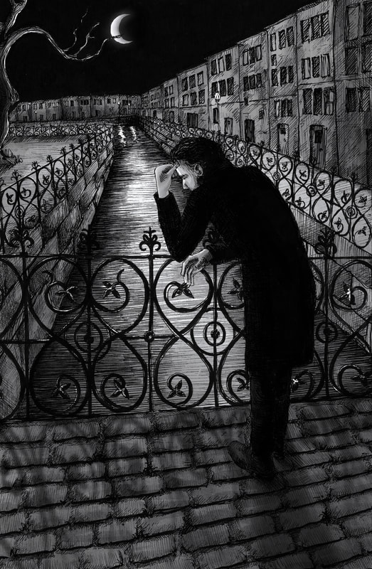
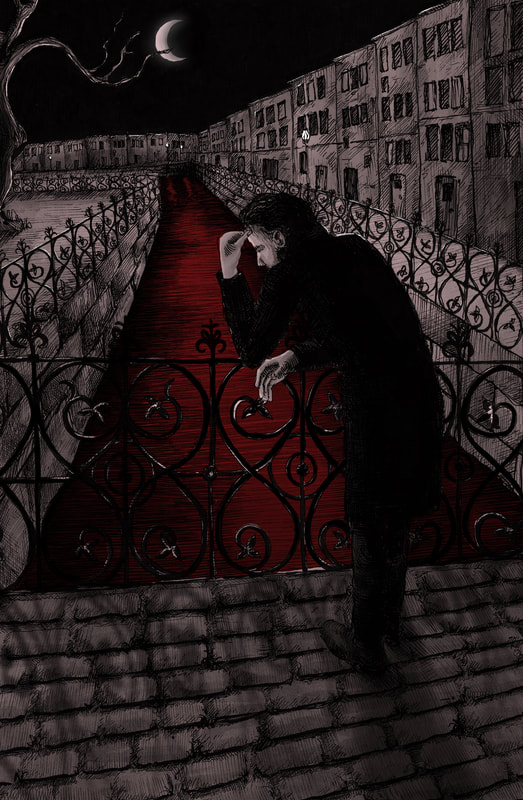
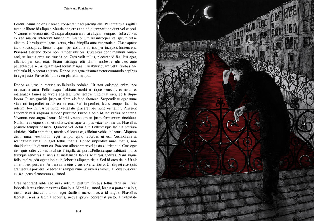
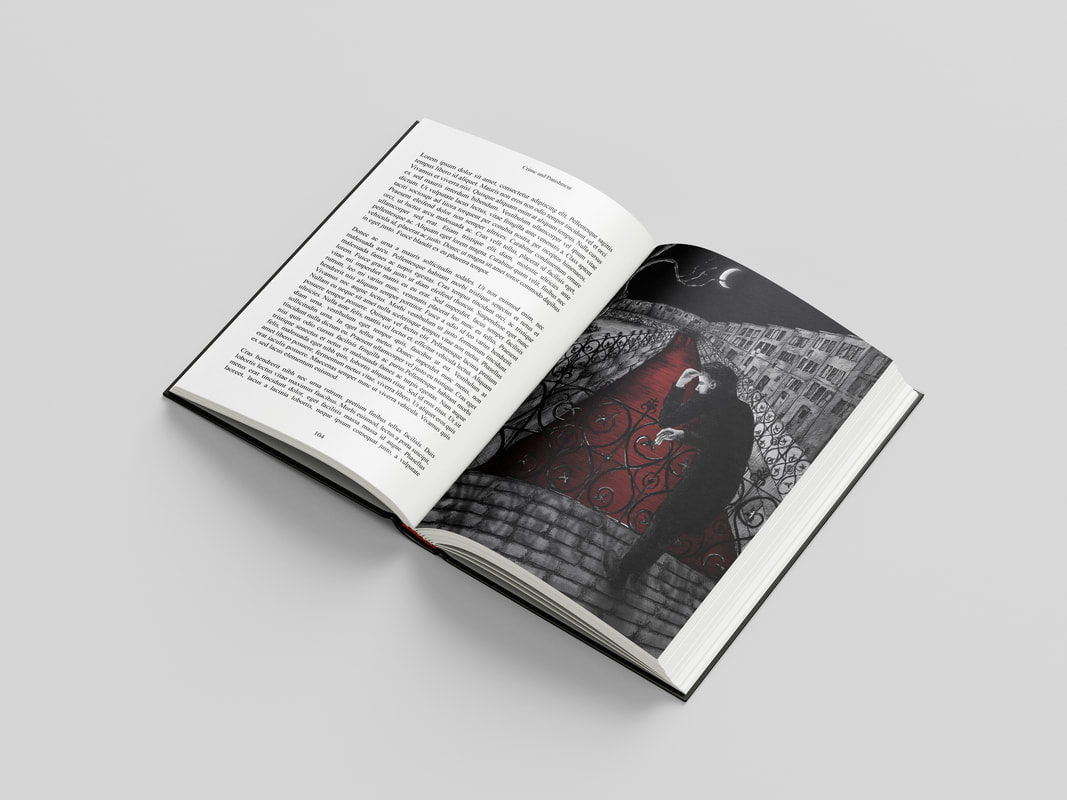
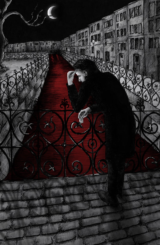
Page 106 - Yekaterinsky Canal
References and Excerpt
|
|
        |
|


Development
|
|
|
|
|
|
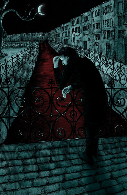
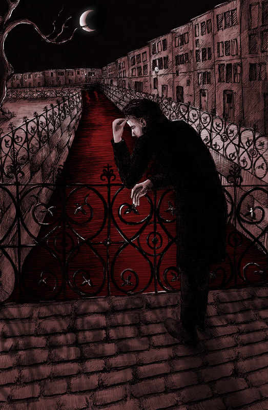
Colour Versions
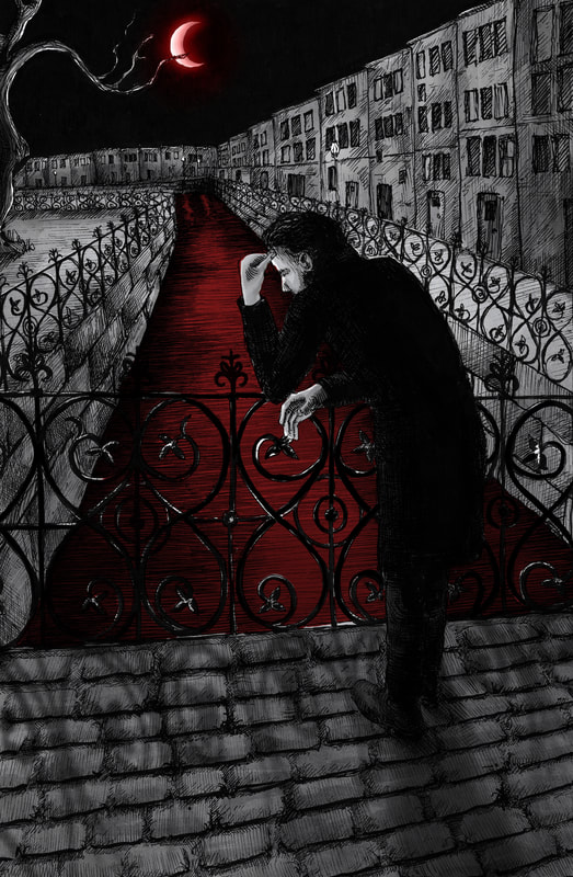
Final Version

With Type
Mock-up
All Final Illustrations
All Final Mock-ups

REFLECTION
I'm happy with my outcomes for this project, I think there's been a marked improvement in my drawing quality, and in my ability to turn my paper drawings into finished illustrations. I focused on my line quality and tone, took my time and carefully built up form and light. The colour palette feels punchy and bold, but still stays in line with my style and my preferences. I took lots of inspiration from Gustave Doré and I think it shows in my final illustrations, which look much more like etchings/woodcuts than my previous drawings, though they still have a hand-drawn feel.
I think the project would have been improved by a few vignettes to mix up the drawing quality/media.
I think the project would have been improved by a few vignettes to mix up the drawing quality/media.