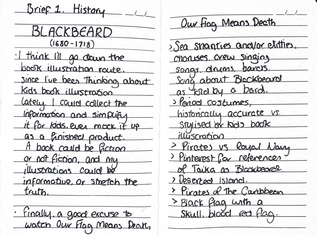
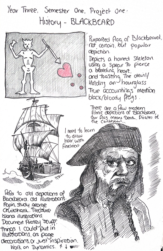
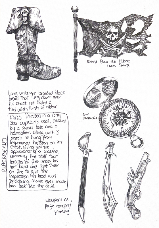
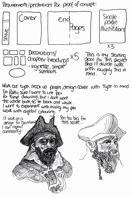
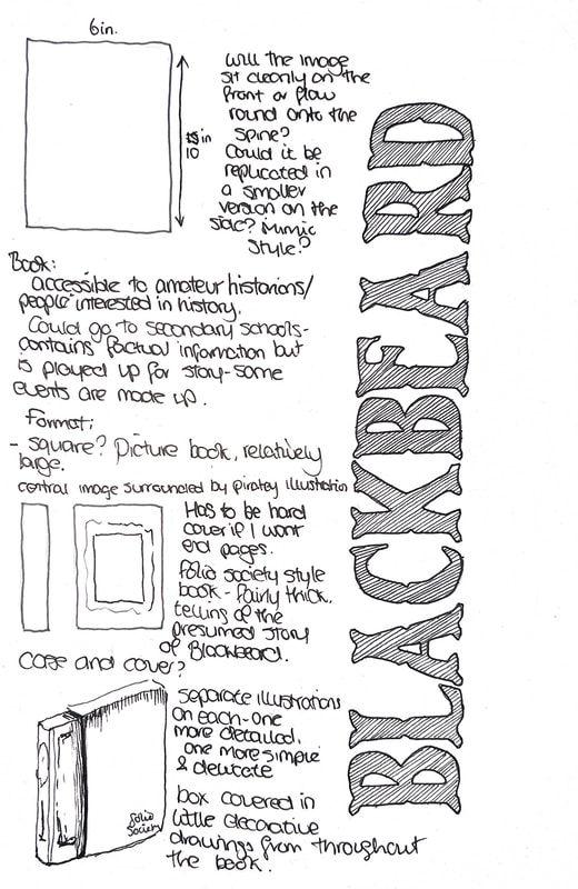
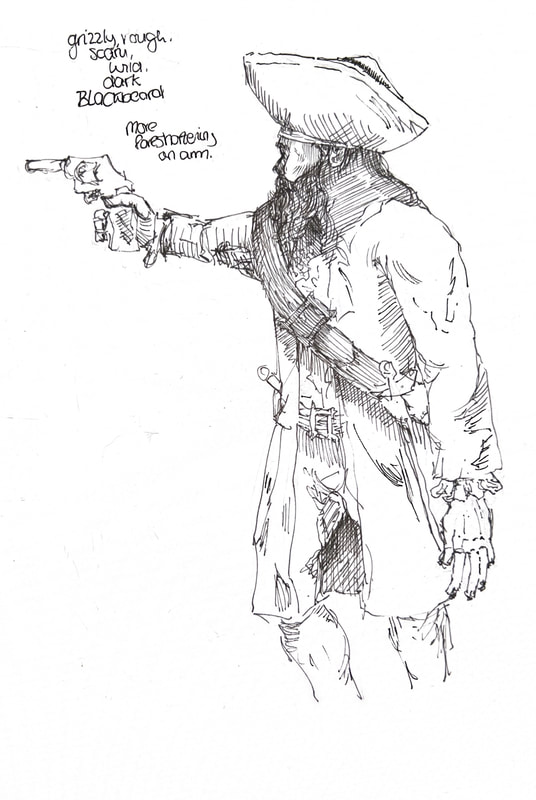
Initial Research
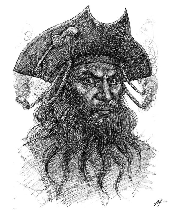
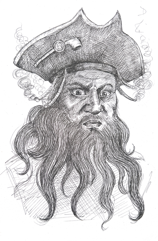
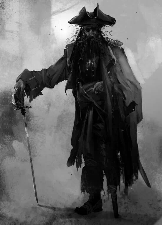
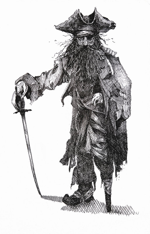
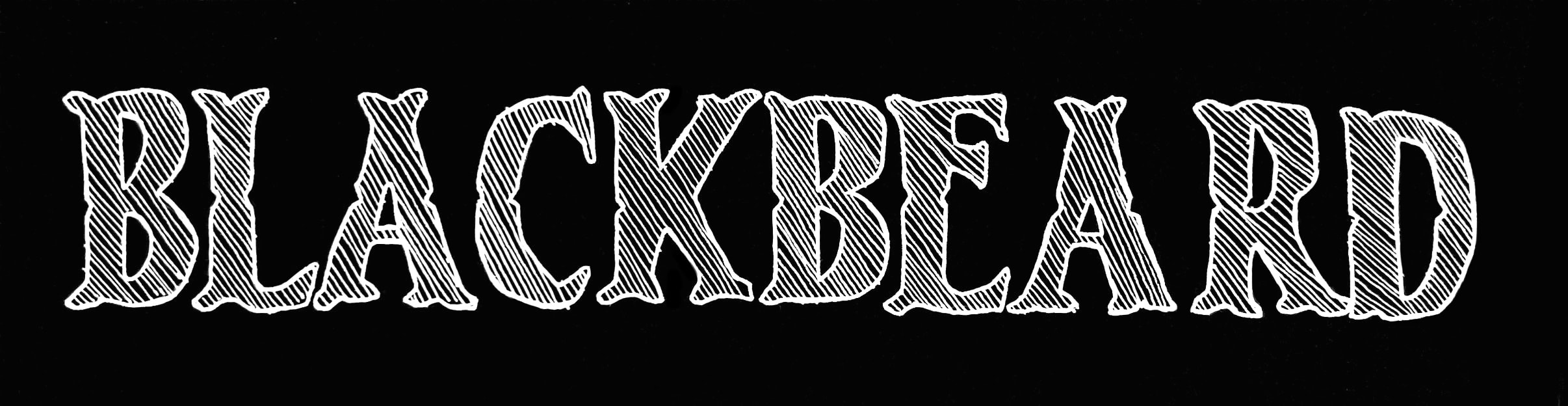
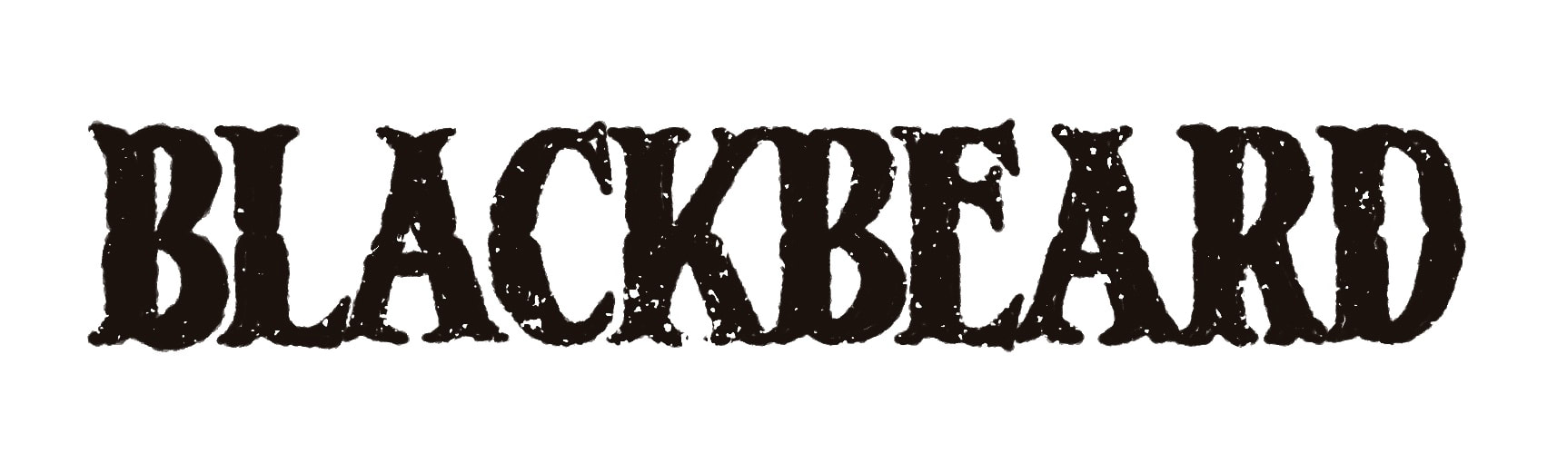
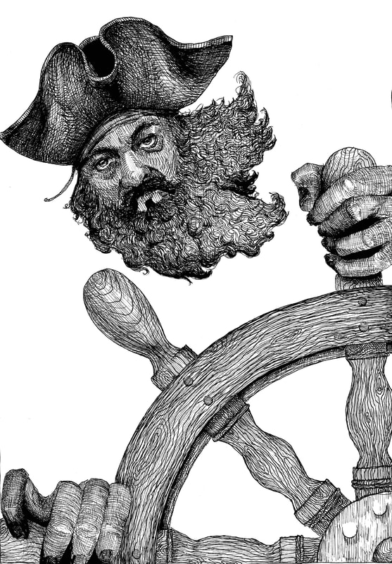
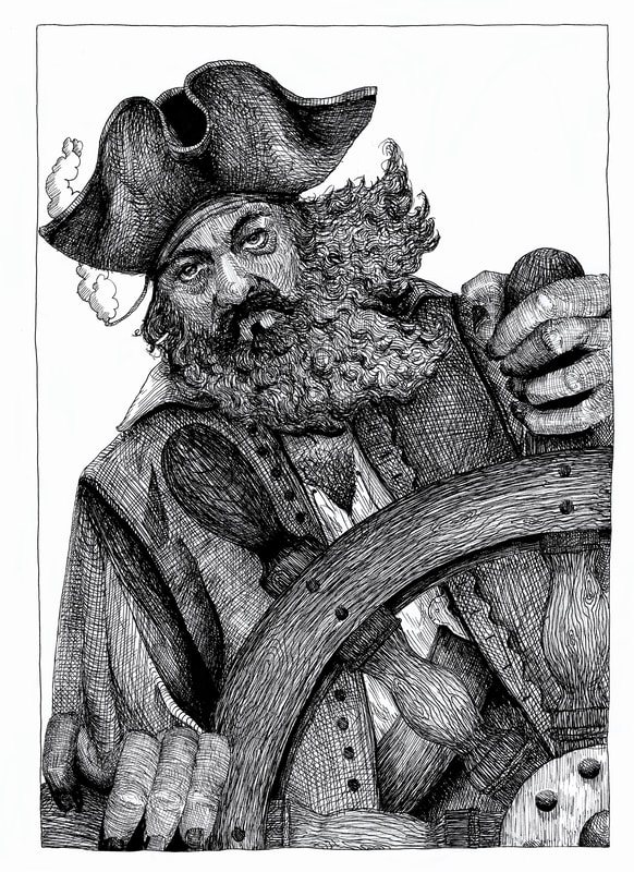
These illustrations of Blackbeard vary in time period, the first being from as early as 1724, the second more contemporary, the third from 1895. I think these media work well for portraying Blackbeard. It appears timely, is associated with older eras/history. I think the second is a print, which I don't have much experience with, but I do enjoy drawing with dip pen/fine liners. These could be options for my illustrations.
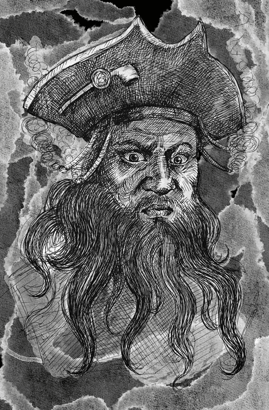
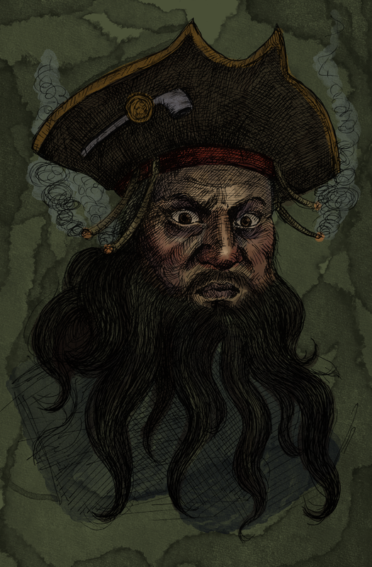
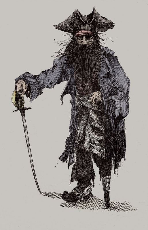
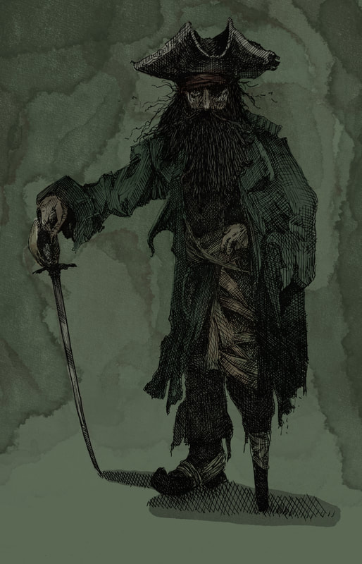
I could combine digital with pen if I want to add colouring, take my penwork into procreate, change the colour of the lines, or mask it and use it as a guide for colour.
I could combine digital with pen if I want to add colouring, take my penwork into procreate, change the colour of the lines, or mask it and use it as a guide for colour.
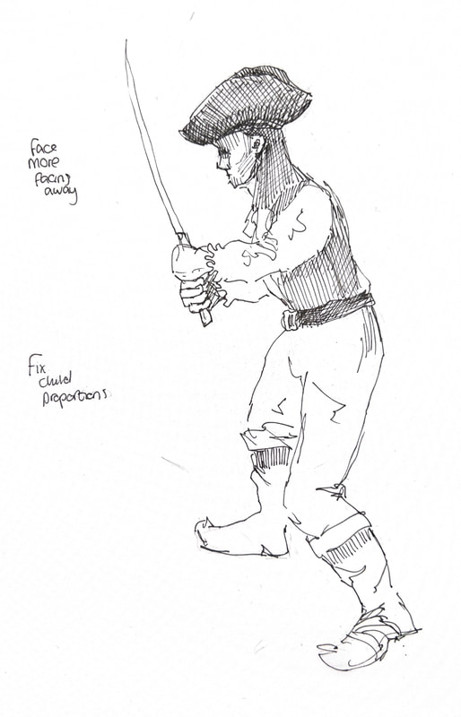
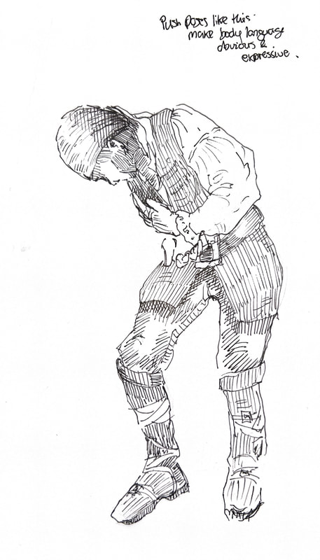
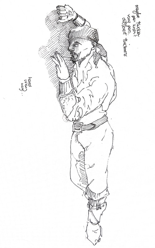
First Sketches/Idea Generation (now scrapped)
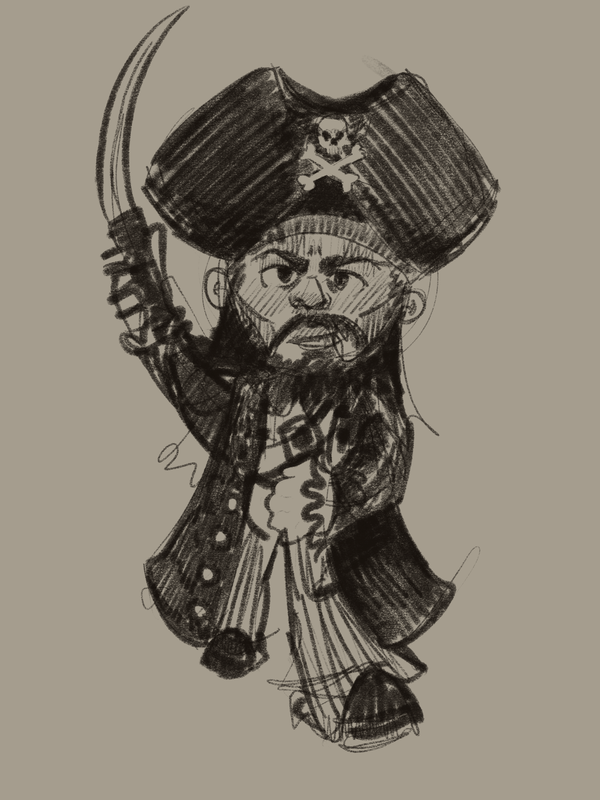
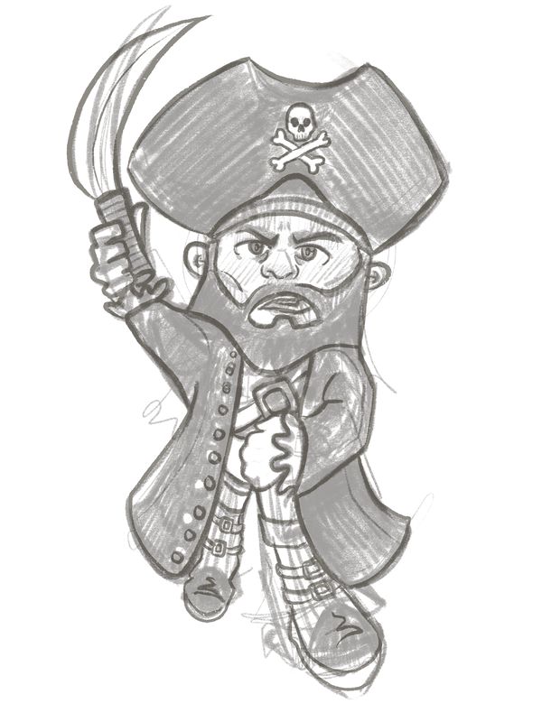
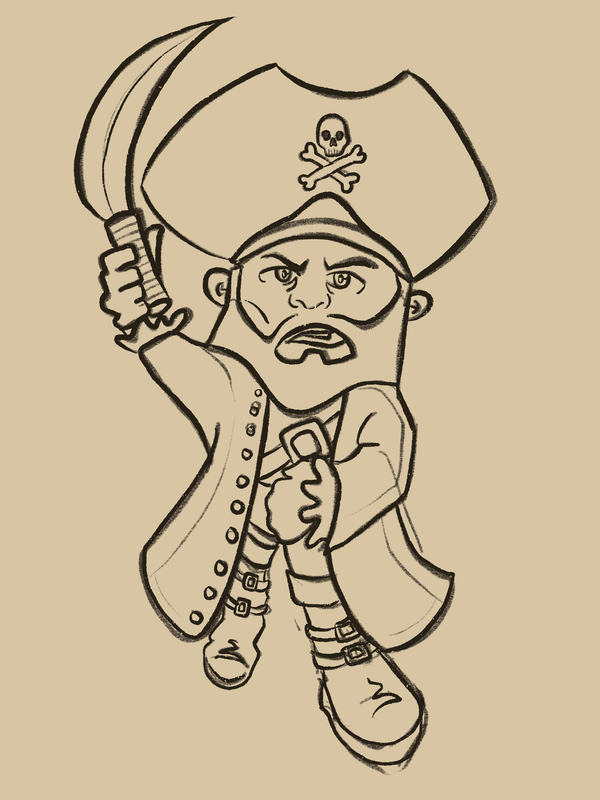
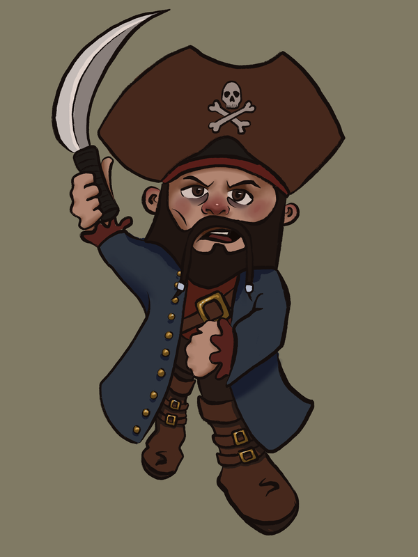
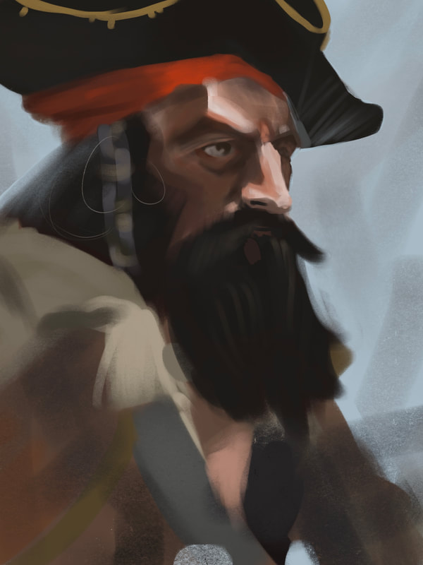
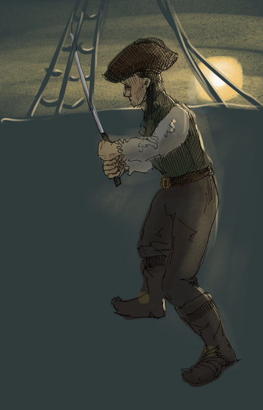
Cartoony Piratey warm-up.
These took around 1hr 30, mostly from my head using things I'd learned from my initial research. I still haven't found a nice balance between hard and soft edge shading, between colour and line art, and between brush quality and fill quality. I think my anatomy has seen a big improvement through my life drawing practice, I can block out a sketch much faster now. The sketch in the first image took 10 minutes.
These took around 1hr 30, mostly from my head using things I'd learned from my initial research. I still haven't found a nice balance between hard and soft edge shading, between colour and line art, and between brush quality and fill quality. I think my anatomy has seen a big improvement through my life drawing practice, I can block out a sketch much faster now. The sketch in the first image took 10 minutes.
|
|
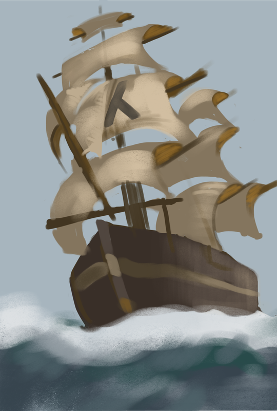
Quick colour/shape digital studies.
I concentrated on shape, form, blocking in colours to build forms with simple shapes, and trying to match the colours to the references. These almost take the form of concept art with their rough sketchy blurry edges, but with the important features defined. This may be a good way for me to plan out illustrations, getting in the big shapes and colours with the convenience of digital art.
I concentrated on shape, form, blocking in colours to build forms with simple shapes, and trying to match the colours to the references. These almost take the form of concept art with their rough sketchy blurry edges, but with the important features defined. This may be a good way for me to plan out illustrations, getting in the big shapes and colours with the convenience of digital art.
Moving into sketchbook |
First sketchbook ideas - I'm making more of an effort to draw in pen in my sketchbooks. I have to be more confident with my lines, it gives me a chance to practice pen work, and I can potentially transfer my drawings to projects, meaning I'm giving myself less work to redo.
Artist copy
Copy of a drawing I found on Pinterest - I focused on line quality, and how shapes are formed with line. I then tried to take it into procreate and add colour, but I'm not happy with it so far. I feel like my colours rarely look right and the hatching muddies the colours.
Seeing my drawing side by side with the original helps me see that my anatomy is off, it definitely looks as if I've tried to draw in a more cartoony style. This may be okay if that's intentional, but if I'm going for a more serious atmosphere, I need to be more accurate with my anatomy.
Seeing my drawing side by side with the original helps me see that my anatomy is off, it definitely looks as if I've tried to draw in a more cartoony style. This may be okay if that's intentional, but if I'm going for a more serious atmosphere, I need to be more accurate with my anatomy.
Artist copy/style test
Another copy of an artwork I found on Pinterest, this time in a different style. I tried to apply some of what I learned during my previous copy on this one, and it does feel like an improvement. While this does look a little bit cartoony, it also feels gnarly and serious, the lines feel like a more comfortable thickness.
Whenever I'm working I feel like my colours are correct, they aren't too bright but they are effective and stand out. But when I get them onto here, the colours look very dark, washed out, don't stand out from each other.
Whenever I'm working I feel like my colours are correct, they aren't too bright but they are effective and stand out. But when I get them onto here, the colours look very dark, washed out, don't stand out from each other.
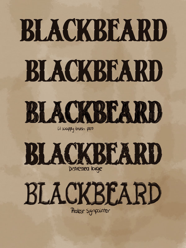
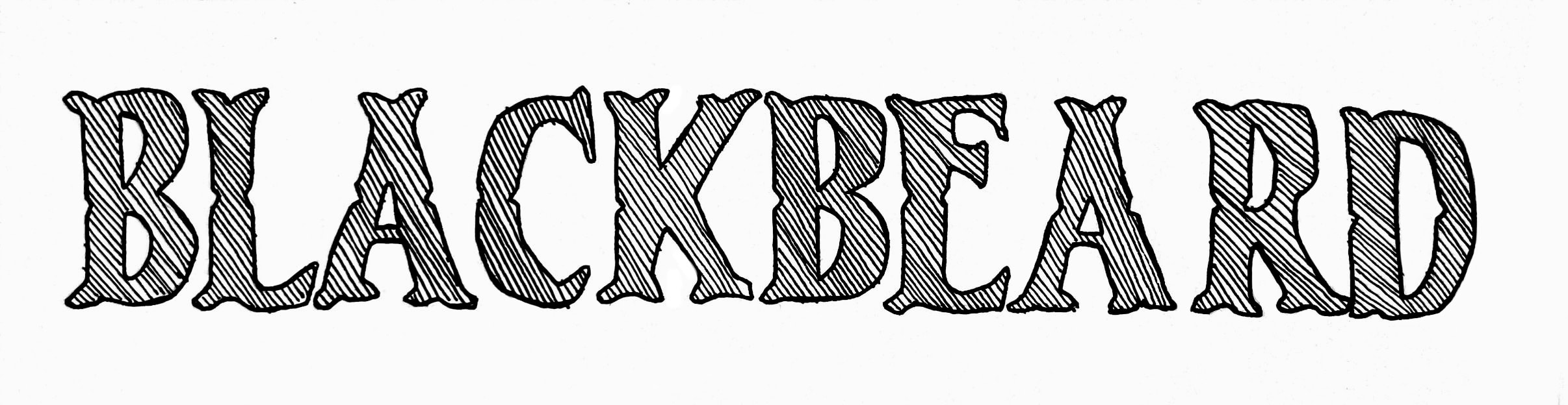
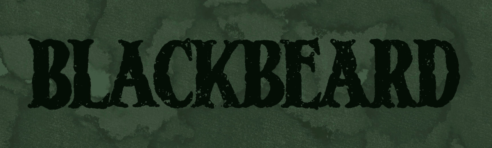
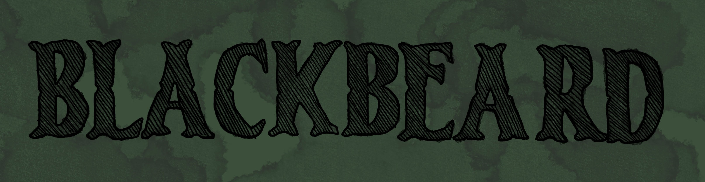
First look at type
|
|
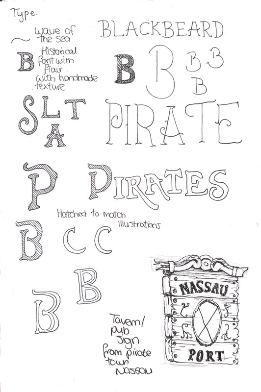
Type work. I used the font Chervels, I took it into procreate and drew over the top of it to add texture. The large distressed brush version is my favourite, it looks graphic and textured and like it was drawn by hand, but also is polished. I wanted to try the hatched one so it could match the drawings, but it feels a bit bland so far. I also think this will blend in too much with the background - it gives me far fewer options for cover design, and if I have more of a contrasting title, it'll stand out against the illustrations.
First attempt drawing a ship/clouds
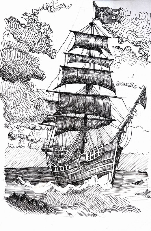
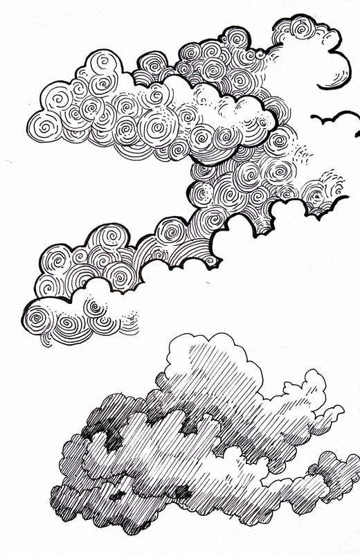
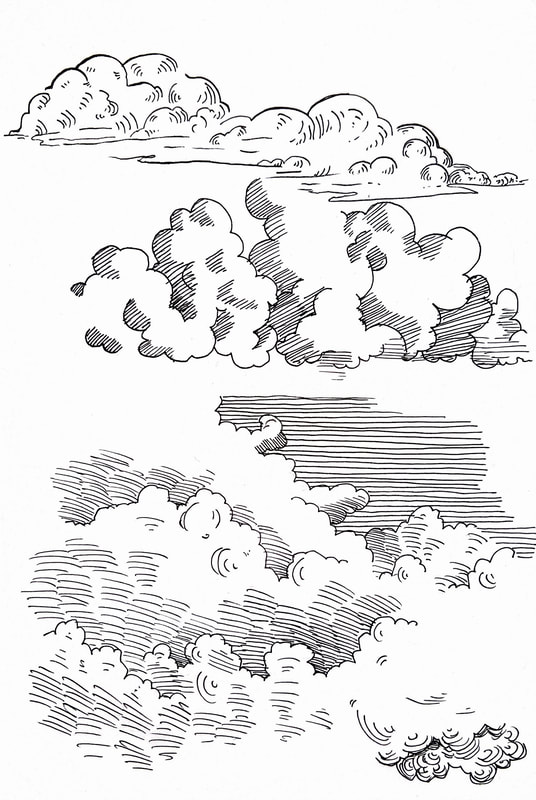
After drawing this ship I remembered my problem from second year where I couldn't draw clouds with hatching, and they looked messy or sharp. I decided to go and practice, and find examples of how other people do it.
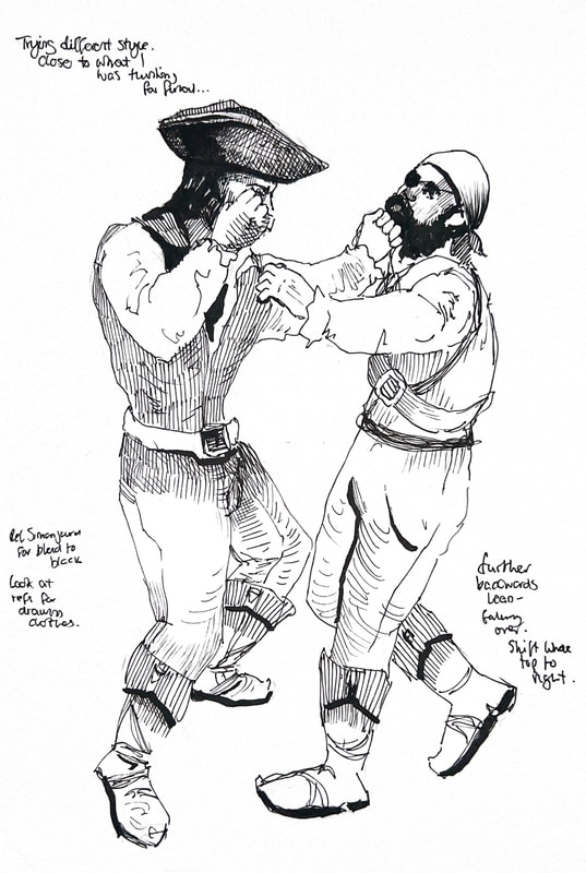
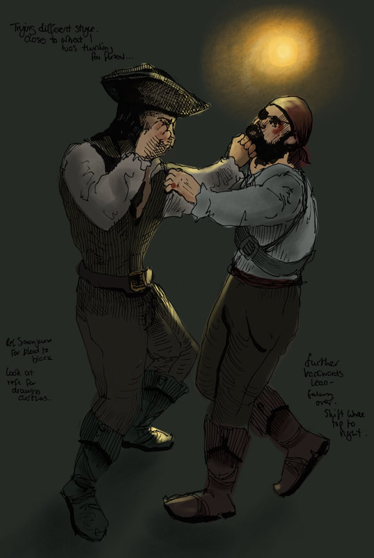
Inspiration
I found these on Instagram, @simonjcurd, and I absolutely love them. This is the kind of thing I want to be able to make, and I think my biggest weaknesses stopping me from getting there are perspective and colour, and clean pen shading. I'm using this project as an opportunity to move myself closer to this.
With how he's done it, some of the lighting and glows are over the lines. I hadn't even thought about doing that, as I always keep my colour and linework separate. If I try to add a highlight or a glow but it's under the linework, it will probably look muddy, which is the issue I've been having.
With how he's done it, some of the lighting and glows are over the lines. I hadn't even thought about doing that, as I always keep my colour and linework separate. If I try to add a highlight or a glow but it's under the linework, it will probably look muddy, which is the issue I've been having.
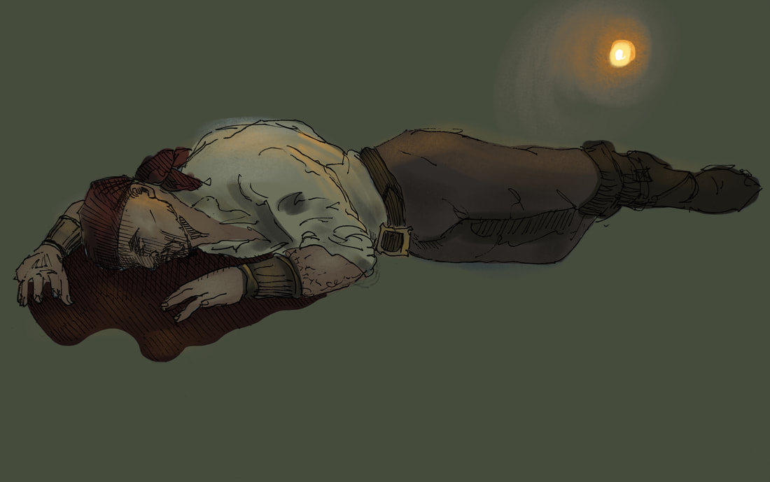
Artist copy
I saw this drawing in a tattoo shop, by @grindesigntattoo on IG, and I'm in awe of the creativity and line quality, so I tried to replicate it to learn from his linework. I did a rough digital colouring, as a concept of style. It captures an atmosphere I’d love to be able to get for my own drawings.
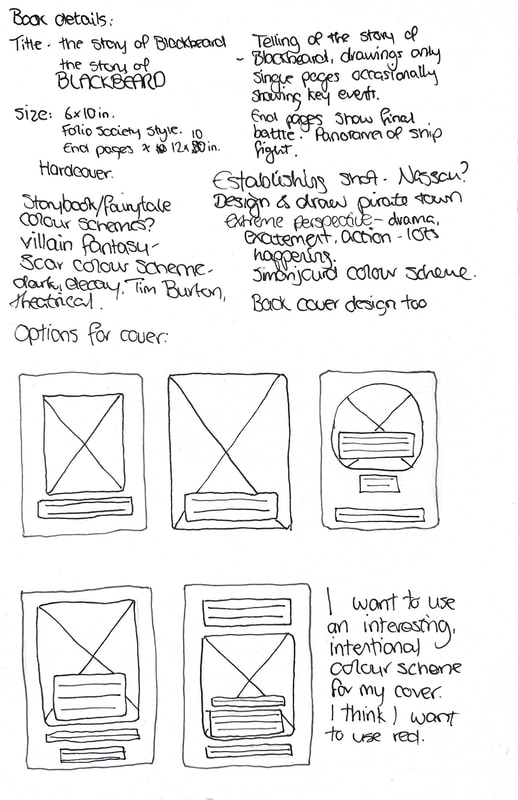
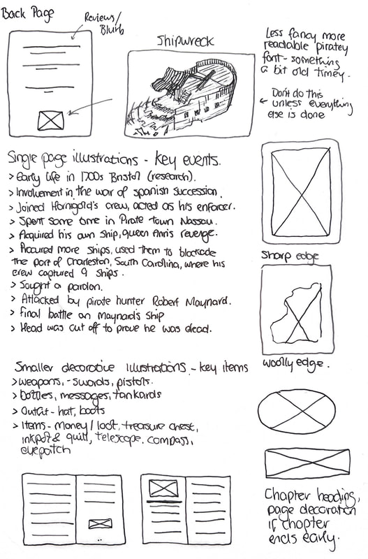
Working out format
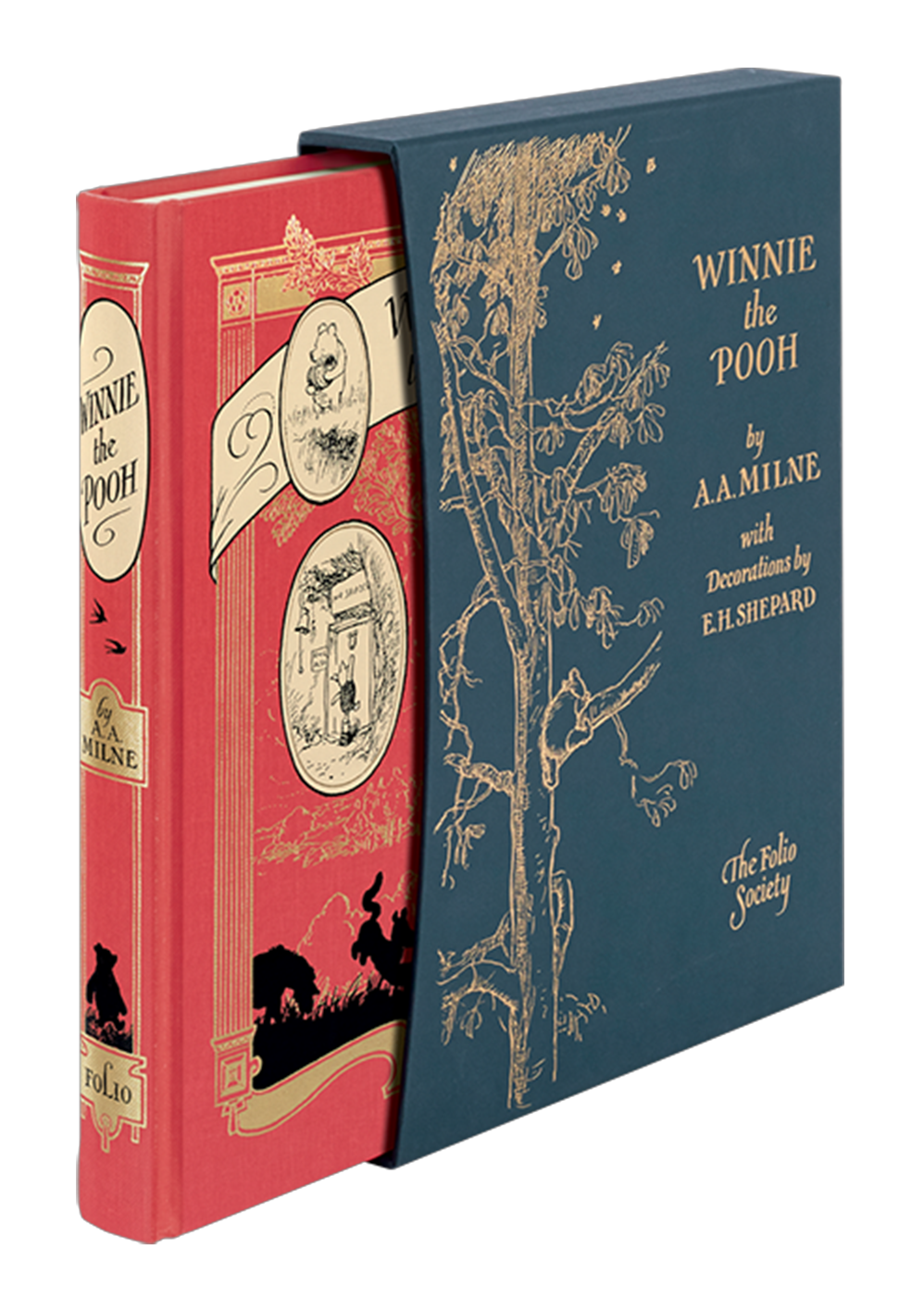
Existing hardcover books


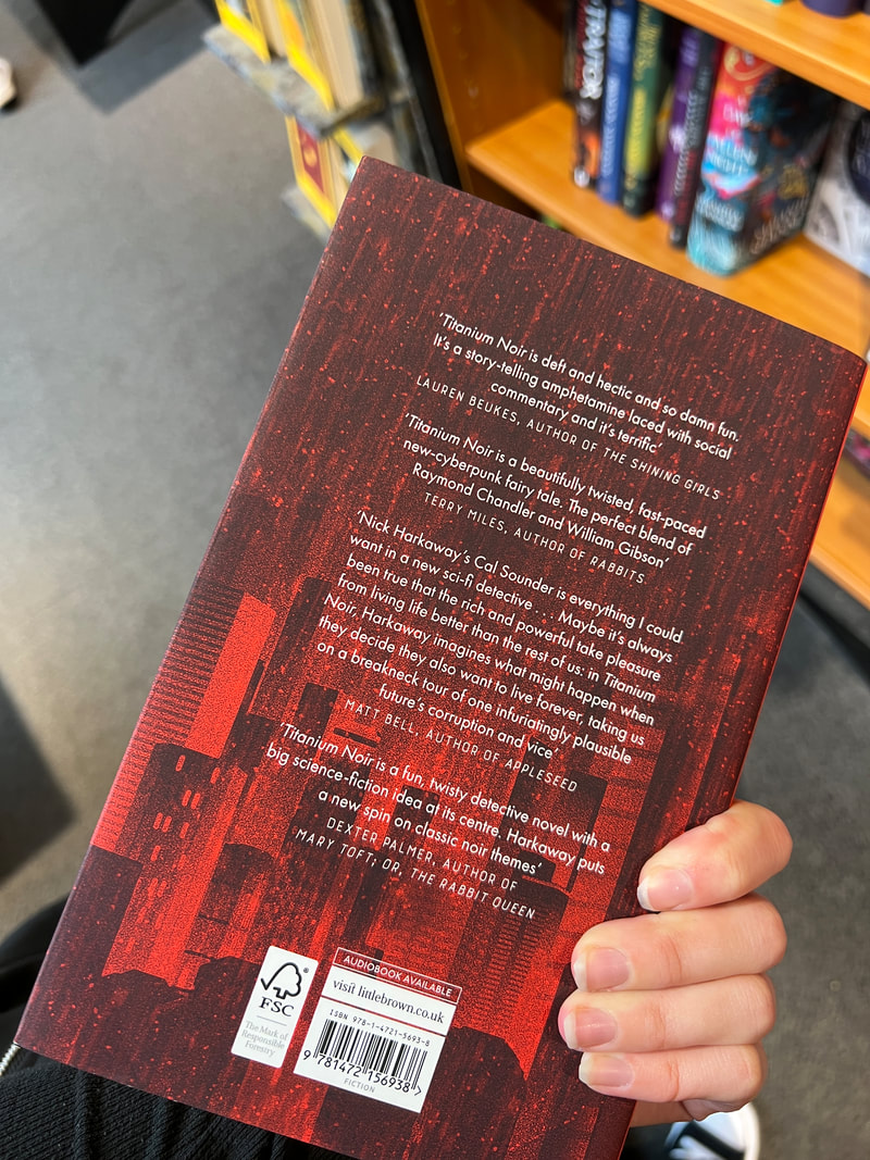
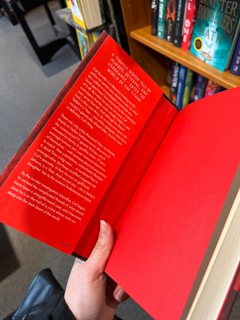
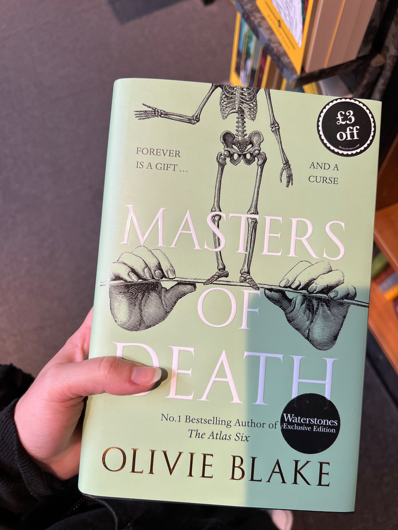
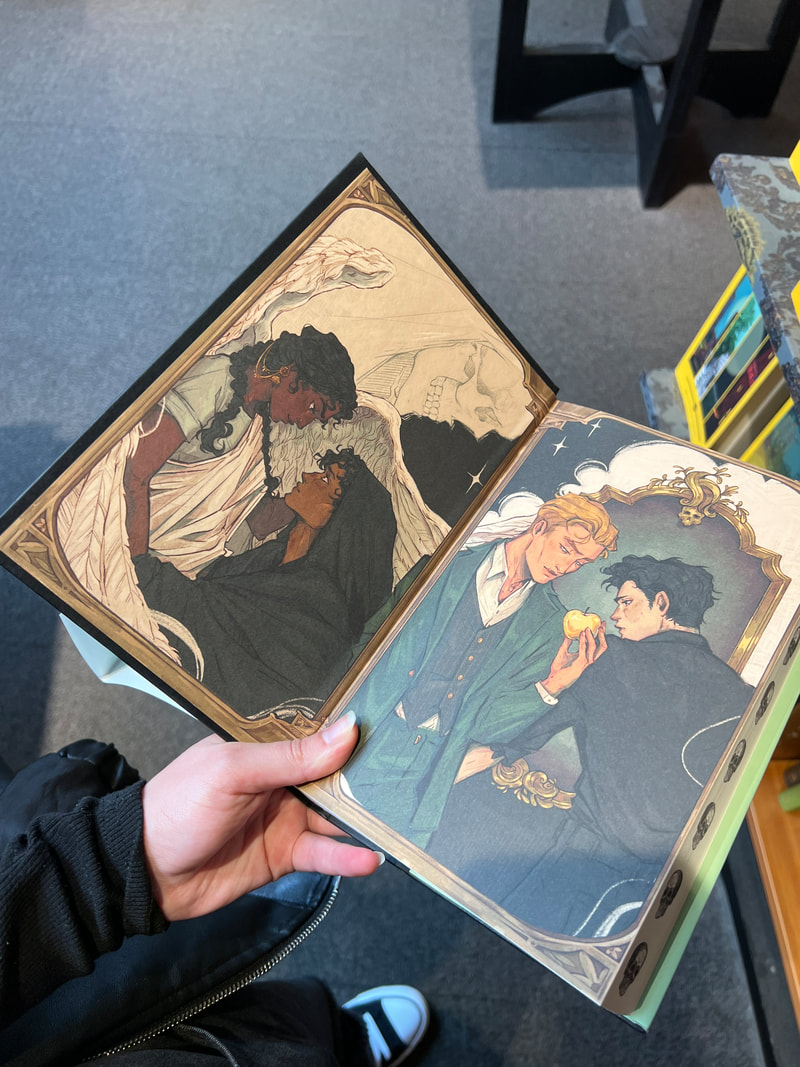
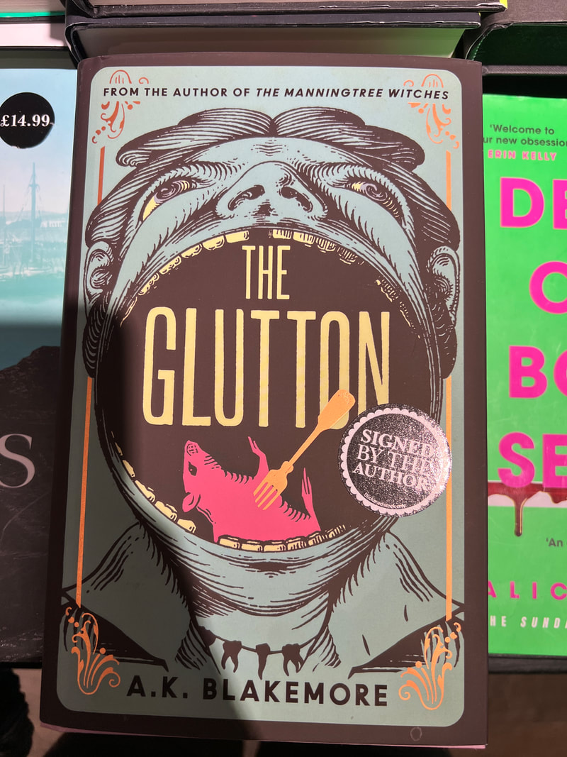
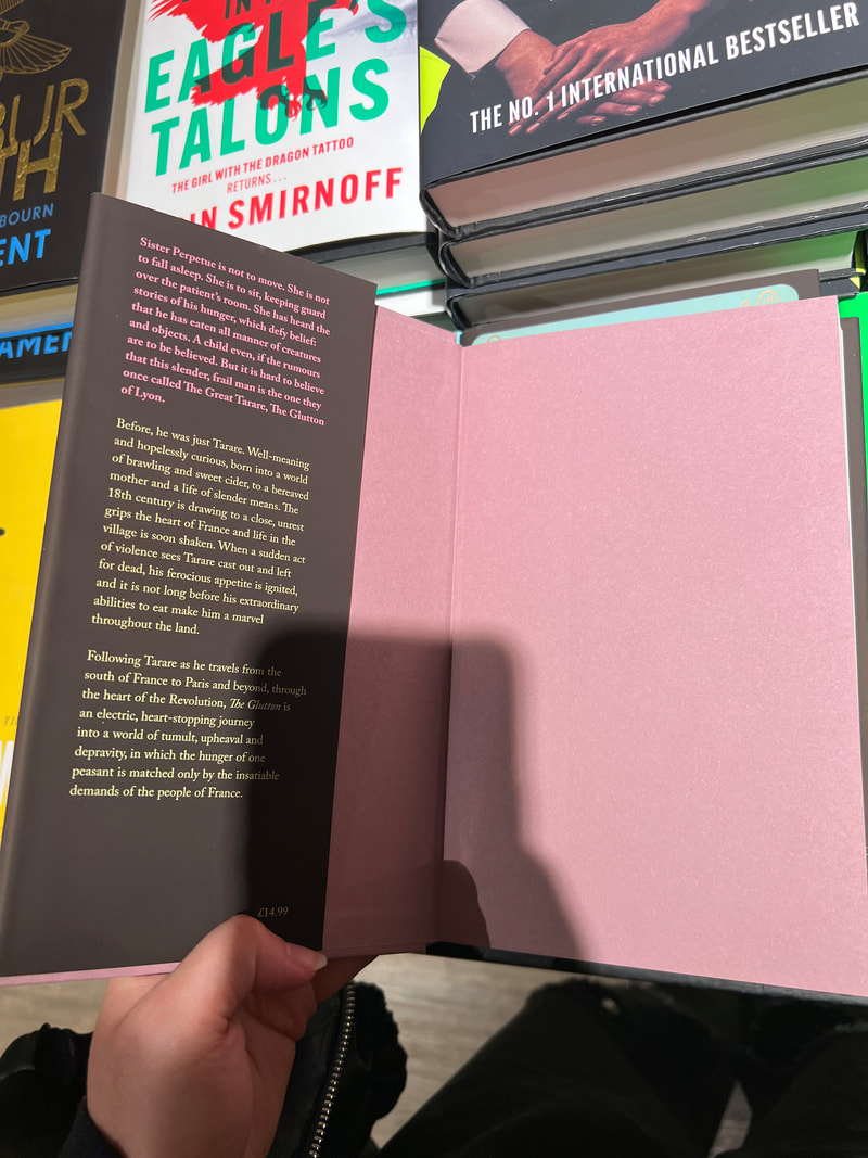
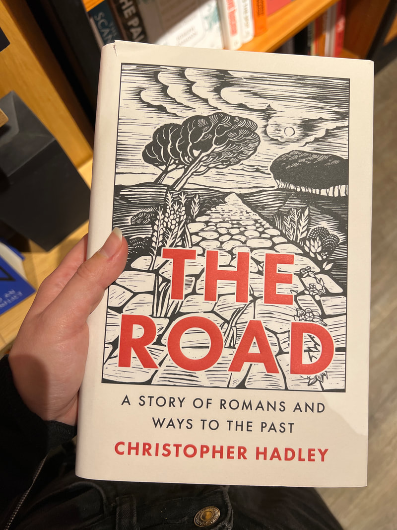
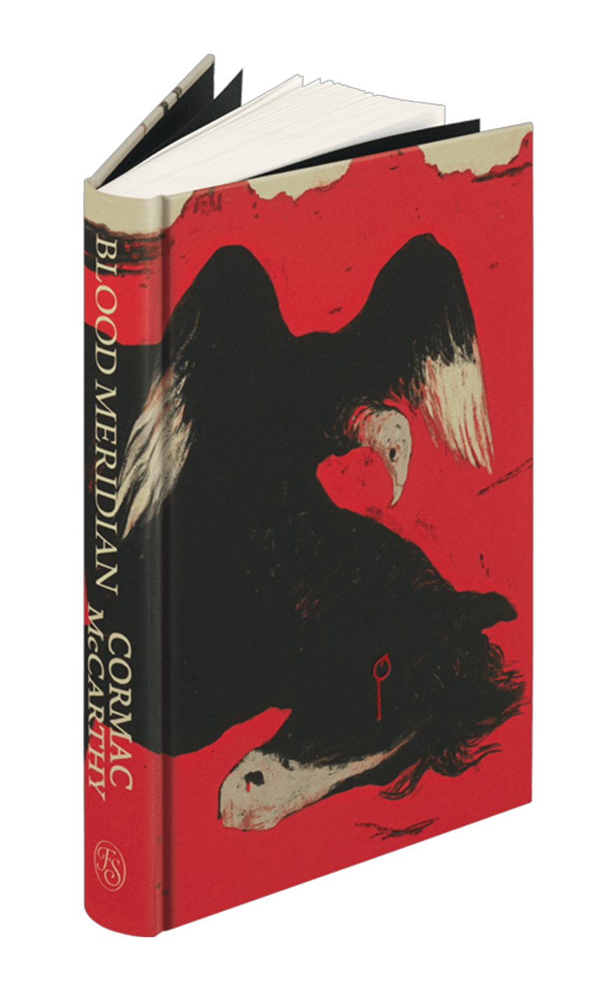
Existing hardcover books and their end pages. I especially like the covers where there’s a pen drawing that’s overlain with colour. I always go for a full drawing when I go to do a cover, but that’s not as common as I’d have thought. Even when they do take up the whole of the cover, they tend to merge round onto the spine. I also tend to force myself into a corner of realism, and think the cover has to make sense and be logically possible, but again that’s rarely the case. Lots of these covers use conceptual illustration.
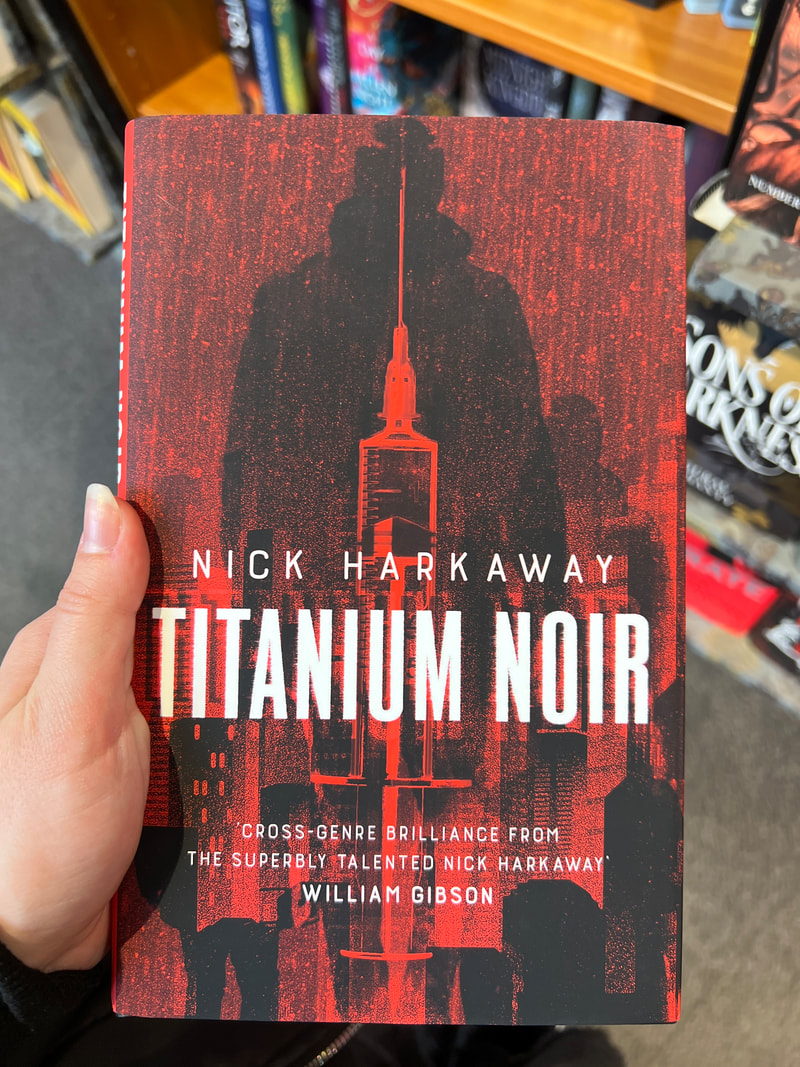
Going forward I’m going to think more about colour scheme. The Shadow Cabinet uses bright yellow for the title, and for the end pages. The illustration on the cover matches the line weight and colour of the text inside the dust jacket. I could even do my own dust jacket, even though that’s not standard for folio society books. I find it interesting that though the Titanium Noir cover illustration itself is quite vague and not very detailed, the dark themes of the book are apparent through the colour scheme, and even through the obscurity itself.
Going forward I’m going to think more about colour scheme. The Shadow Cabinet uses bright yellow for the title, and for the end pages. The illustration on the cover matches the line weight and colour of the text inside the dust jacket. I could even do my own dust jacket, even though that’s not standard for folio society books. I find it interesting that though the Titanium Noir cover illustration itself is quite vague and not very detailed, the dark themes of the book are apparent through the colour scheme, and even through the obscurity itself.
Format thumbnails
Page/layout planning.
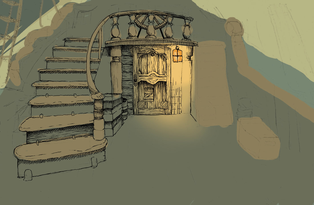
Ink test with digital colour
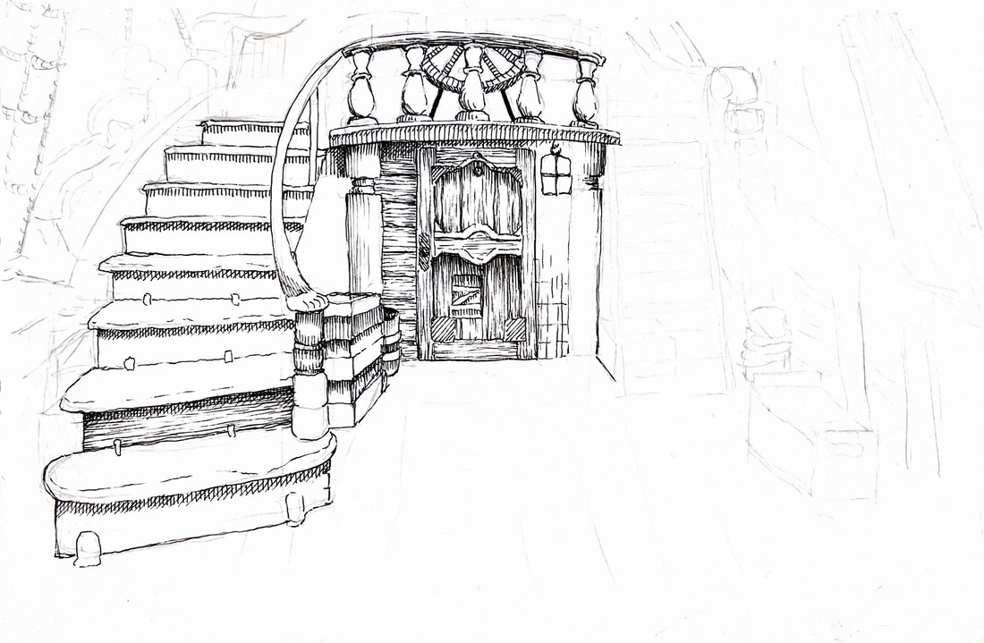
Fineliner drawing of a ship’s deck. I need to figure out how to draw wood more accurately. I also need to start drawing bigger so that I can fit more detail in and place everything more accurately. This was at A5.
Pinterest board
My Pinterest board for this project.
Initial thumbnails & Dip pen tests
Testing some new dip pens and burnt umber ink for my illustrations. >
I got some brown ink because I wanted to try out softer lines, and potentially have some colourful washes. As I've found out, bristol board doesn't take water very well. |
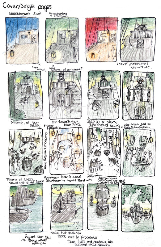
< Initial Thumbnails
I found it quite frustrating doing these, I had so many ideas but didn't find it productive drawing at this scale. It felt restricting and looking at the boxes made me feel demotivated. I like drawing small to get ideas out but for composition, I like drawing big and blocking in colours digitally with big brushes. Those can be used as bases for final drawings, which makes the development process feel more meaningful. 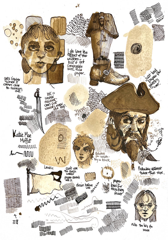
|
Drawing wood and water
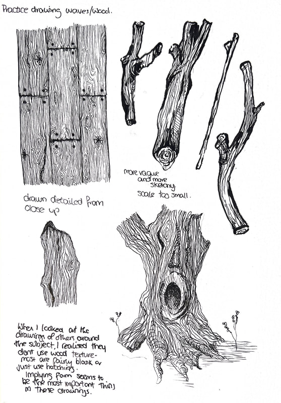
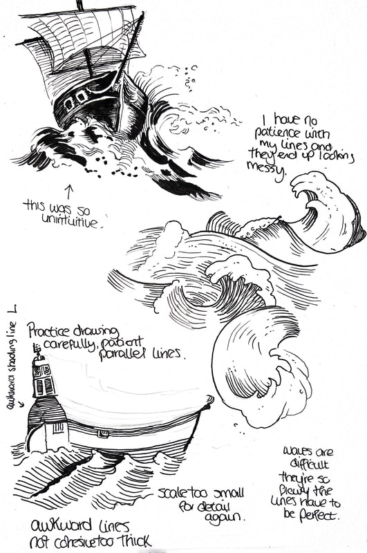
Sketchbook pen practice.
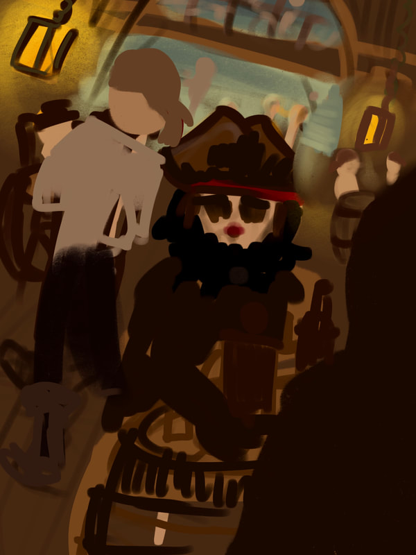
Digital thumbnails/mockups
Digital mockups of my drawings. I find it a lot easier to get quick sketches out digitally than as paper thumbnails. It helps me build a full illustration better, get accurate colours, and imply lighting.
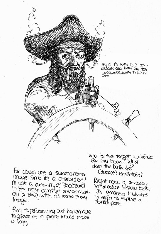
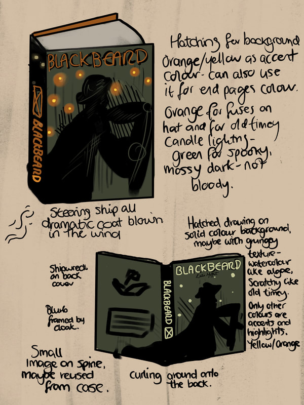
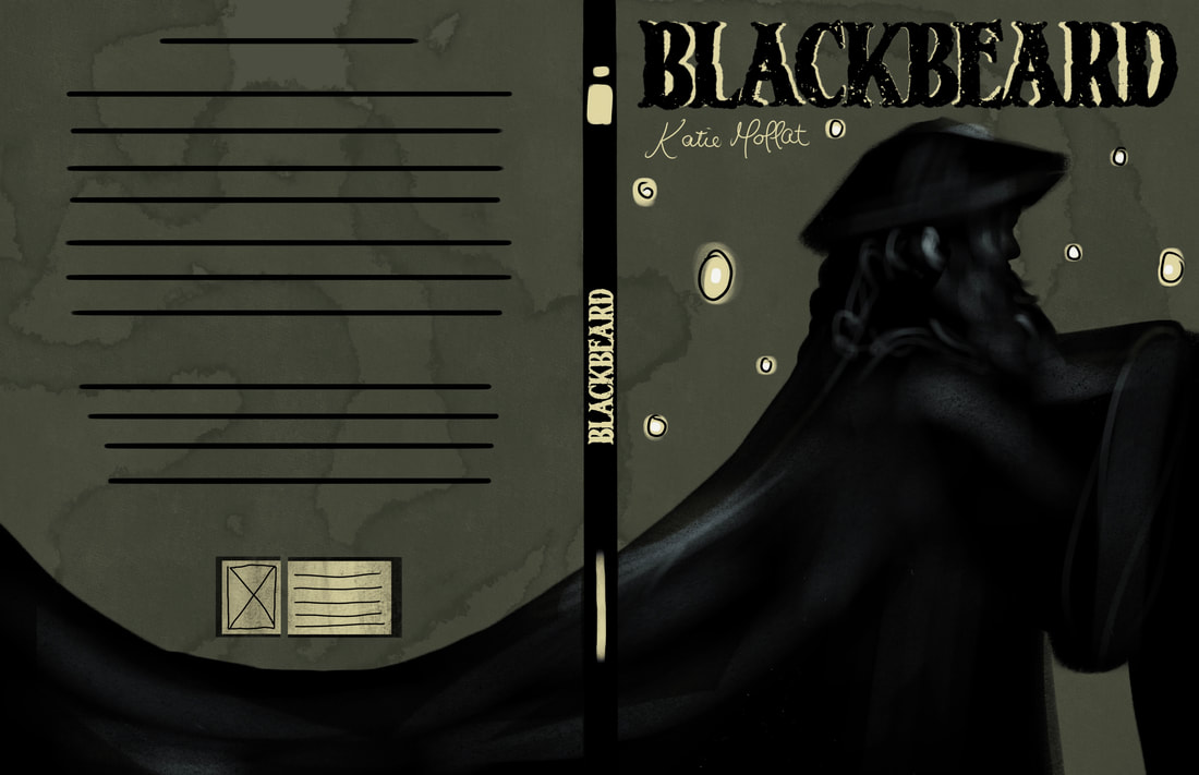
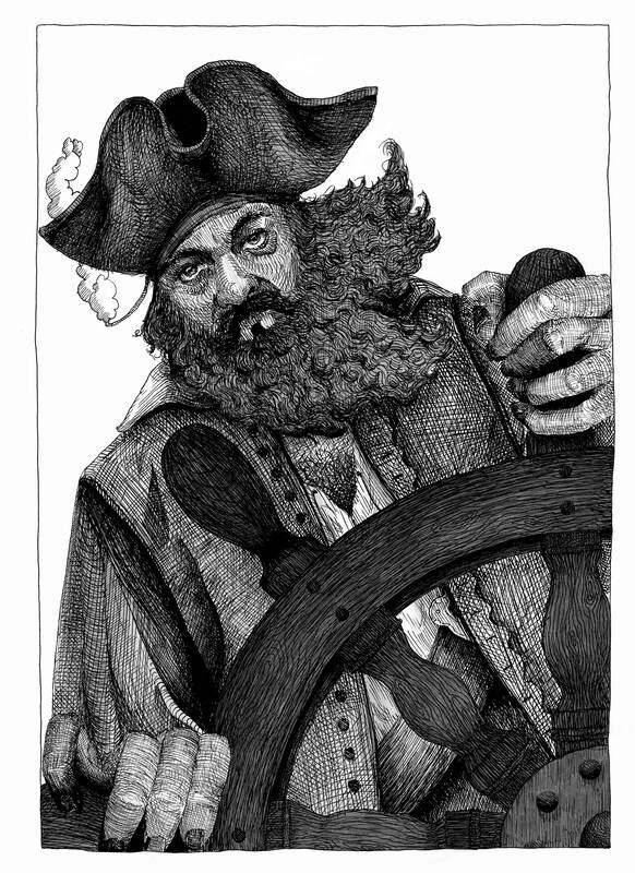
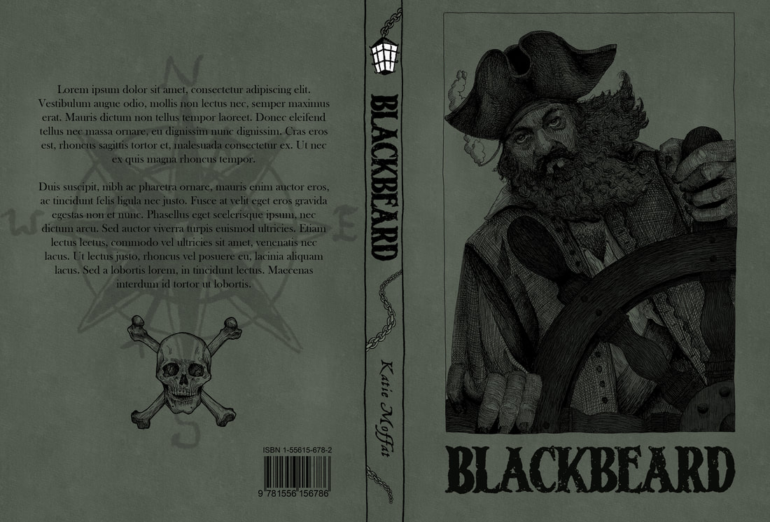
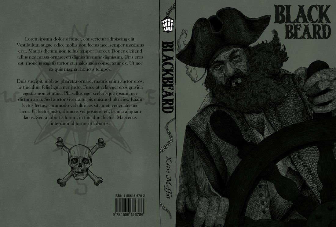
I want to attempt to have no edge on my cover illustration, and have it curve round the spine and onto the back, framing the type. I think since the book is called Blackbeard, the most striking way to do this would be to do have a pen drawing of Blackbeard alone, his cloak sweeping in the wind and curling around the back of the book. He could be holding the wheel of the ship which is emerging from the bottom/right side of the cover.
I don't want these drawings to be full bleed, I'll draw a clean box around them with pen, and contain the colour and drawing inside that box. It'll sit on one page with text on the other.
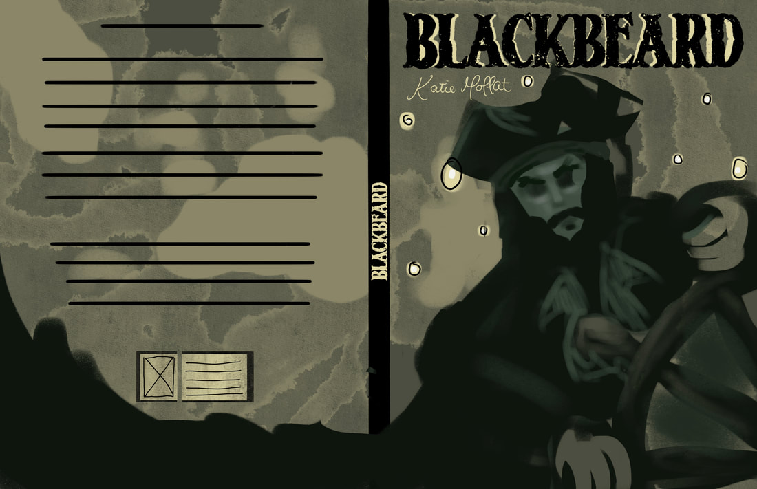
Cover/Slip case/Spread digital tests
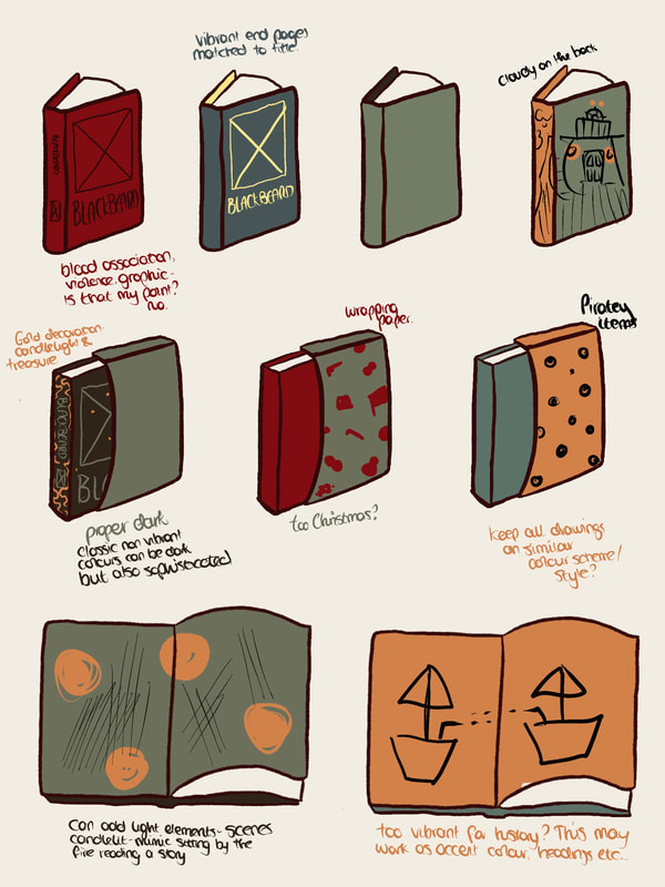
More thumbnails and rough designs. I wanted to try a red background for my cover, but I think it's too evocative of blood, which Blackbeard wasn't involved in. I want him to feel scary, dark, spooky as a 'character', but not violent.
I'm trying to see my covers as full images, not just separate elements. I've included hints of the end pages and the spine and shown different angles of the book to get a sense of how it would work as an entity. I like the black spine dividing up the green front and back, it will also look different when the drawing is hatched and not a silhouette, because they won't blend together. I haven't decided on my accent colour, but since I'll just be overlaying my hatched drawing on digital colour/mockup, I don't think that decision's important yet.
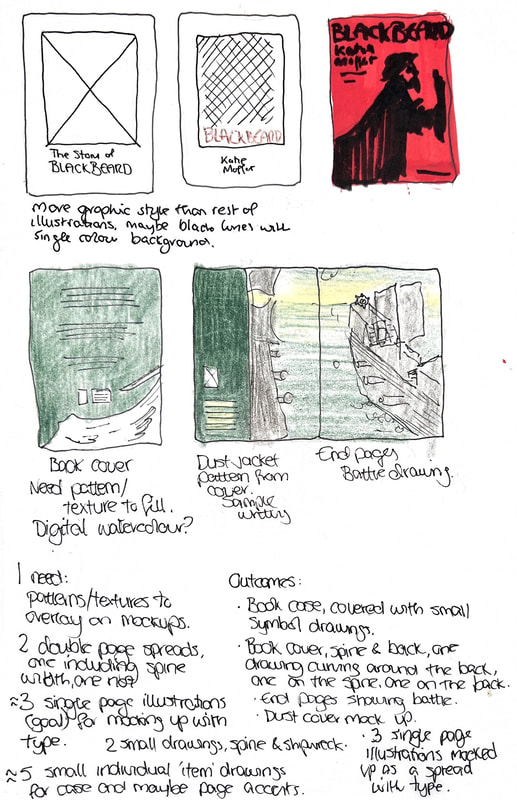
In the last image I've listed my intended outcomes.
I'm trying to see my covers as full images, not just separate elements. I've included hints of the end pages and the spine and shown different angles of the book to get a sense of how it would work as an entity. I like the black spine dividing up the green front and back, it will also look different when the drawing is hatched and not a silhouette, because they won't blend together. I haven't decided on my accent colour, but since I'll just be overlaying my hatched drawing on digital colour/mockup, I don't think that decision's important yet.
In the last image I've listed my intended outcomes.
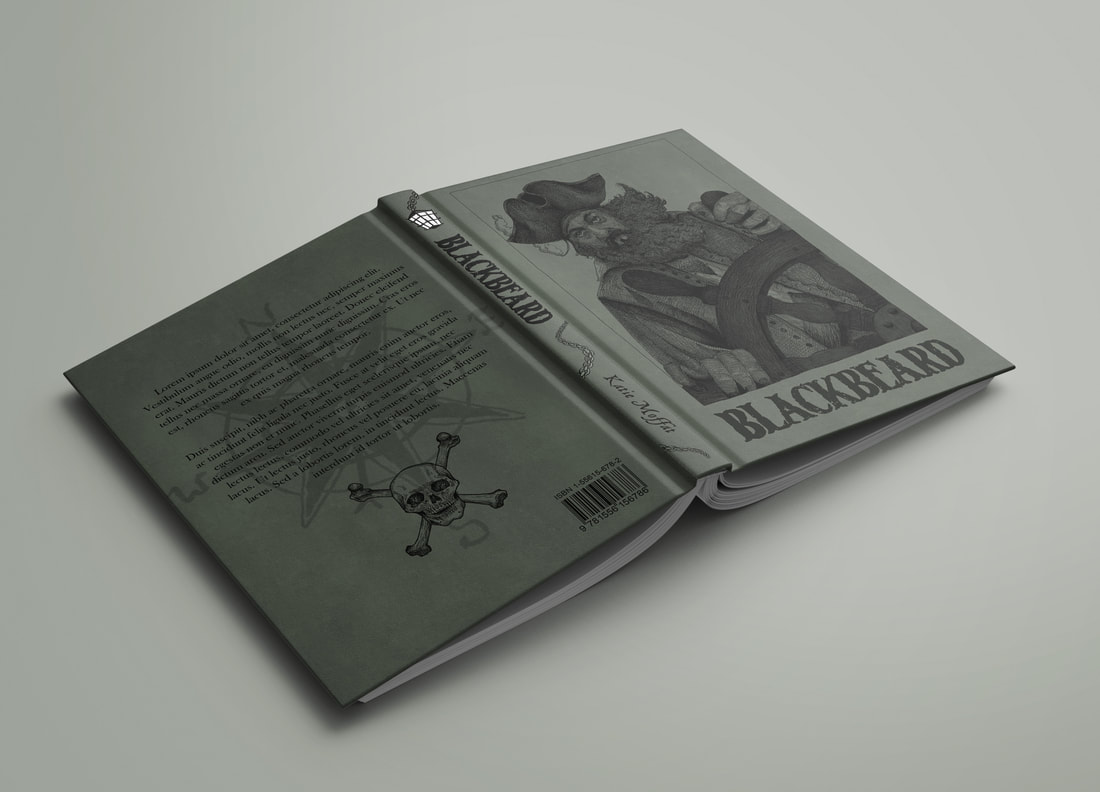
Book exterior mockups
Mockup for book cover, spine, and back. Could be looking slightly more toward the viewer, and have a more dynamic pose. This shows general placement. I've used a watercolour texture for the background that I made quickly with digital brushes - I'll keep working on this.

Updated for more dynamic pose.
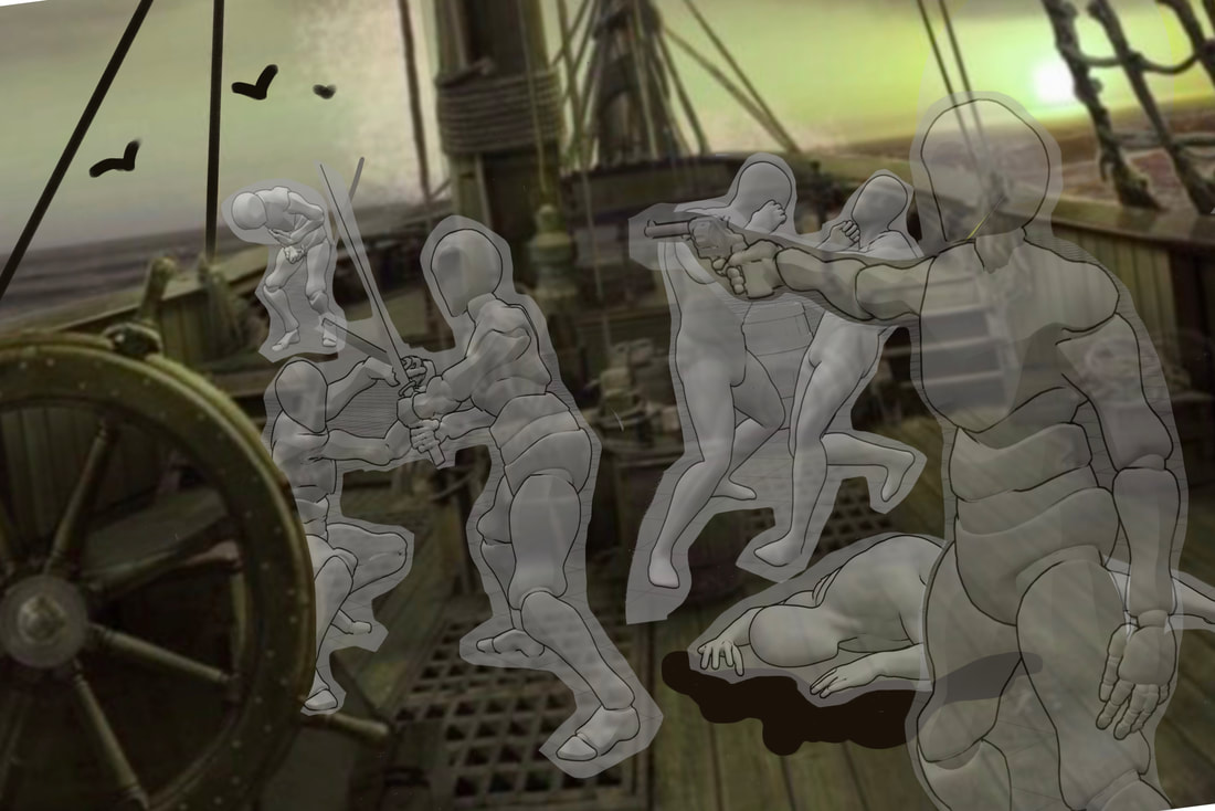
'PoseMy.Art' pose references
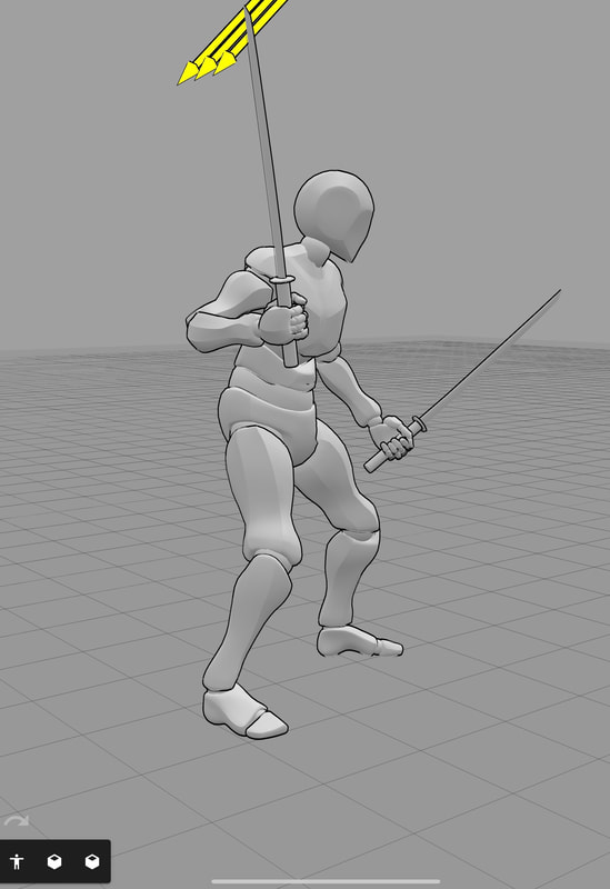
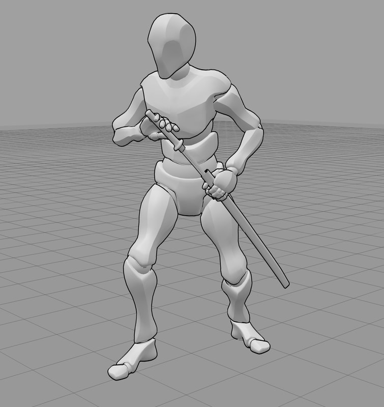
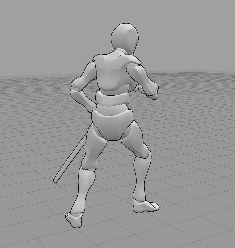
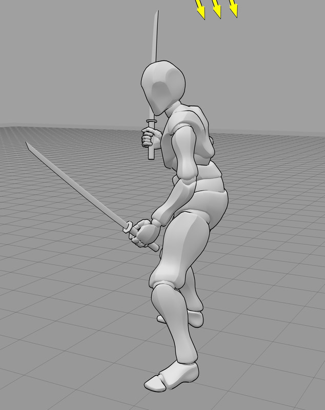
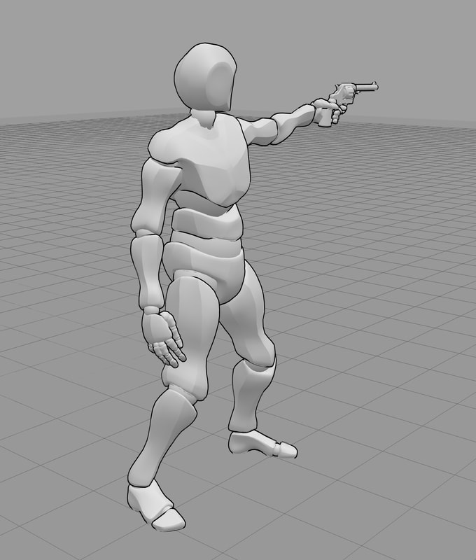
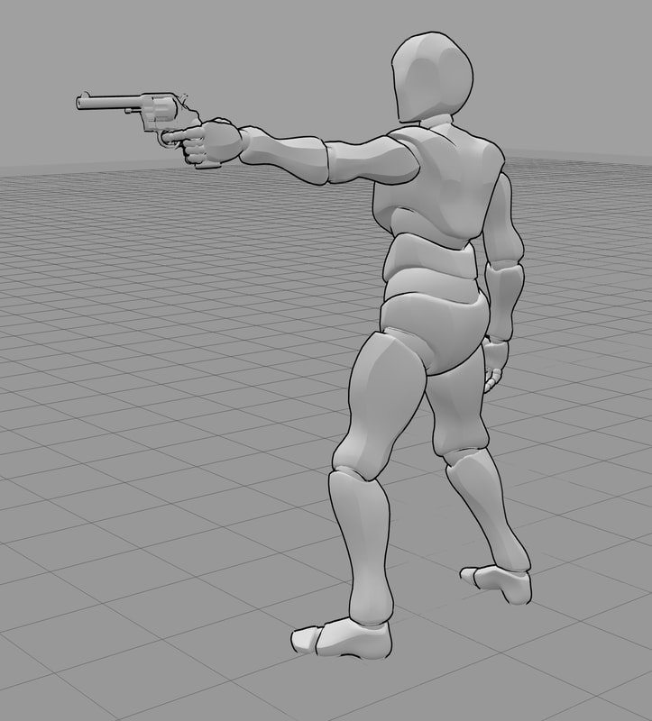
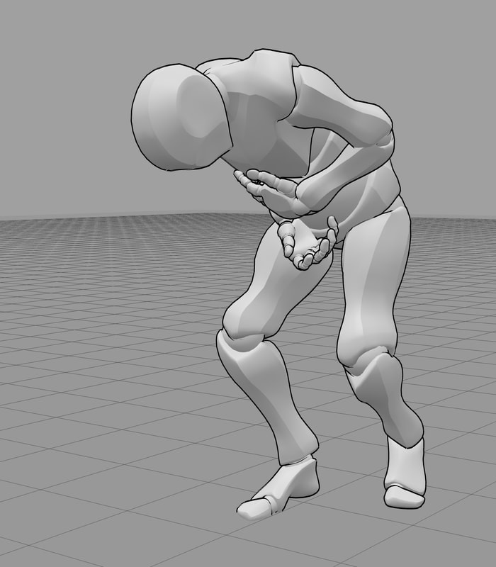
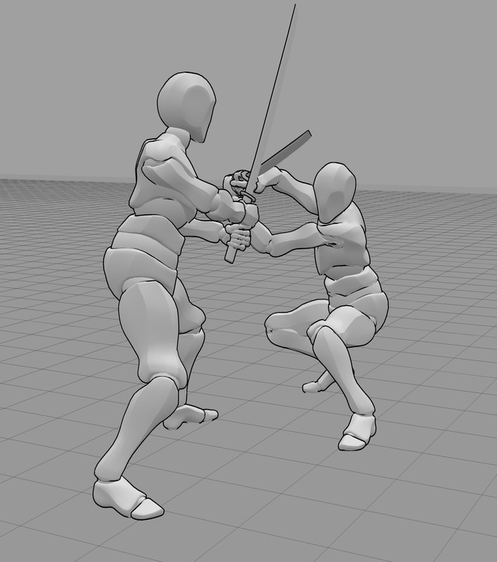
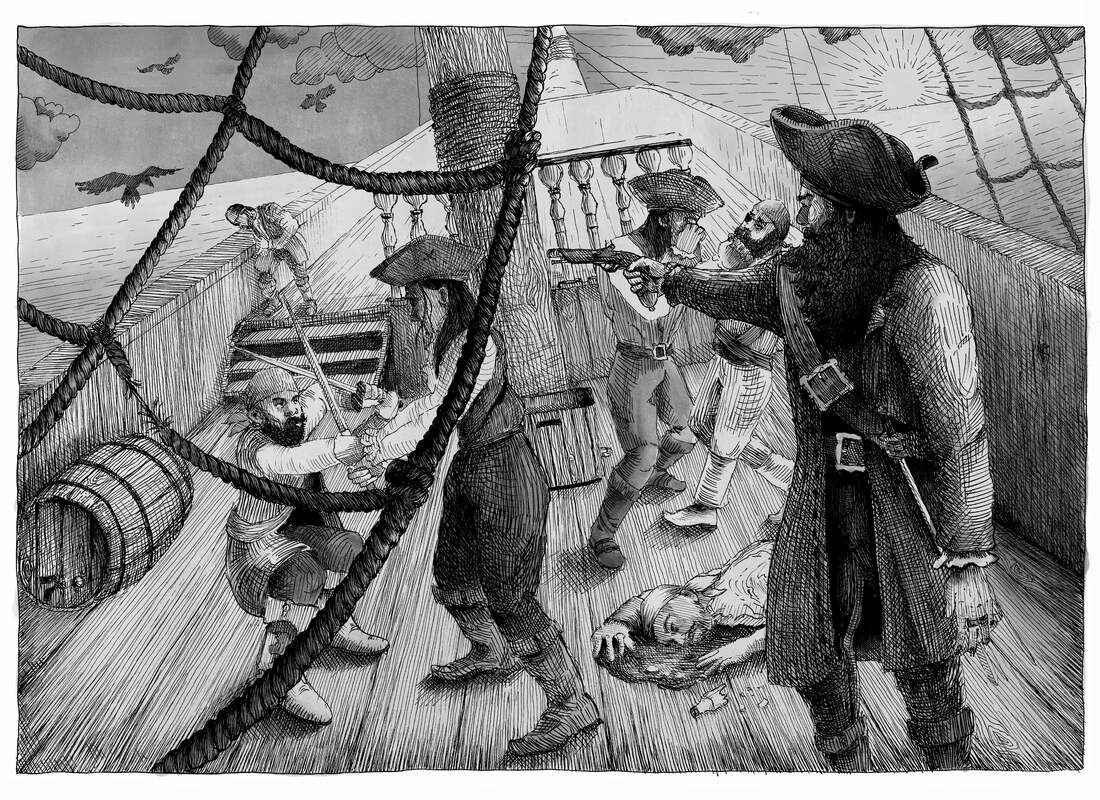
Posemyart references for the boat fight scene for my end pages
Mock-up for end pages.
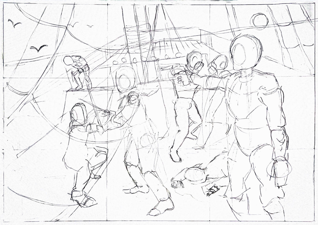
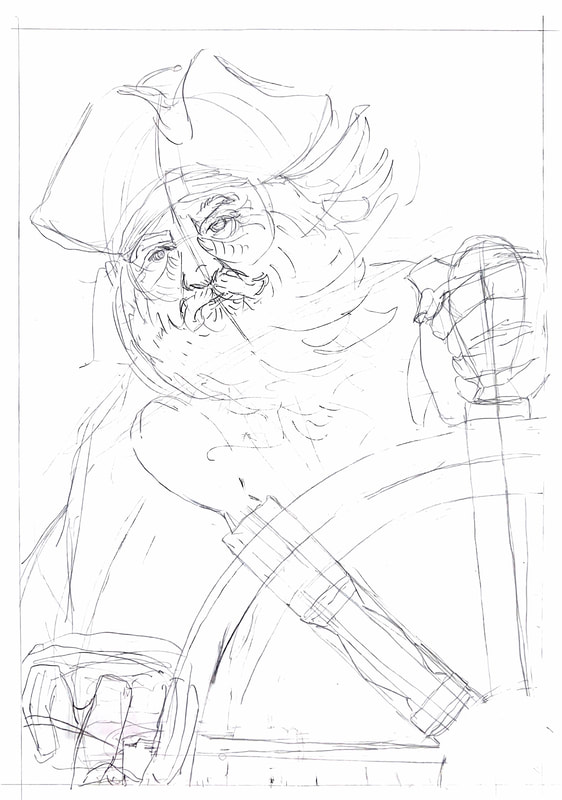
Draw-ups before starting final illustration
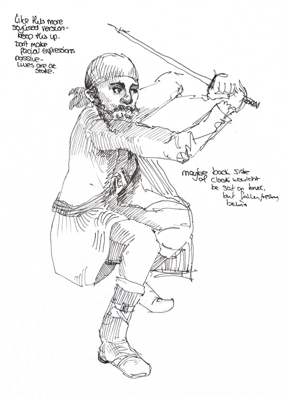
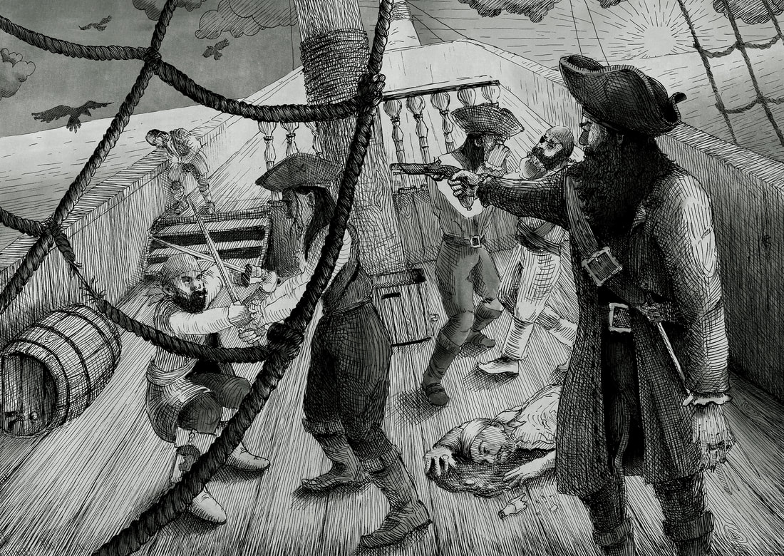
Sketches showing general idea of pirates in fight illustration.
Rough colouring of test drawings
Sketches coloured for general colour scheme - low sun filtered through foggy sky, green glow around everything. Darks are very dark, lights are very light. The brush pen when not blended properly or placed accurately interferes with colours uglily.
Inspiration/copies
Instagram posts from an artist I'm going to try to reference. Thicker pen is used for main outlines, thinner pen for shading or smaller details.
An artist copy and a quick rough colour to show what I'd do with it.
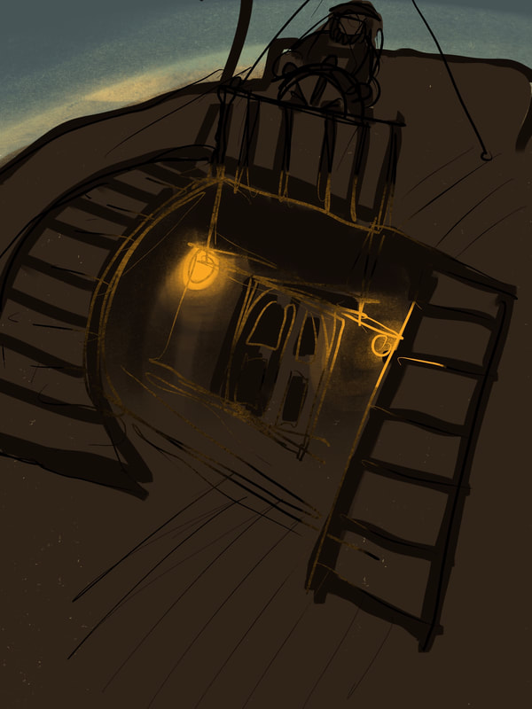
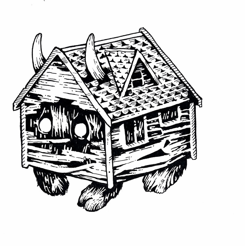
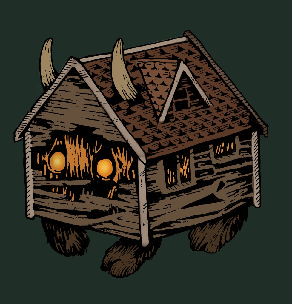
Something went wrong with the roof...
Something went wrong with the roof...
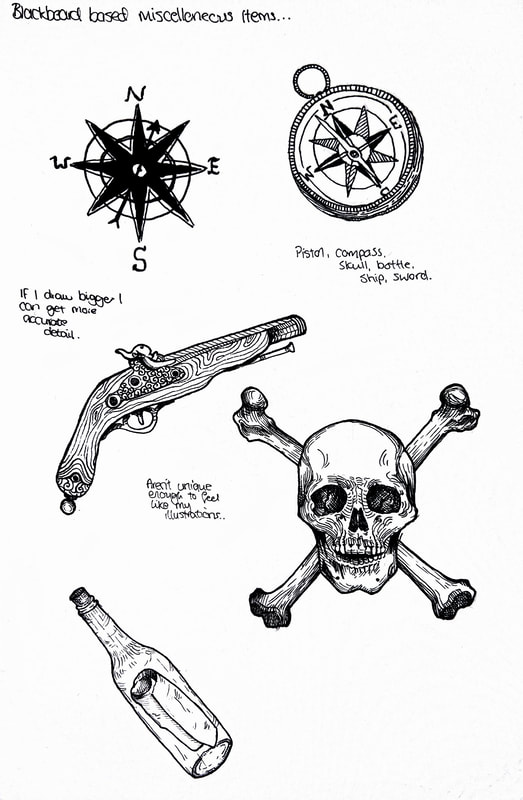
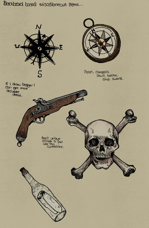
Piratey symbols for potential Slip Case
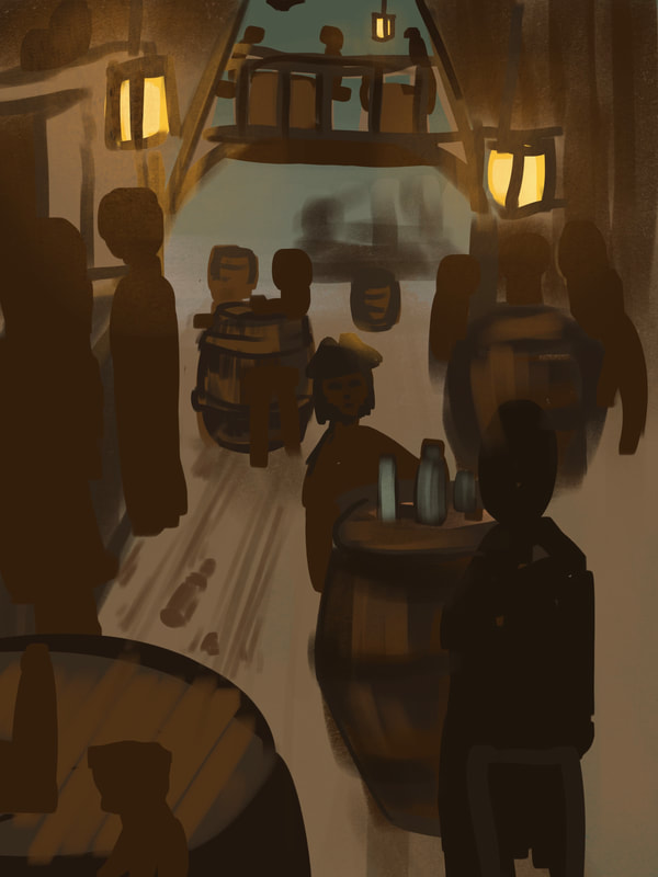
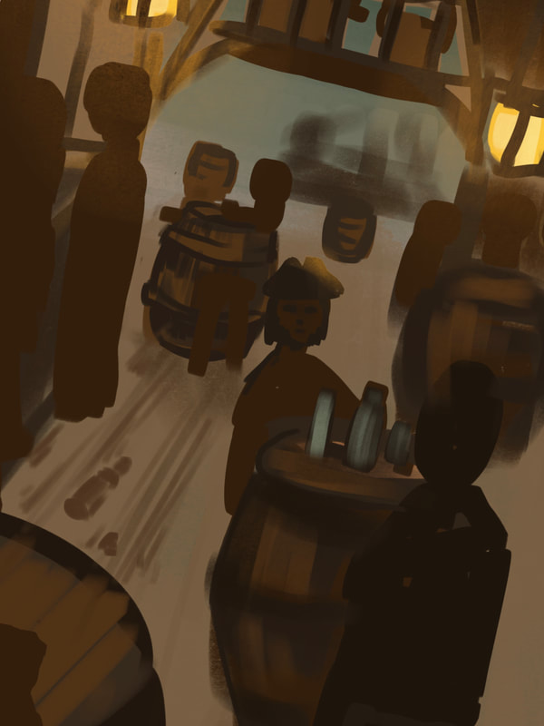
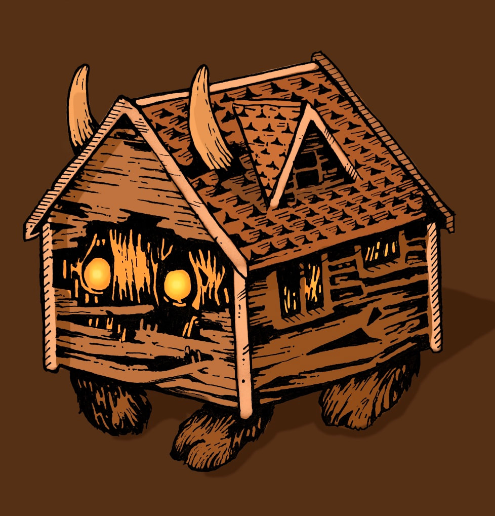
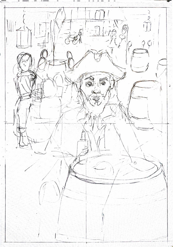
Tavern mock-up and paper sketch
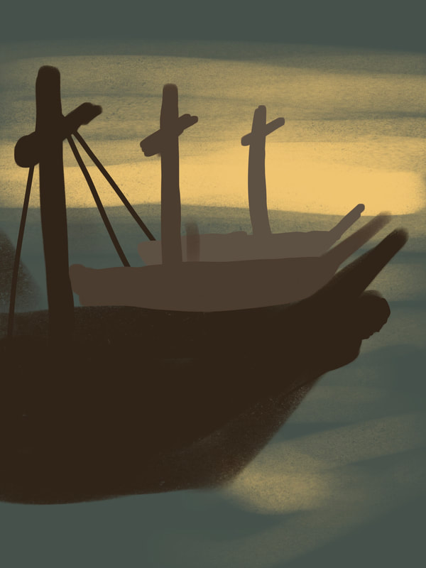
Final mock-ups. I don't think I can go ahead with my back cover plan and have it make sense. I could add some waves in the background after Blackbeard is done, but I think I'm going to draw him and the wheel as one drawing and add anything else after.
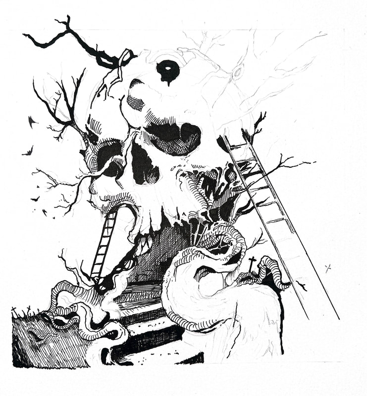
Sketches on Bristol board ready to ink.
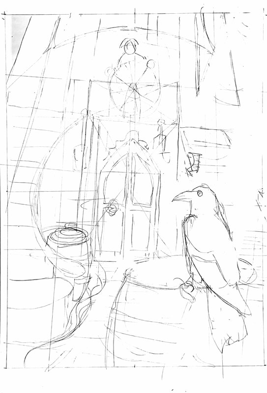
For my next project I'd like to find a way to draw certain elements separately then add them together. Having them all in one drawing puts a lot of pressure on every element to be right.
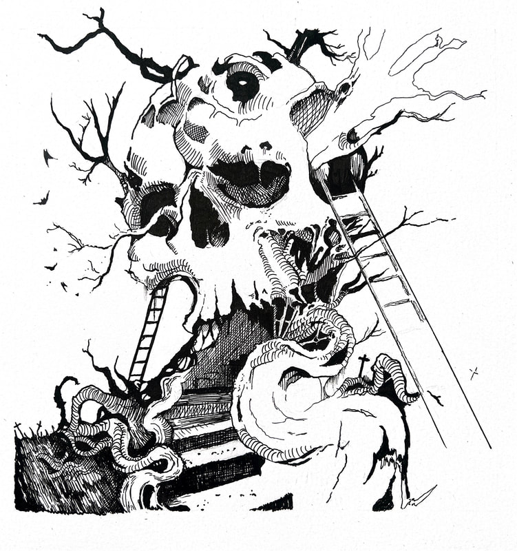
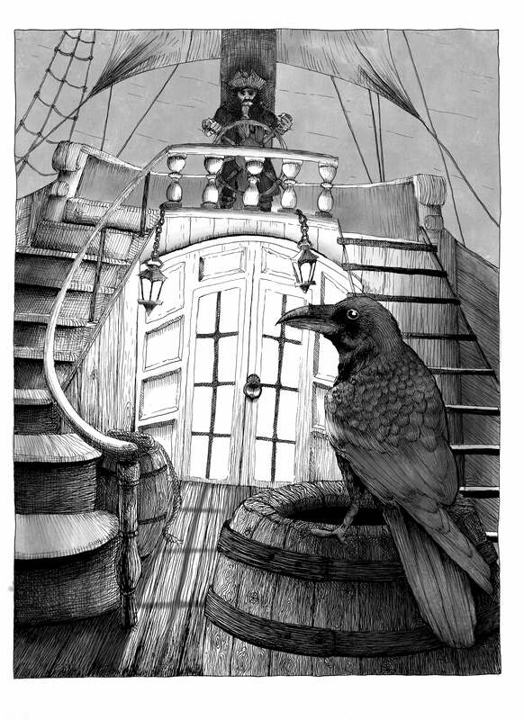
Crow ink/colour test
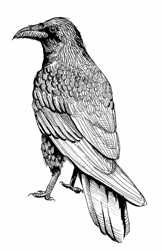
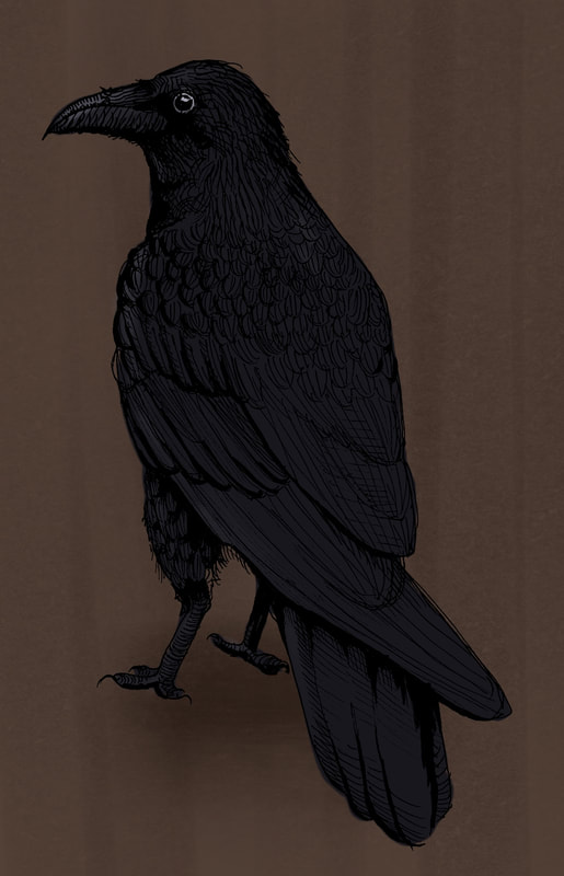
From this I figured out I need to be wary of areas I'll have highlights. Those should be accounted for in the line art, not just added afterwards behind it. The line art or black areas will darken highlights and flatten those areas.
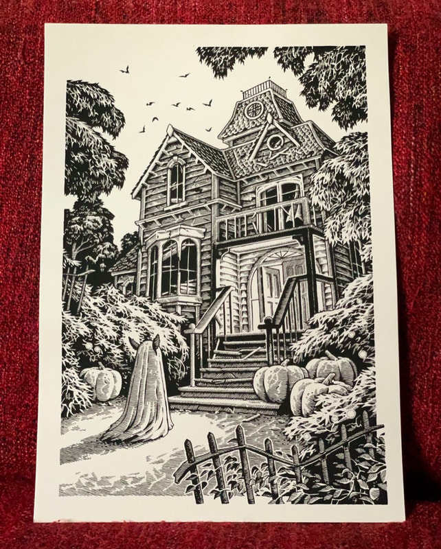
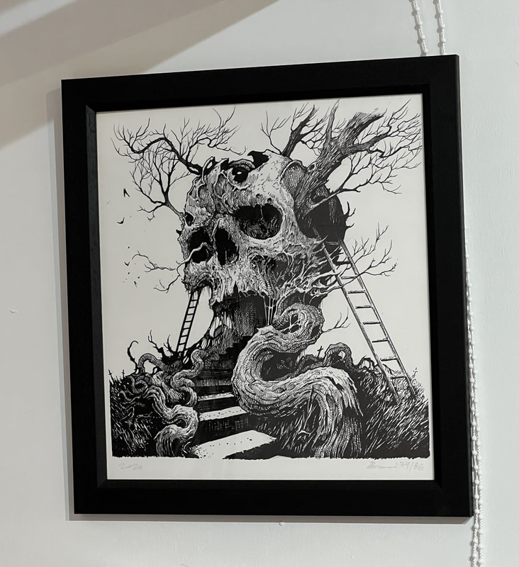
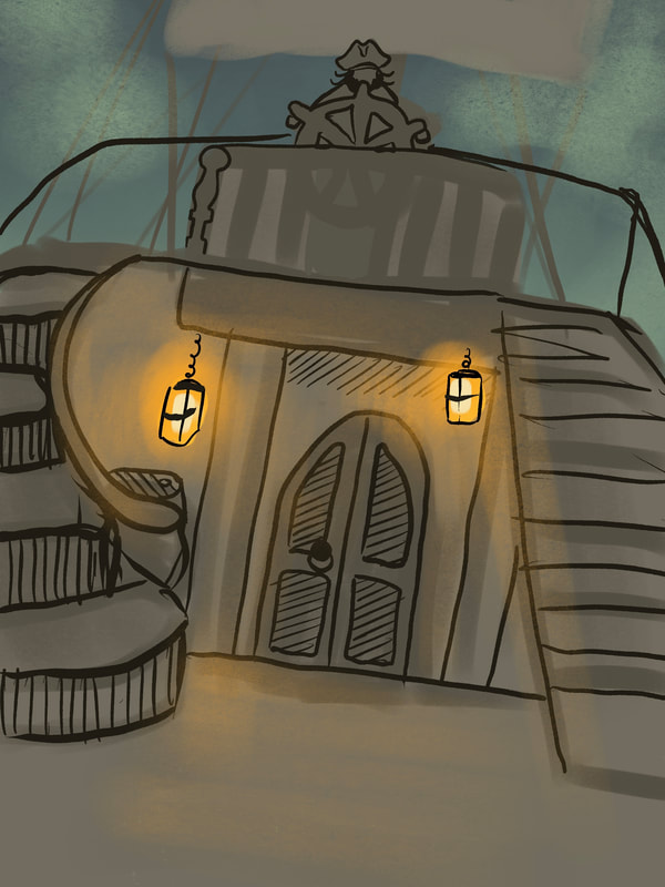
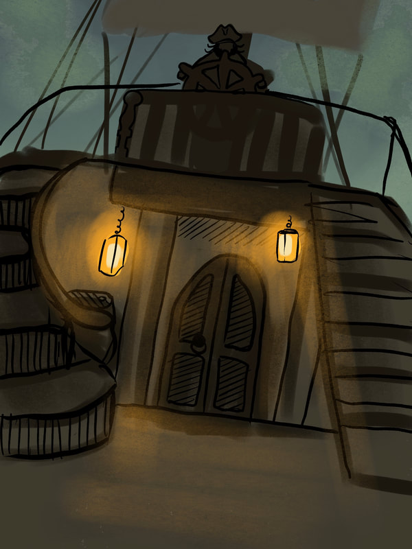
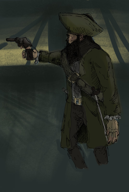
Finished Ink Drawings
Digital Work
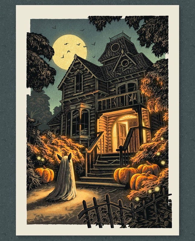
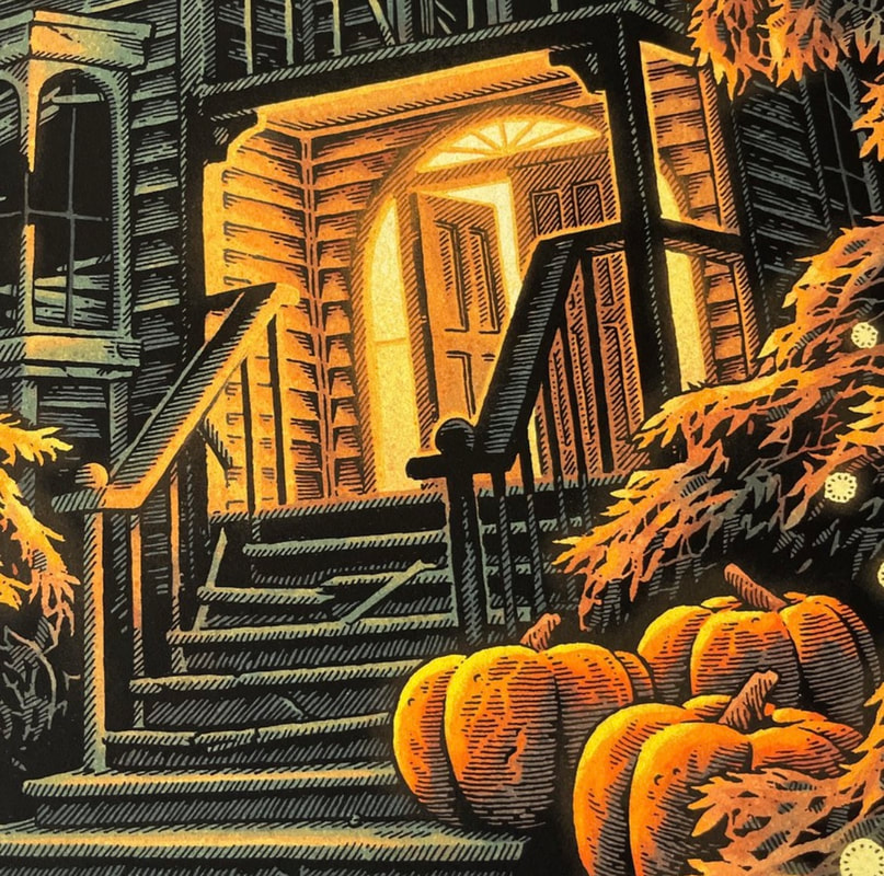
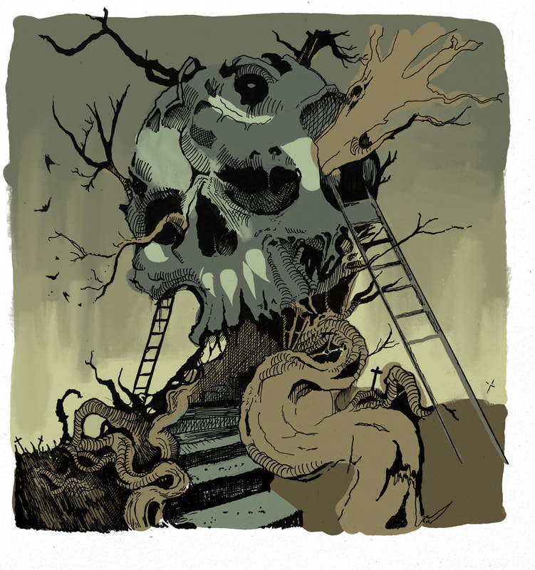
With Digital Washes
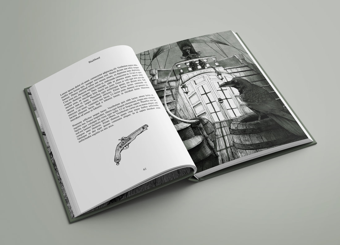
Book Mock-ups for Pen Drawings

Flat versions
REFLECTION
I'm very happy with my outcomes, this has definitely been my most successful project so far. I think the mock-ups look clean and professional, and the illustrations are a huge step up from those I was making at the end of year two. I think I'm starting to develop an eye for aesthetics, a style, and my finished products are a result of a more advanced attention to detail due to more knowledge, awareness and effort overall.
I wanted to include colour for these illustrations, and in the final product I ended up adding a green watercolour filter over the illustrations, which I think improved them by making them look more atmospheric. However, I didn't end up fully colouring my illustrations as initially planned. This was a combination of time left at the end, and at the colouring not working as I'd hoped. I don't think digital colouring works well underneath hatching, it looks muddy and ugly, in my case at least. The artist I was looking at through this project, @Simonjcurd on Instagram, uses very dark, crisp lines to show form and tone, and implies light through leaving less densely drawn areas in combination with digital drawing. Because my pen drawings are largely of similar tones, mostly living in the mid-tones, my colouring looked flat.
I had a panic towards the end of the project, where I even had to leave out one of my intended outcomes because I didn't have the time, and I wasn't sure if I was going to get the work done. I think I spent too much time on development and should've started making my illustrations earlier. I think that because I draw them in one go on one sheet of paper and I can't easily correct them down the line, I want to absolutely nail down my ideas before I even think about drawing them up. Changing my drawing process to accommodate could help this. I want to try to draw separate elements on different pieces of paper, then bring them together at the end. I think this could save me time, let me get into drawing sooner, AND allow me more freedom to change things afterwards. This will come naturally with digital drawing, as I can use layers and undo, and I want to try more digital drawing for the next project. I've been practicing it over the summer and I want to start to really nail down colour and brushes, so I'll aim to use the Science project to move towards that.