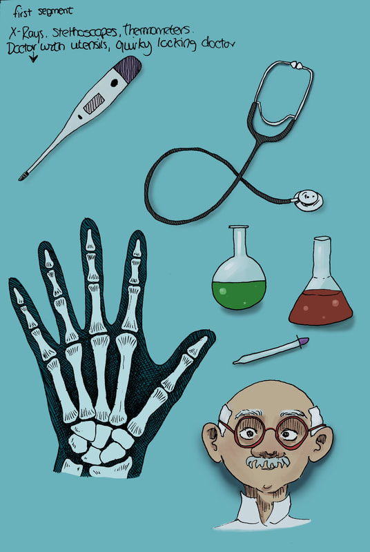
Initial Research
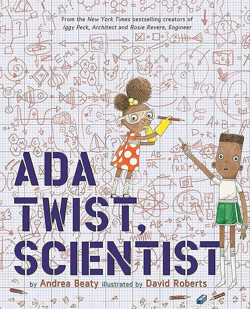
Existing science books for kids
|
David Roberts
|
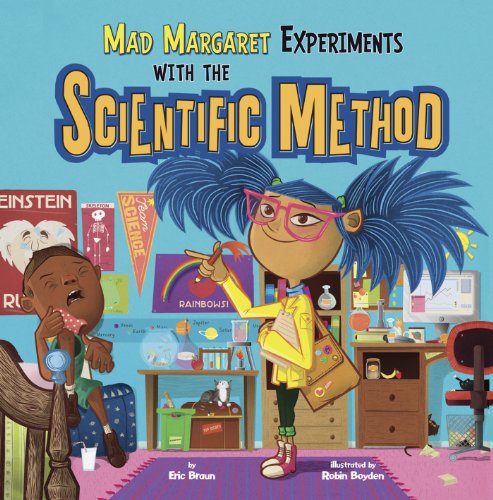
Robin Boyden
|
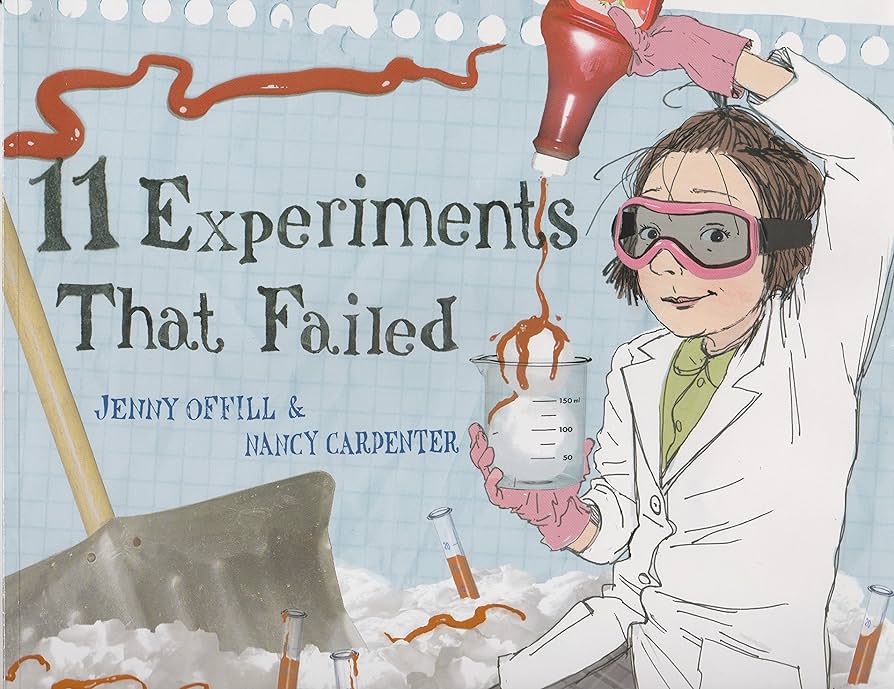
Nancy Carpenter
|
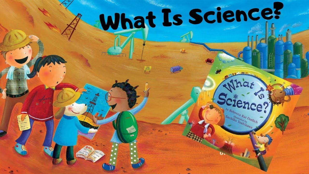
Sachiko Yoshikawa
|
Pinterest board for this project
Edge Chronicles books
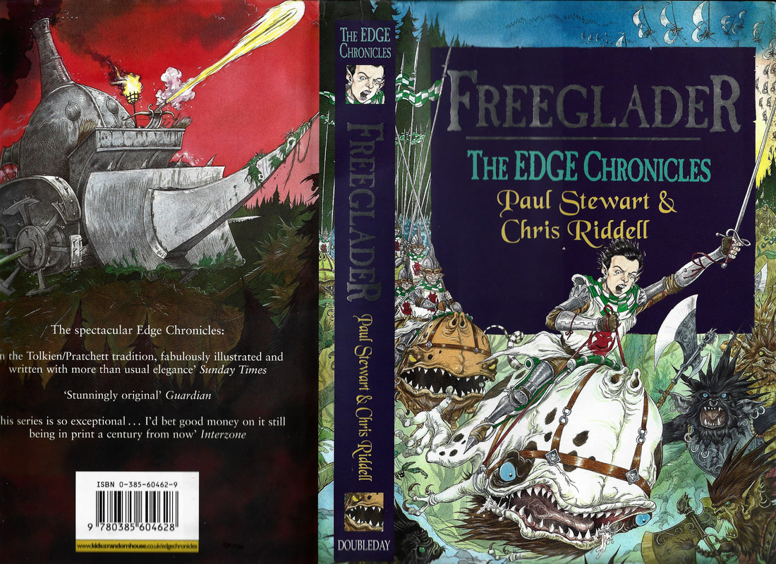
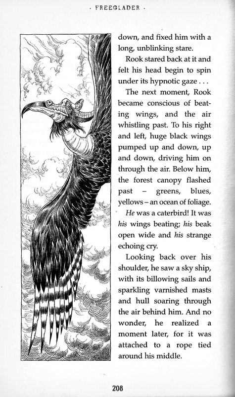
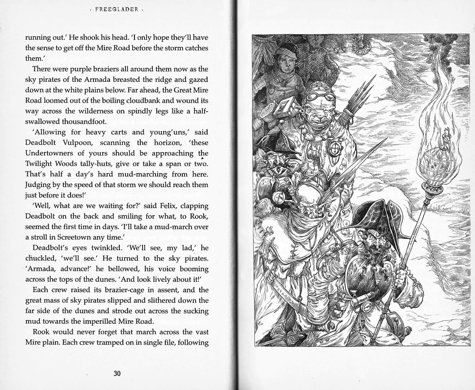
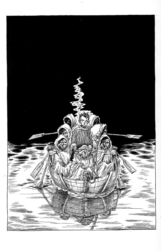
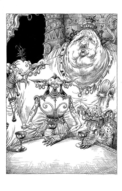
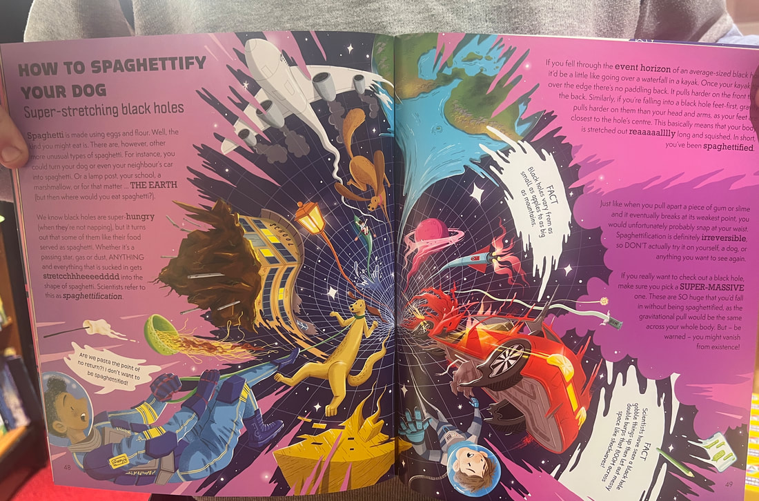
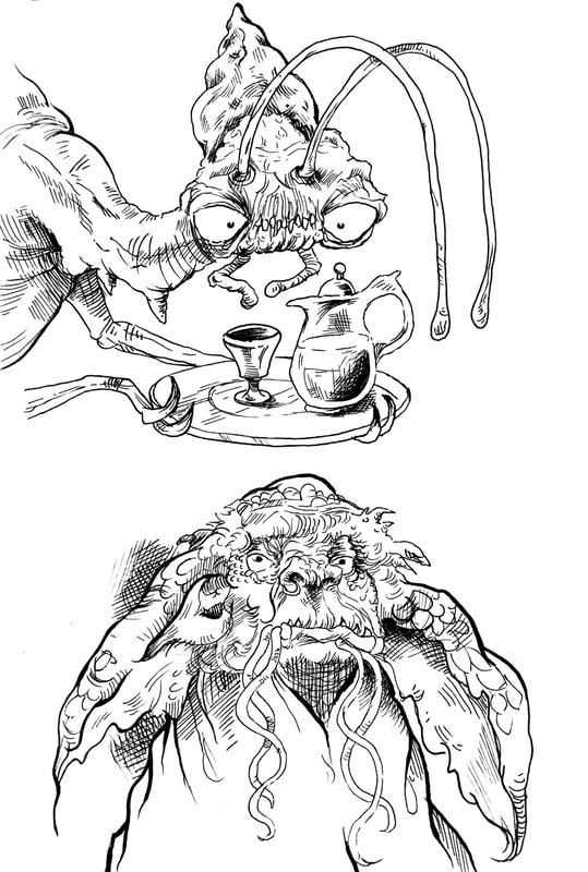
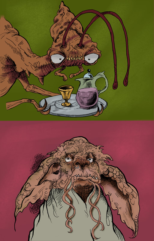
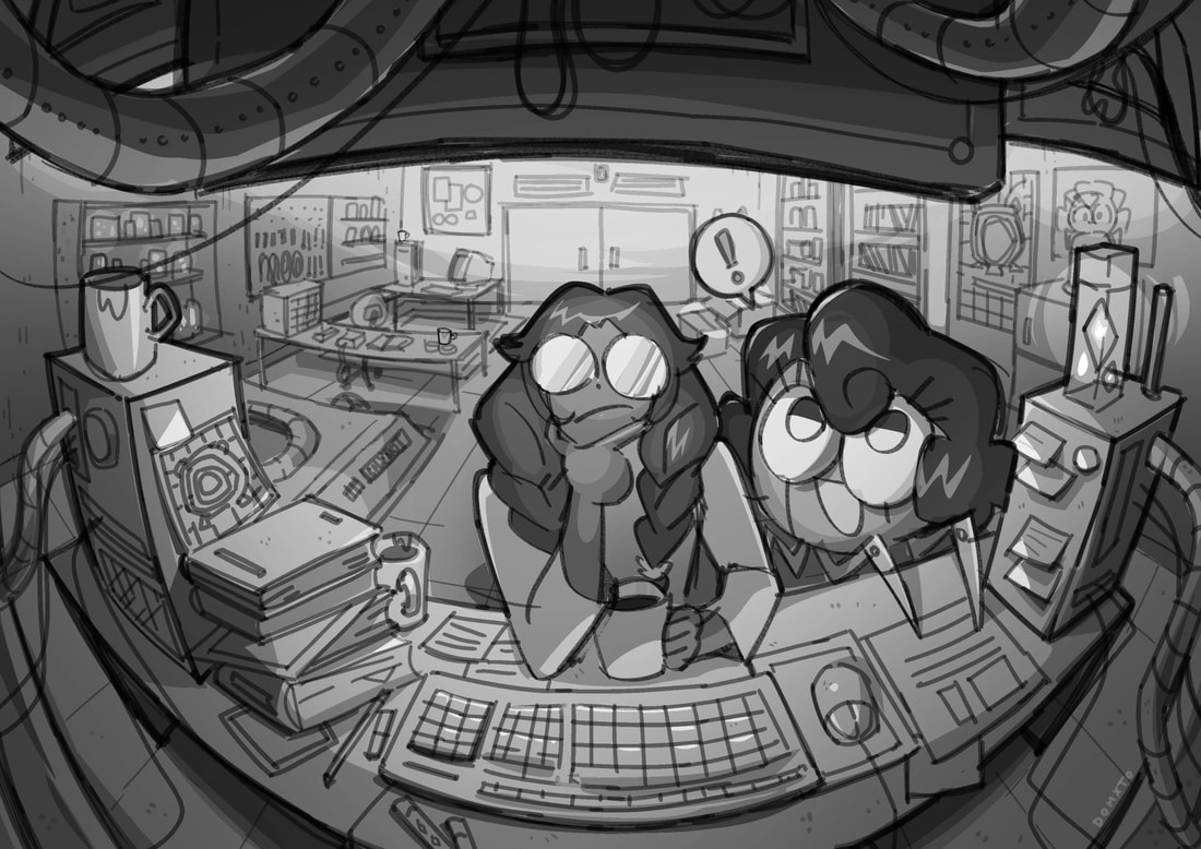
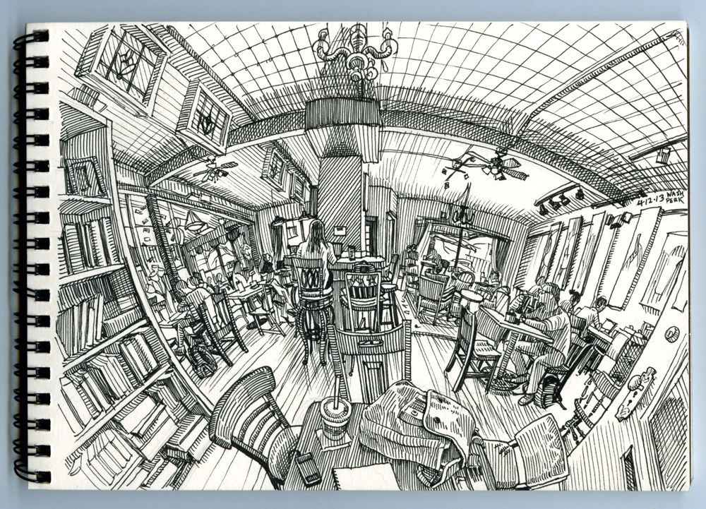
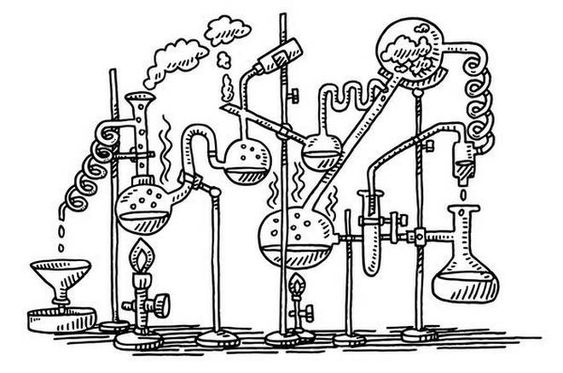
I love these illustrations and their creative layouts.
As of right now I intent to reframe the textbook for an audience of 7-10 year old children. I want to play around with digital illustration as a primary method of drawing. I may bring pen drawing into it further down the line, as in the cover of Freeglader.
First Visuals
|
Artist copy with added colour
|
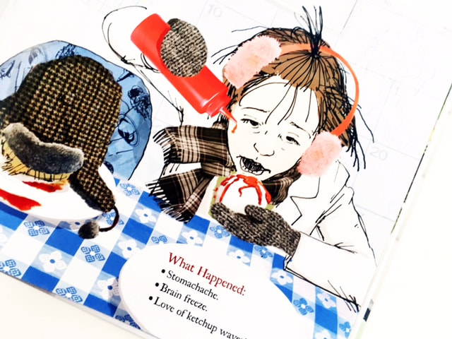
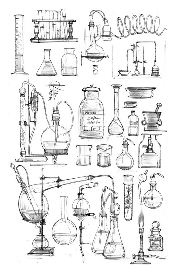
Body science related visuals
|
Intended Outcomes
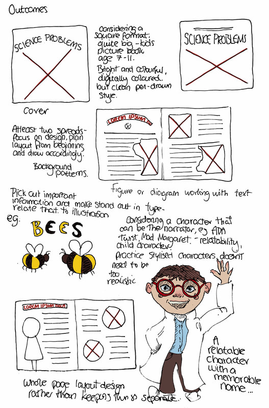
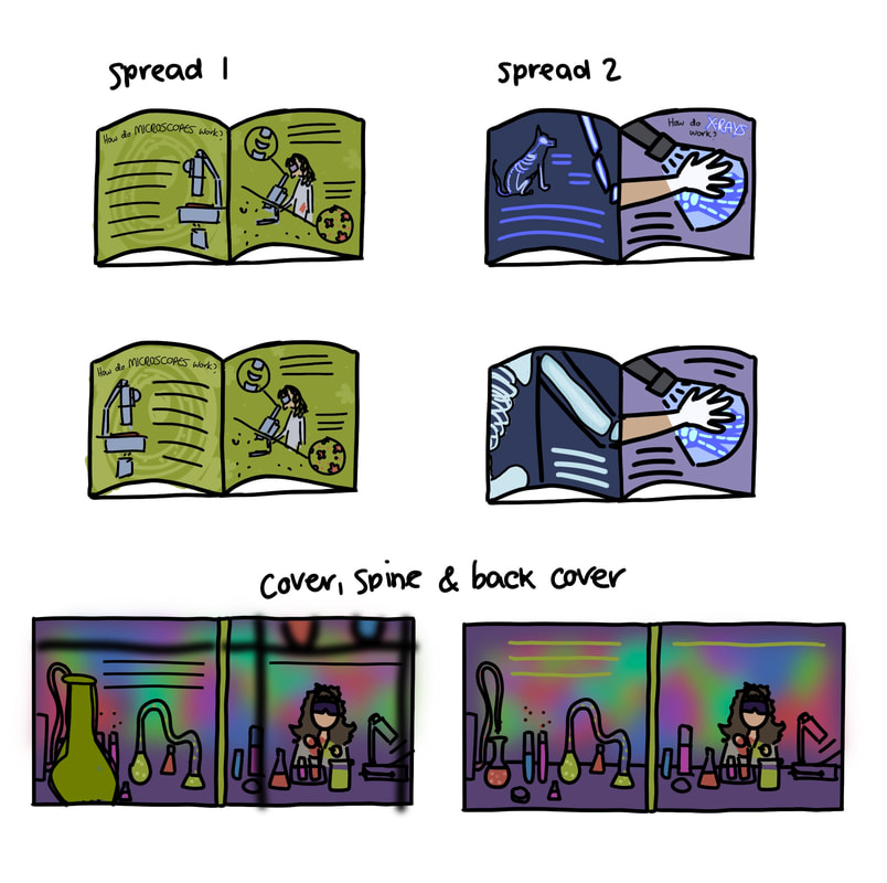
I intend to make two spreads from these options, along with a cover.
First look at type
Sciency fonts to kids book fonts. 'Amina Reska', 'Handwriting Draft', 'LT Comical', 'Pink Chicken', and 'The Last Comic on Earth
Initial Thumbnails
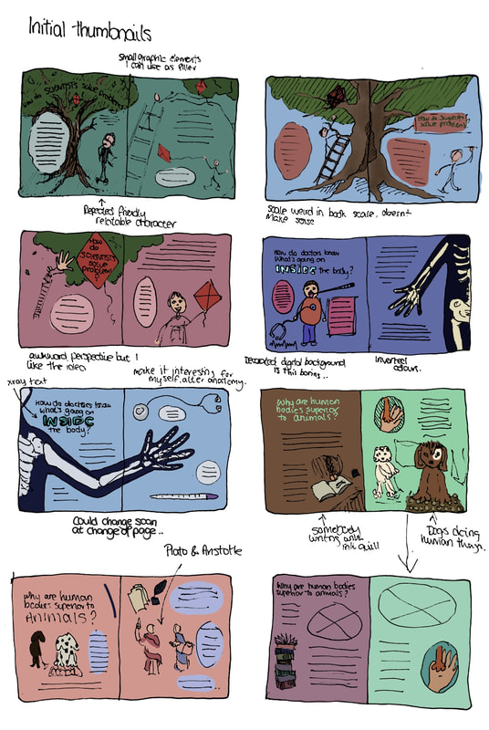
Ideas for a cover and spreads. I'm not liking any of these so far, they feel quite uninspiring and lack substance.
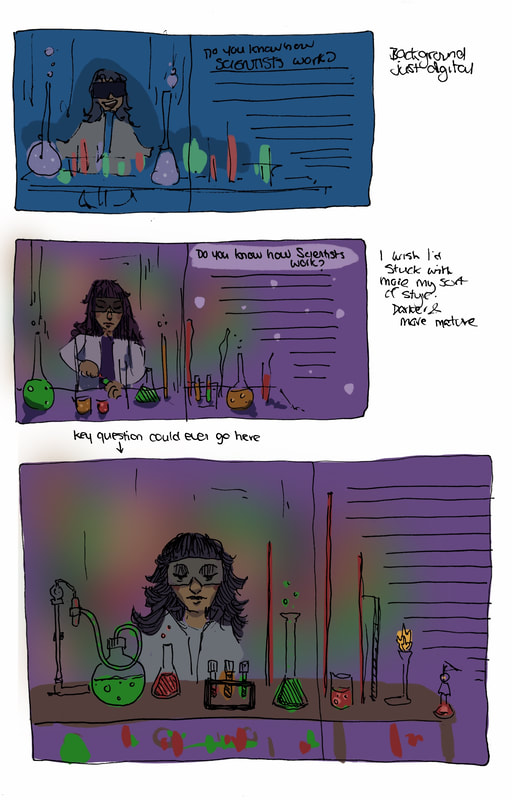
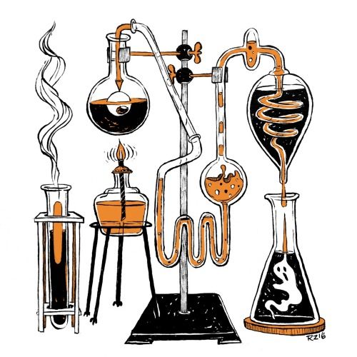
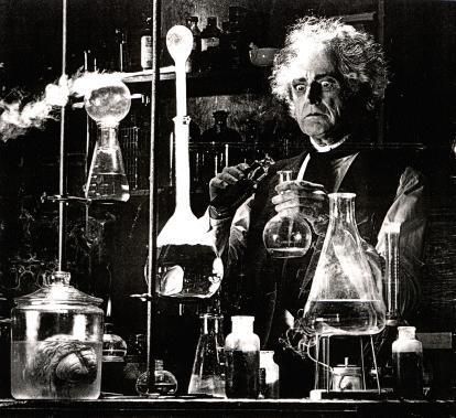
I tried out a different idea, showing a laboratory, and found the visuals much more inspiring.
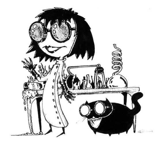
Practice drawing character digitally, again feeling uninspired, need to reroute.
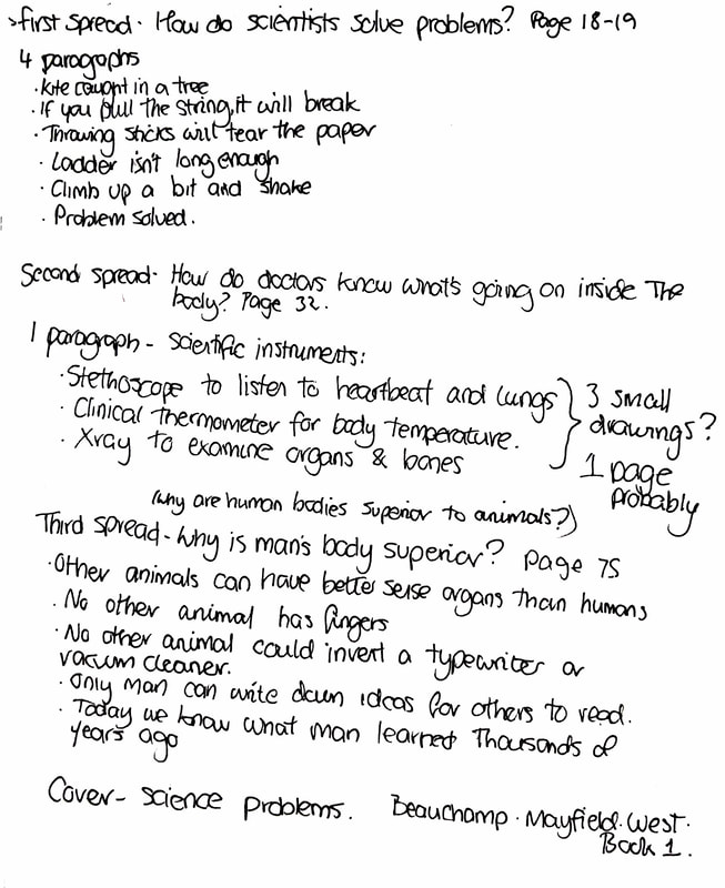
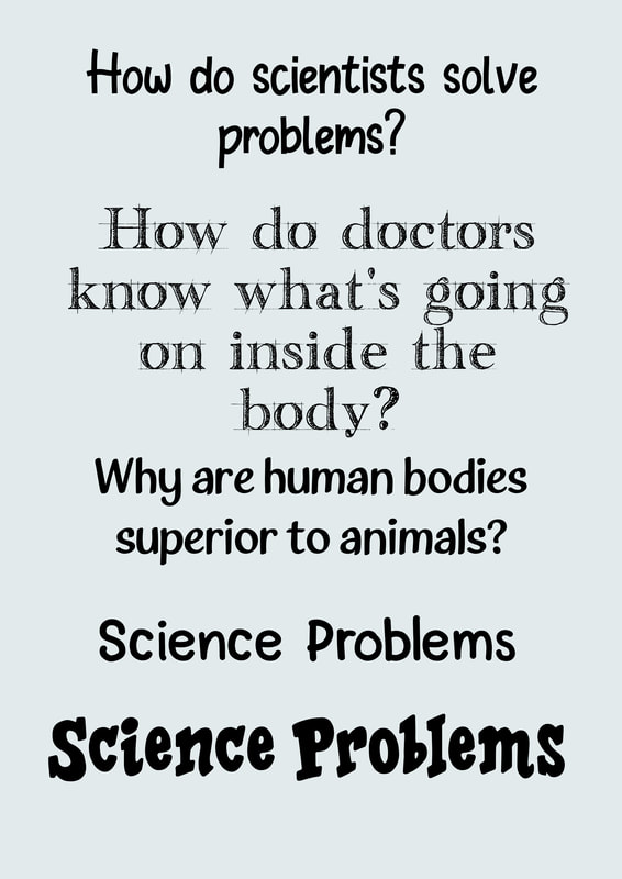
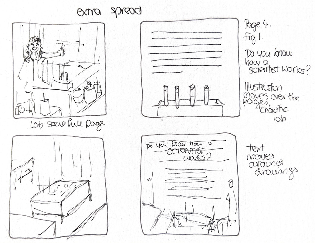
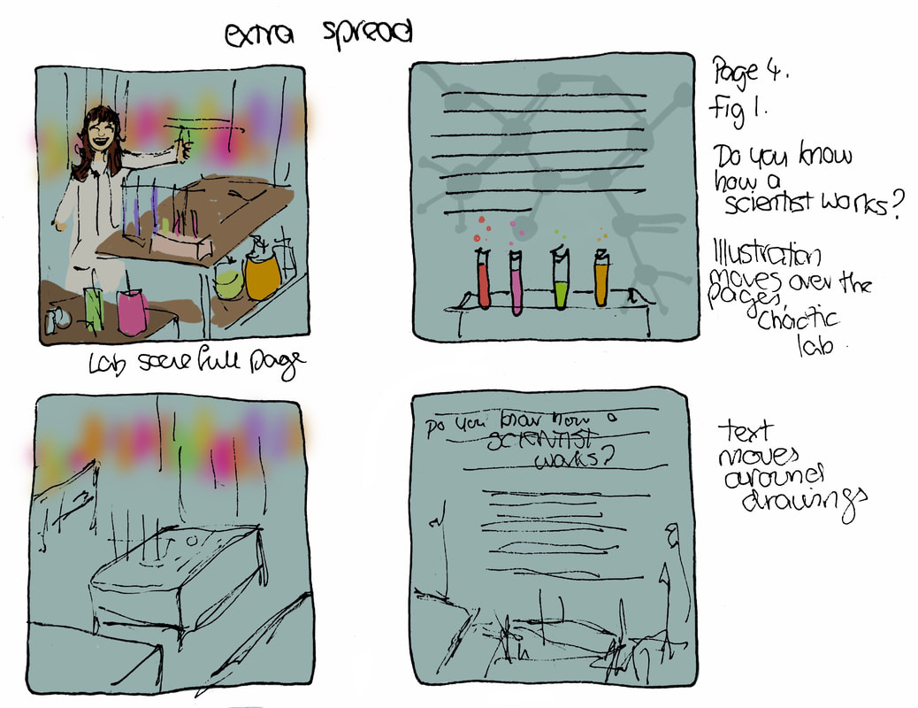
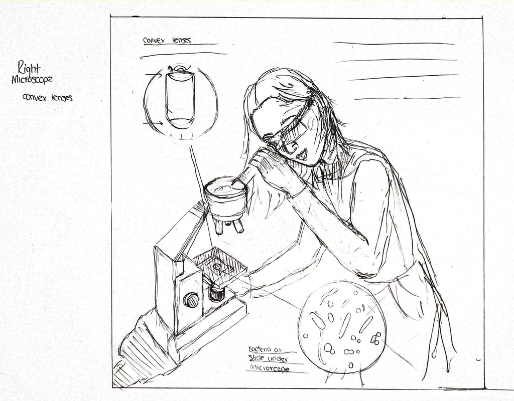
Adapted thumbnails - Clarifying Information
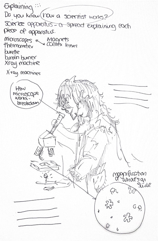
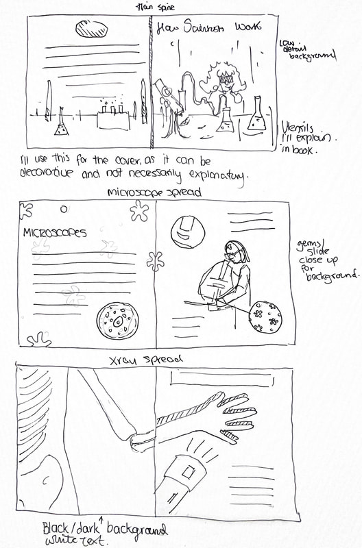
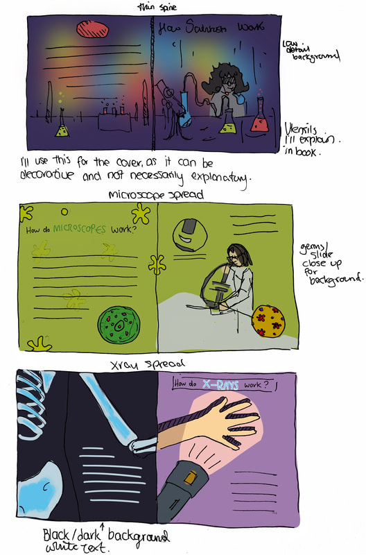
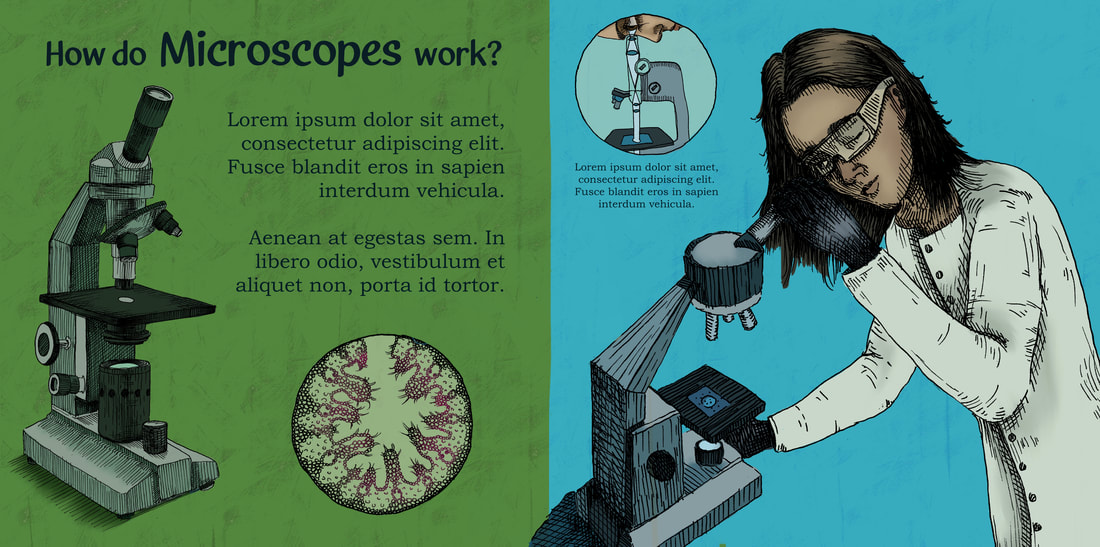
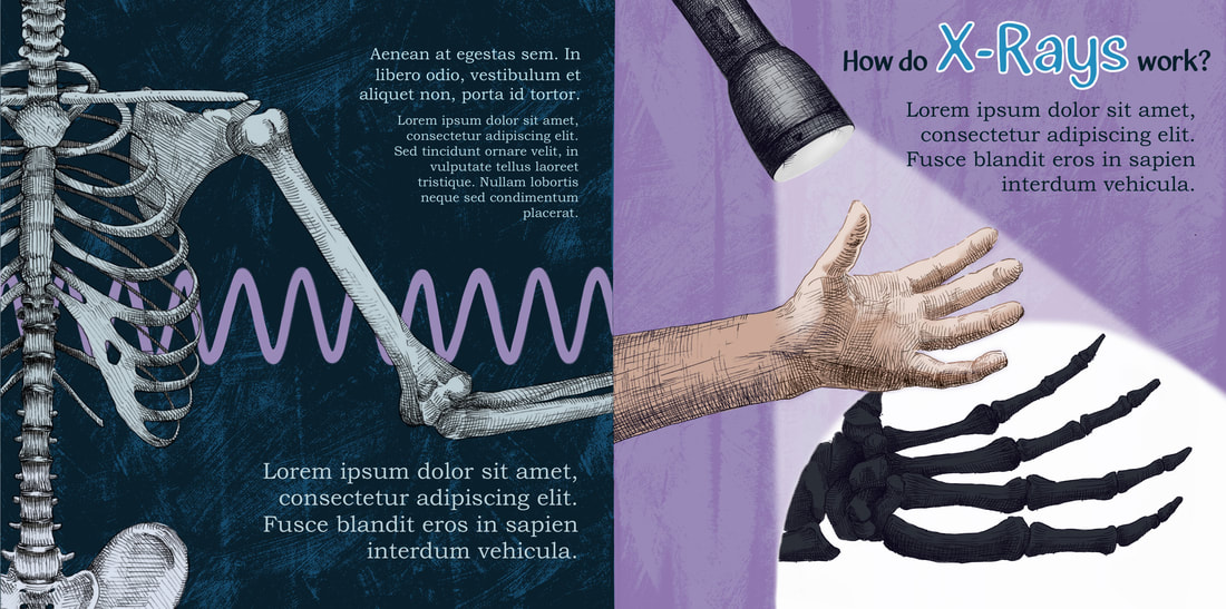
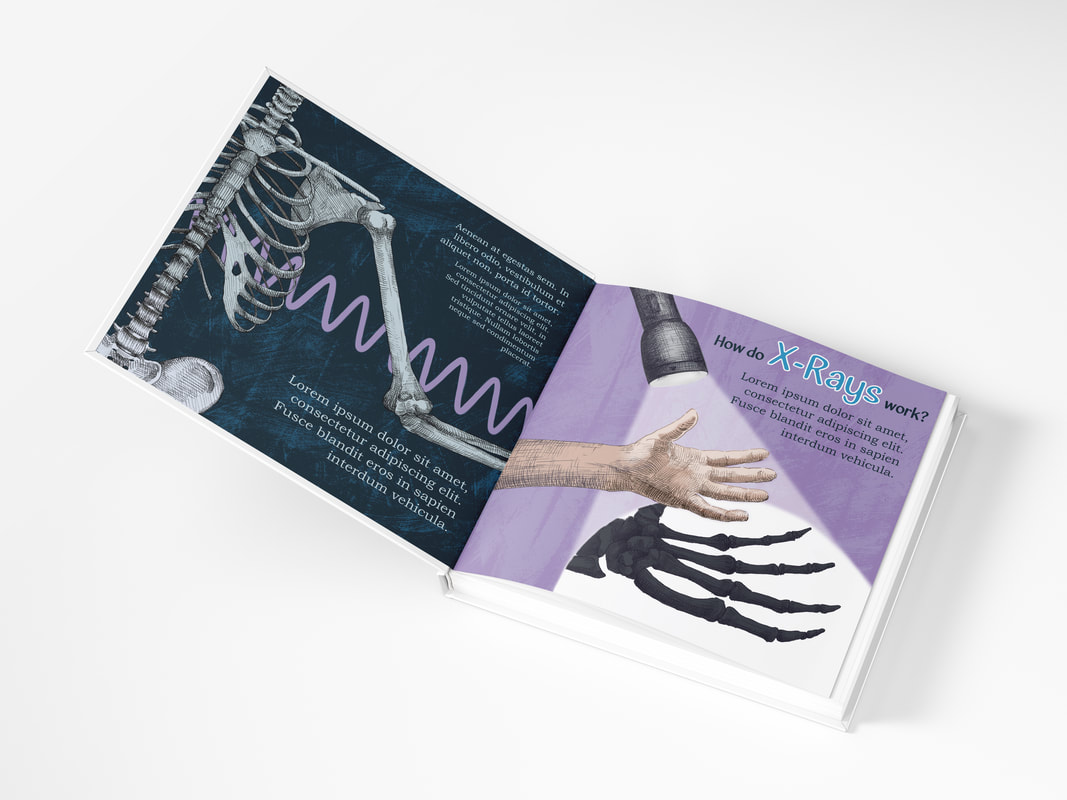
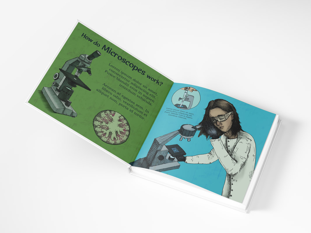
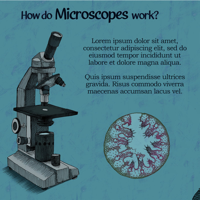
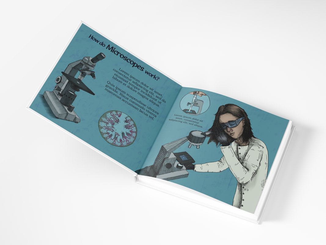
I'm going to make two spreads, one about how microscopes work, one about how X-rays work. I'll also make a cover and back cover.
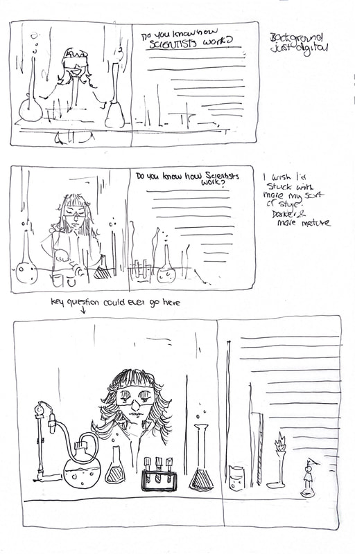
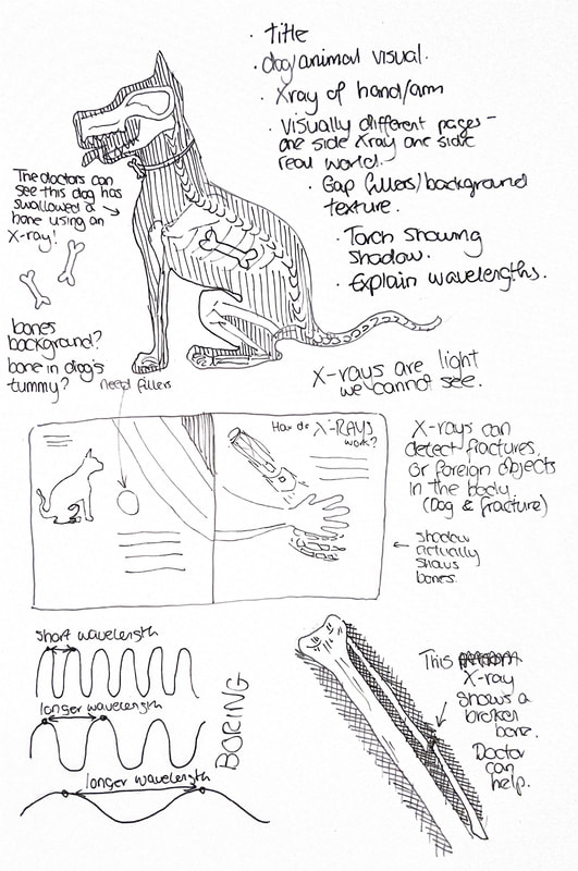
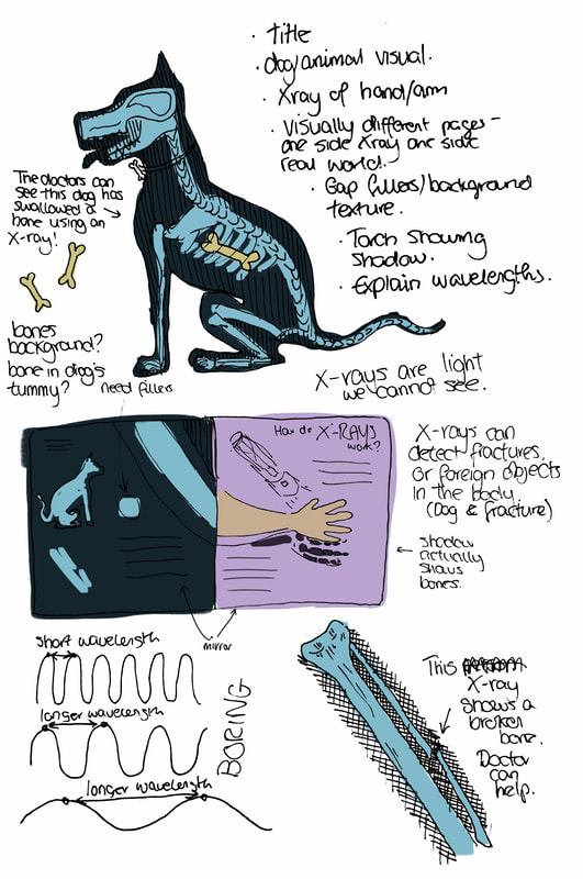
Final Thumbnails
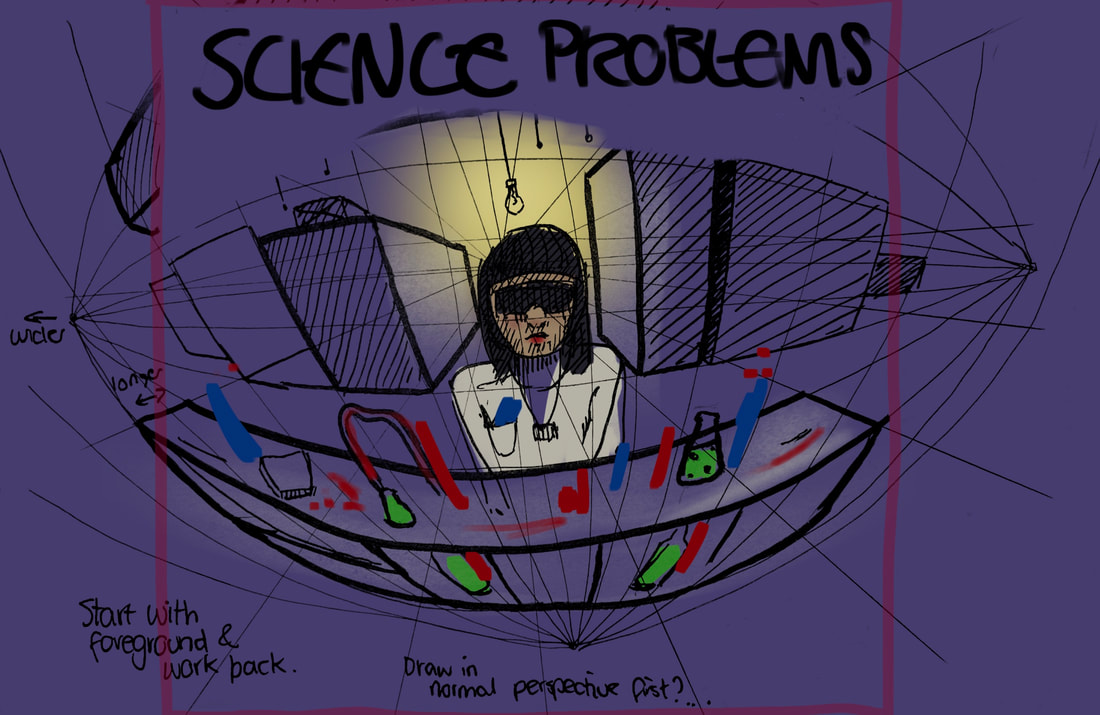
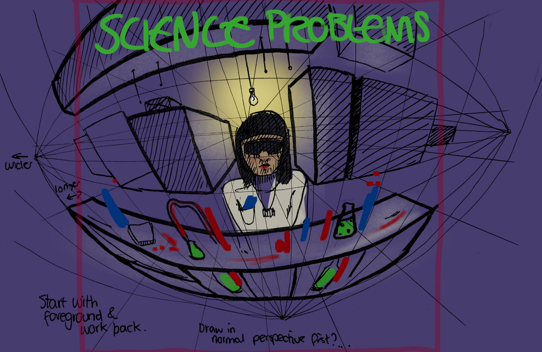
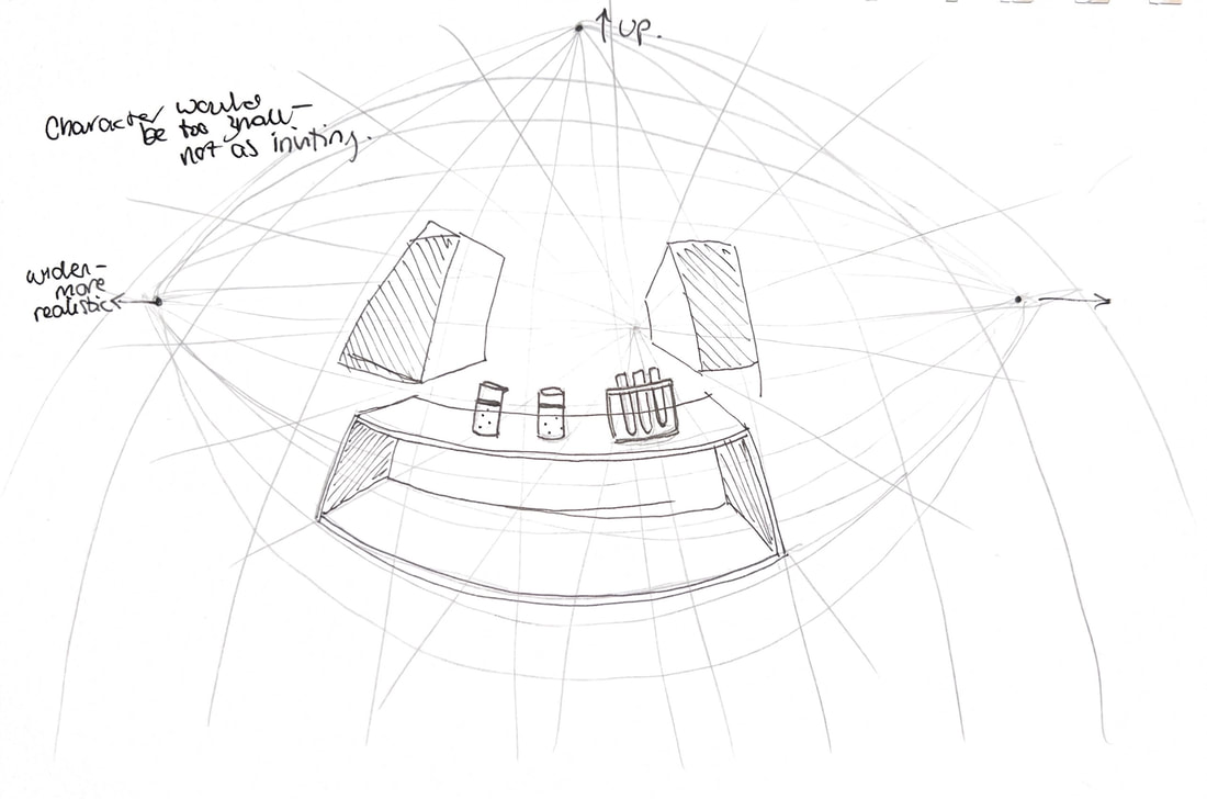
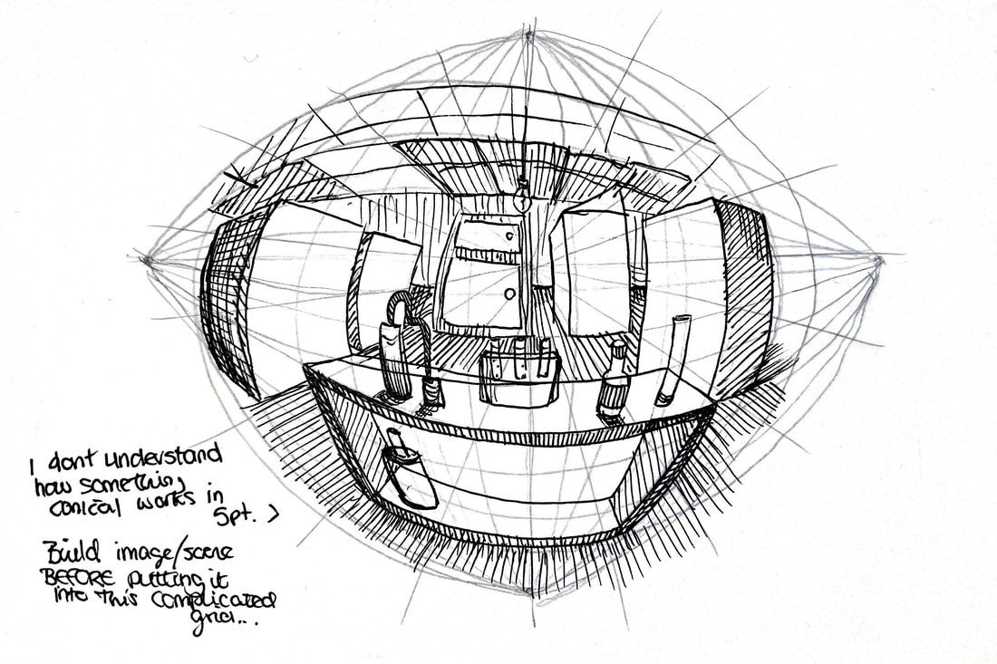
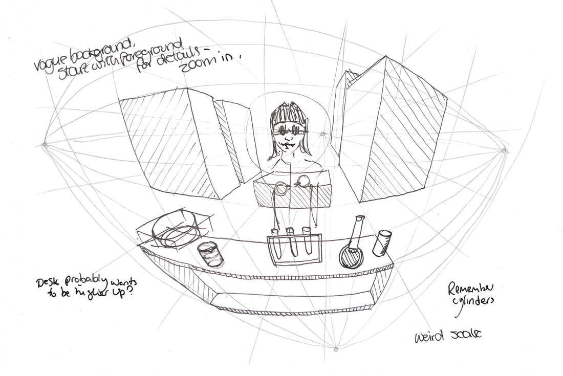
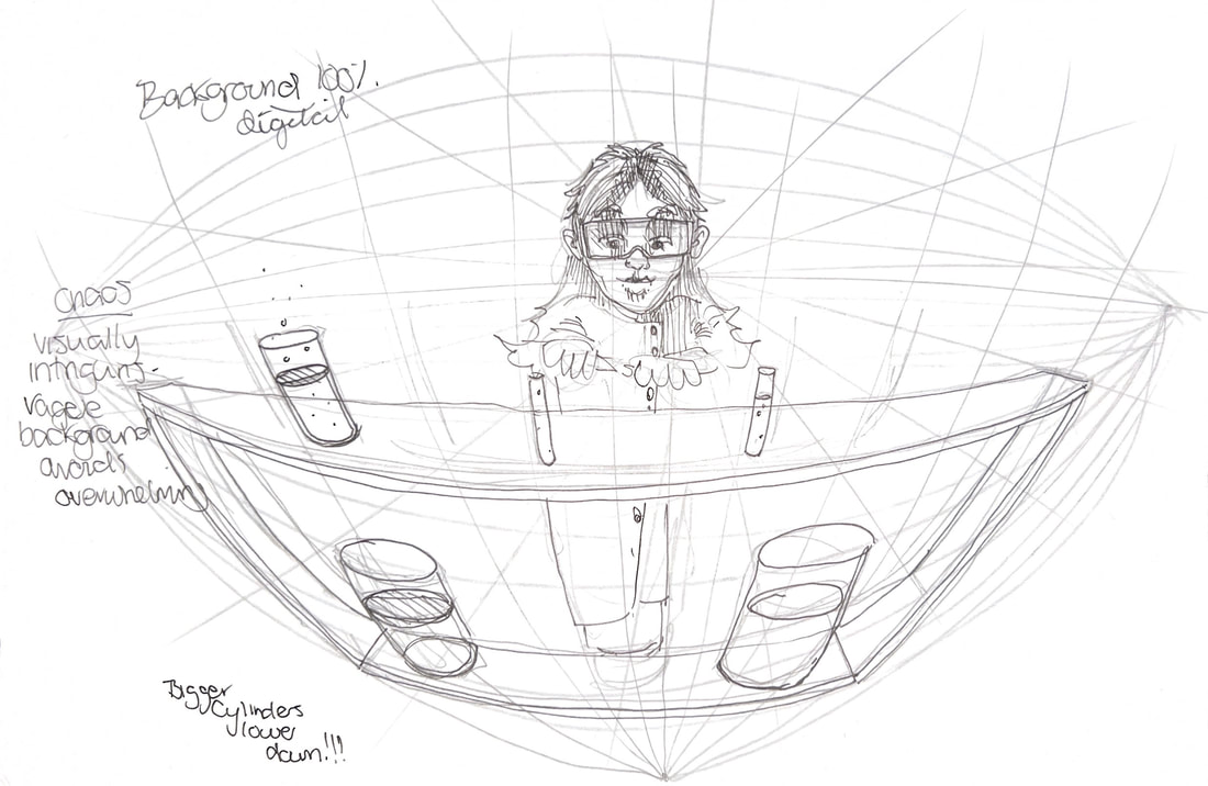
I want to use 5 point for the cover, as I'm finding the layouts quite boring right now and want them to be less 2D.
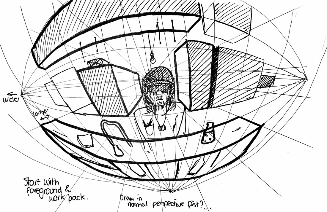
5 Point Examples
|
|
|
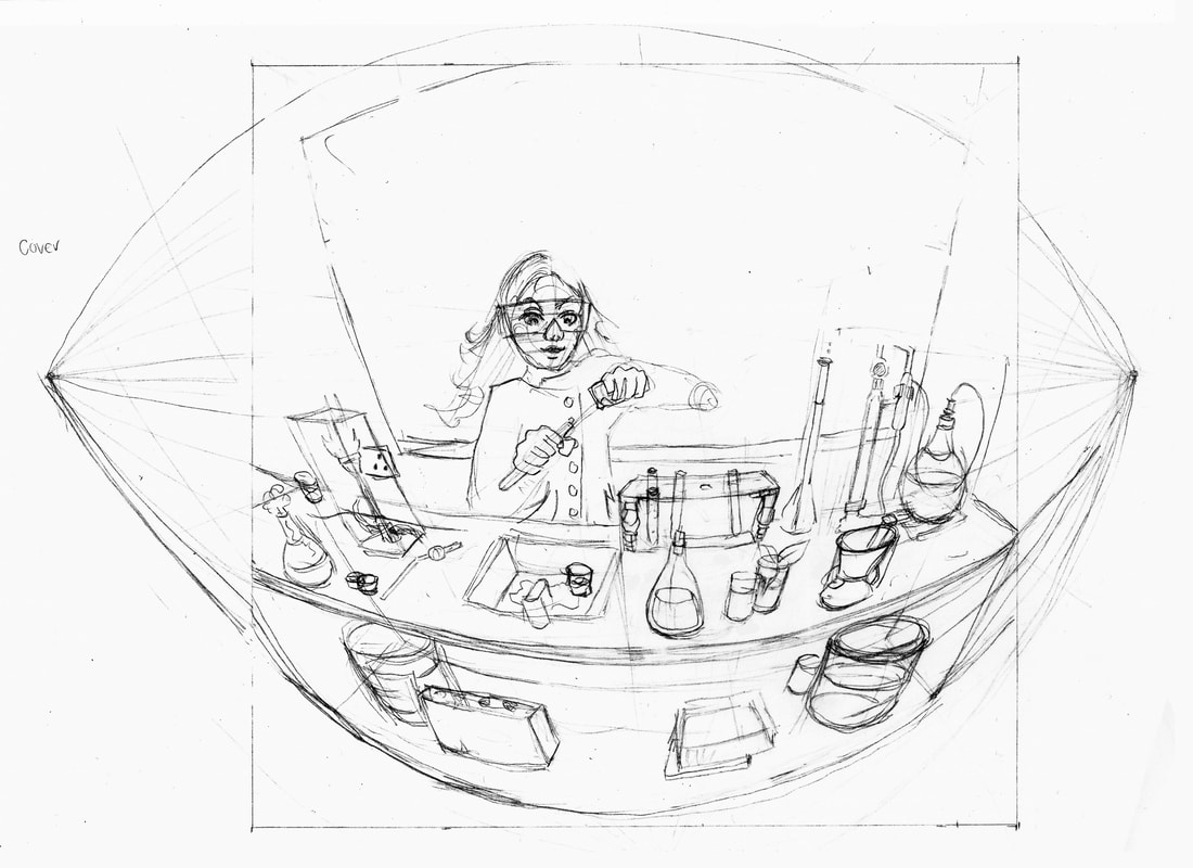
I want to use 5 point perspective to make my cover more dynamic, it may just stay on the cover and I can do something different for the back/spine.
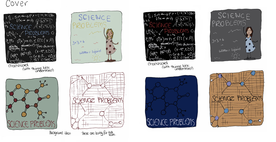
Cover Mockups
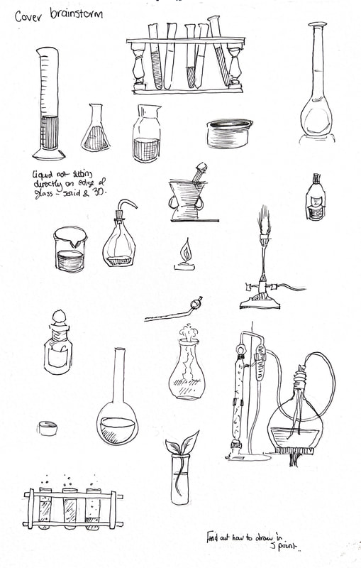
References
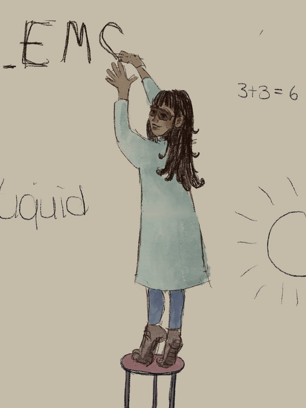
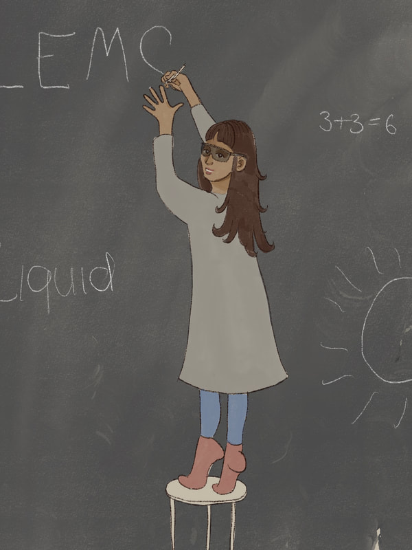
Test drawings for final
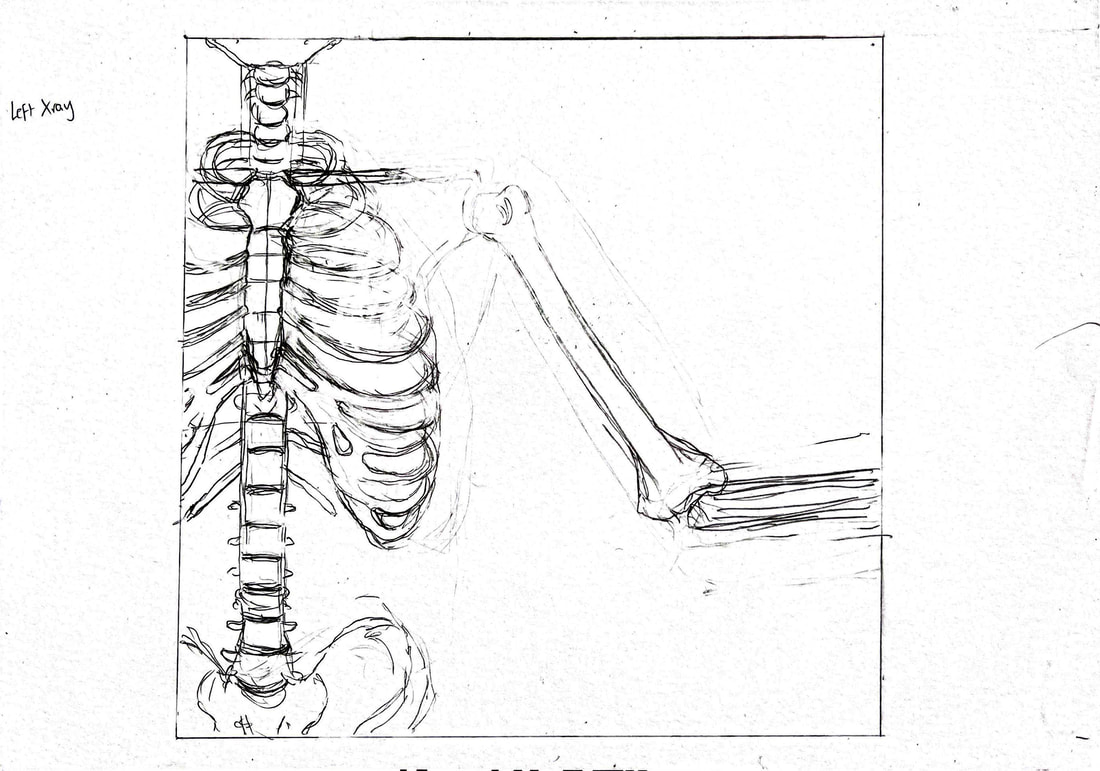
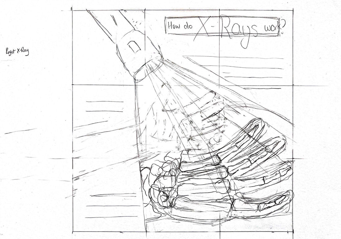
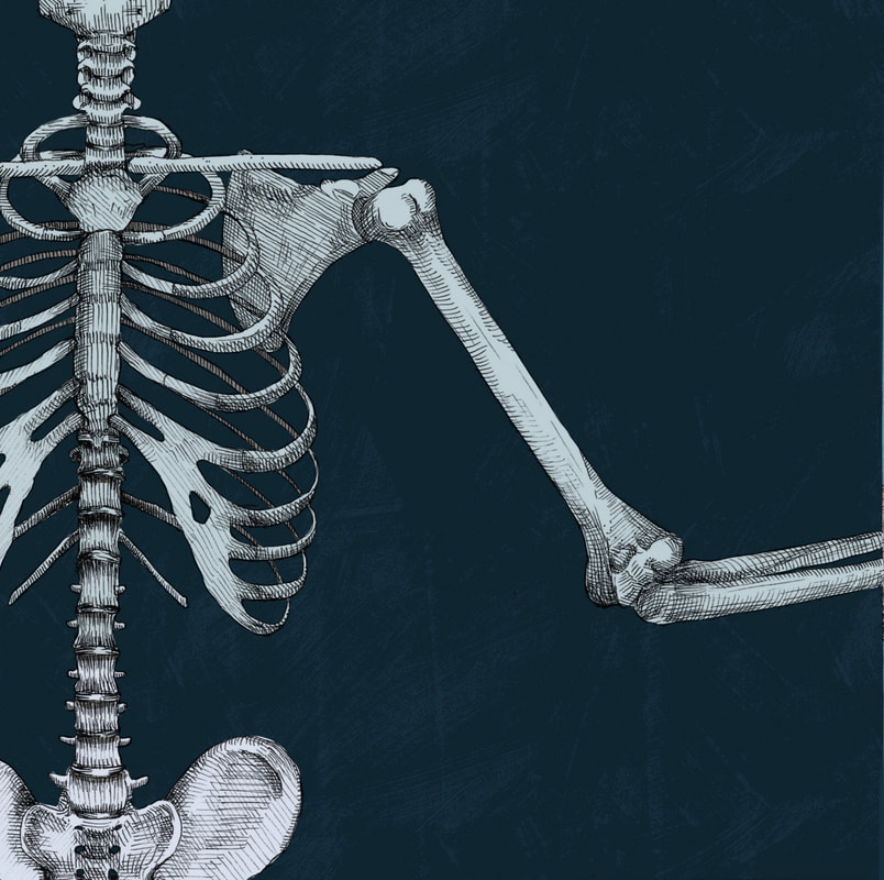
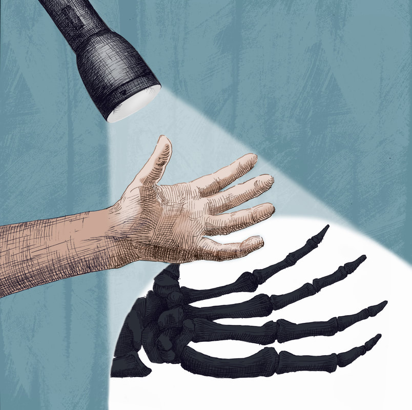
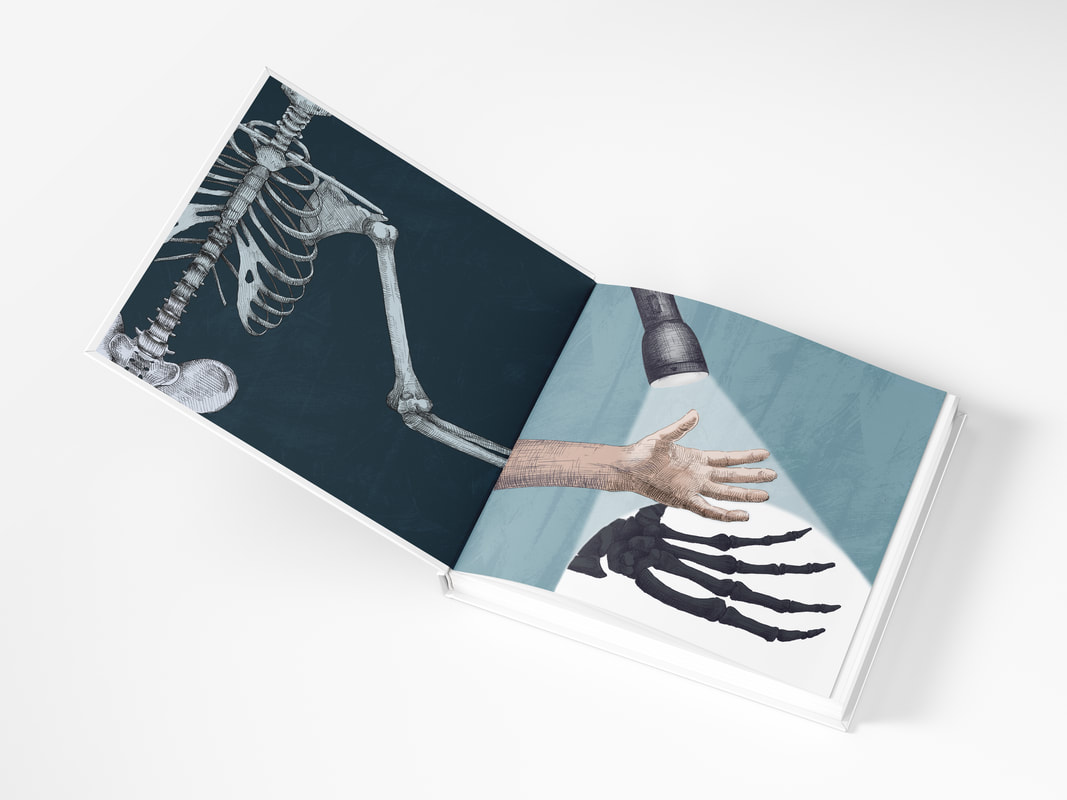
X-ray mock-ups
Sketches
Since I'm still not quite sure how I want the final illustrations to look, I'm going to scan them in at different levels of detail. The illustrations I did for the science project were drawn too detailed to be coloured nicely.
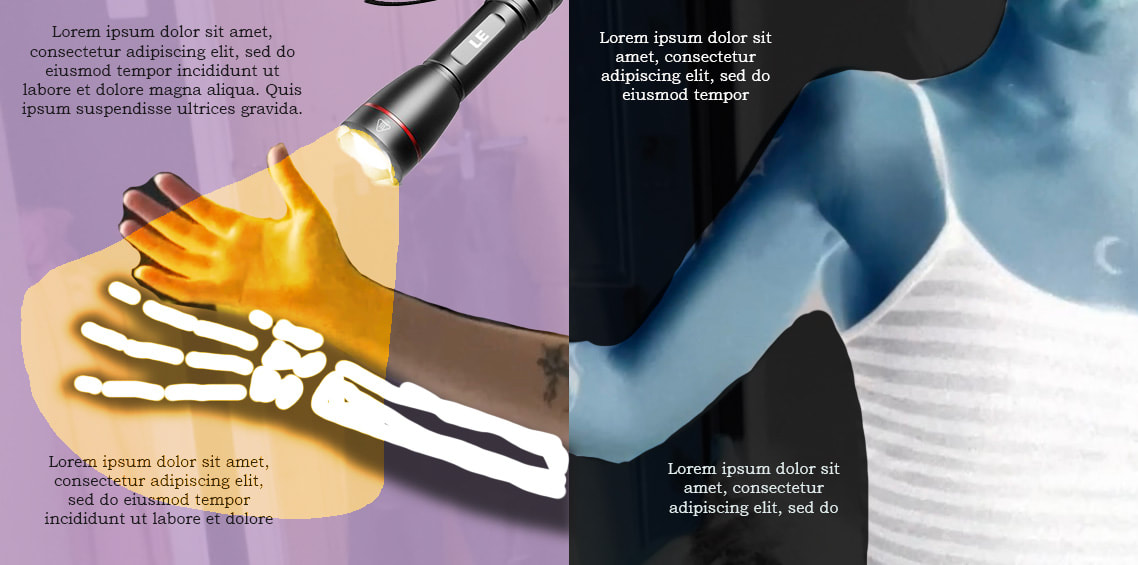
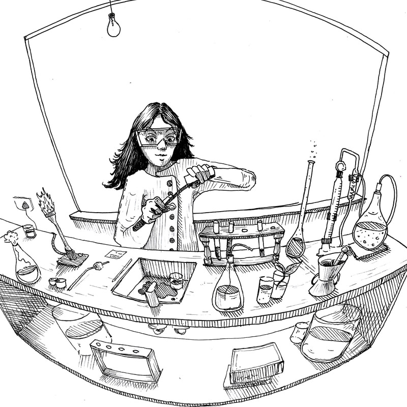
Pen drawing progress
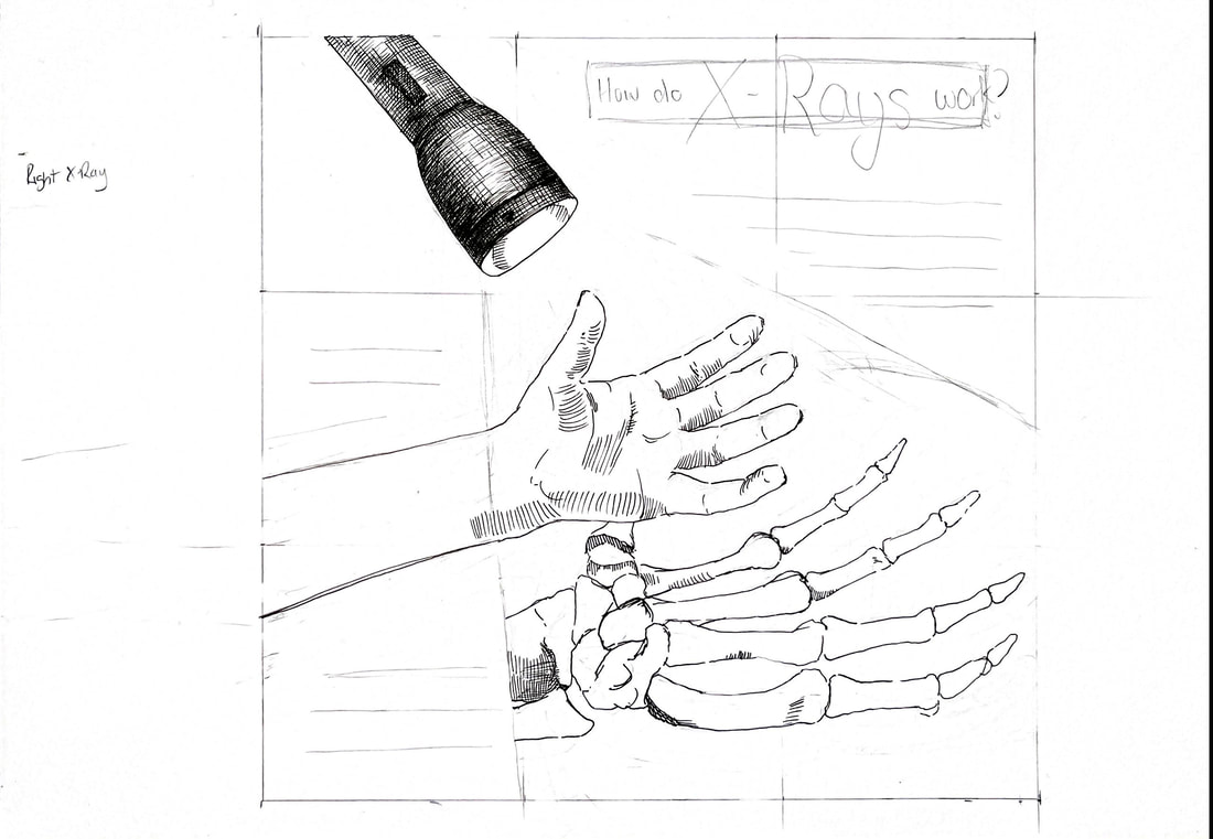
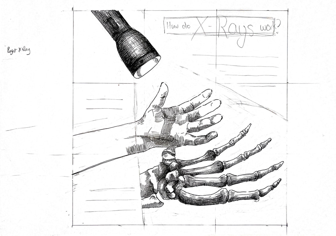
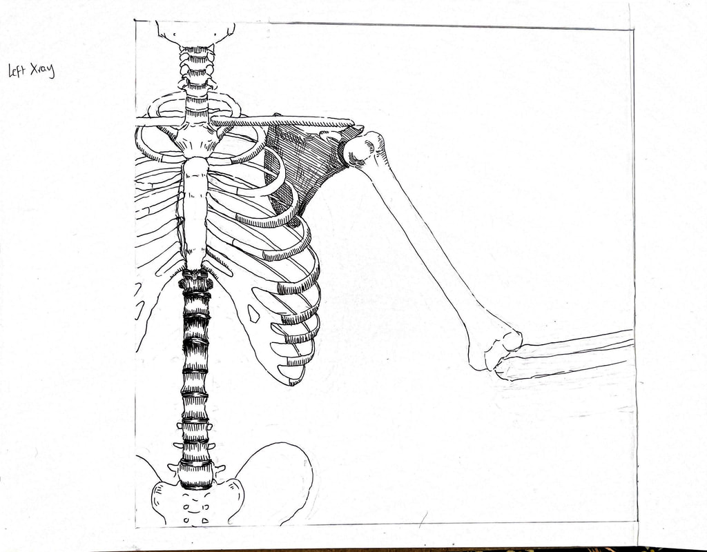
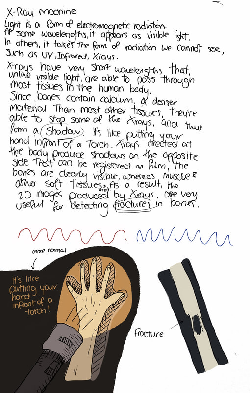
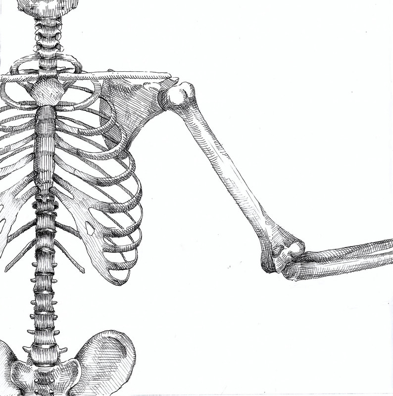
Finished pen drawings before editing
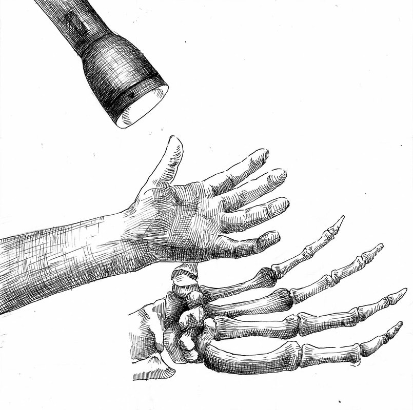
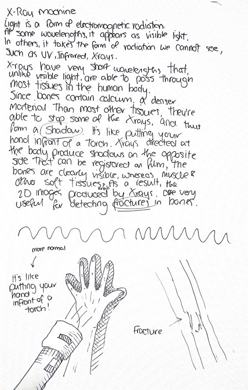
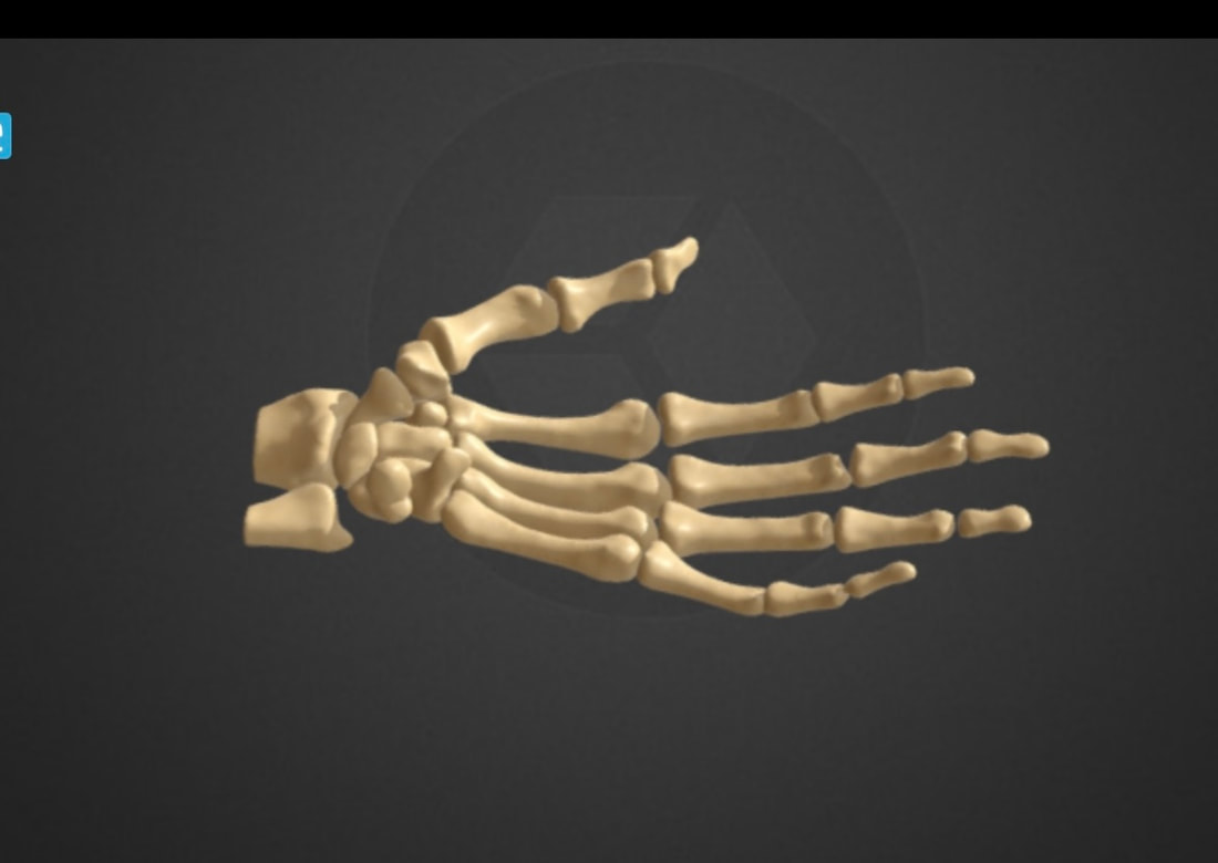
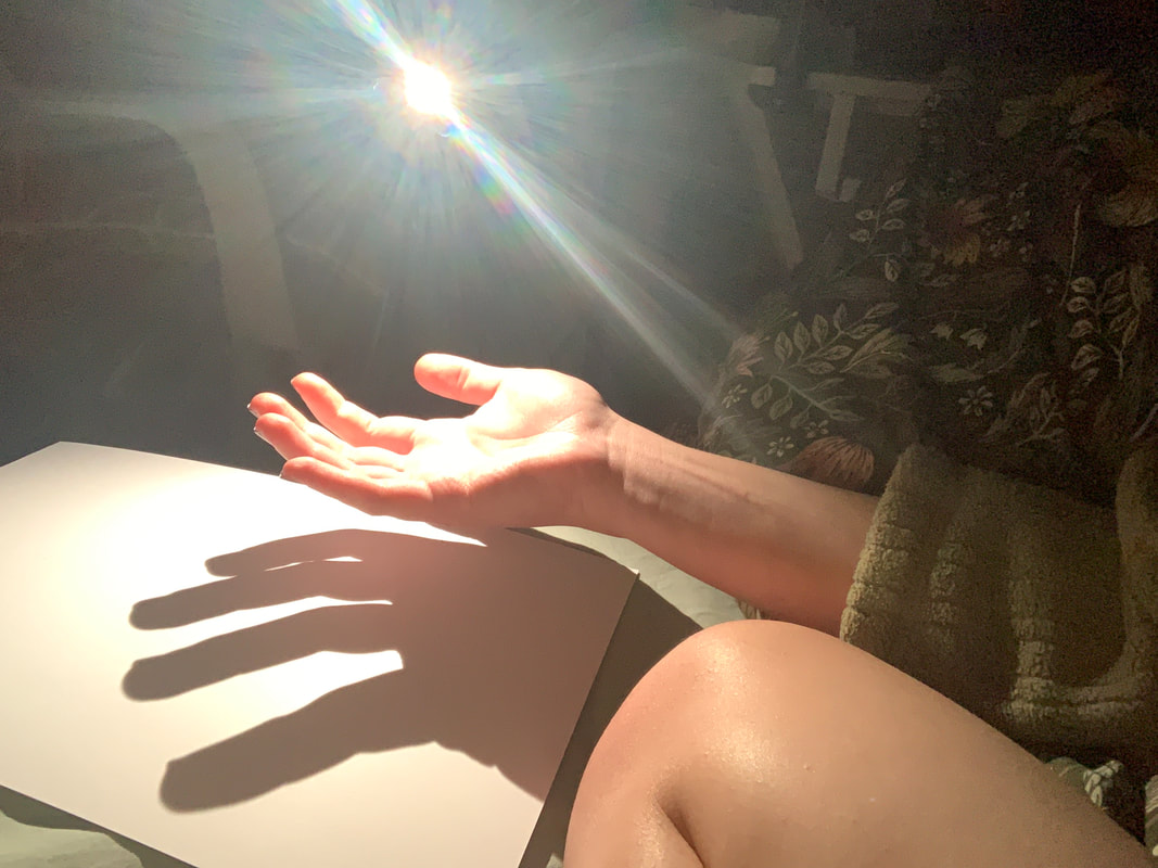
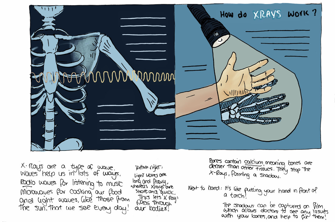
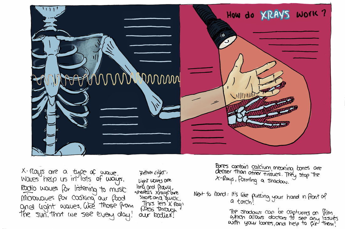
Right now just as pen drawings, the bones under the hand don't look like a shadow. It will of course work better when you can see the outline of the light, but I might need to add washes and effects. The drawing on the left doesn't really 'explain'. I want to find a way to demonstrate the waves passing through the body, but I could draw that digitally.
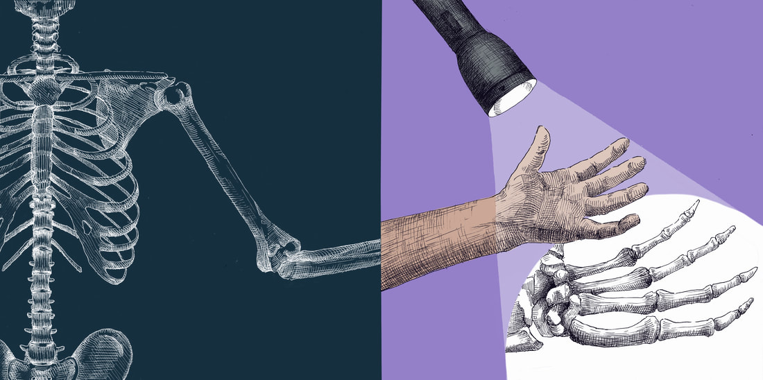
Working up digitally
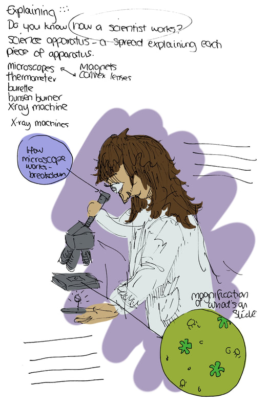
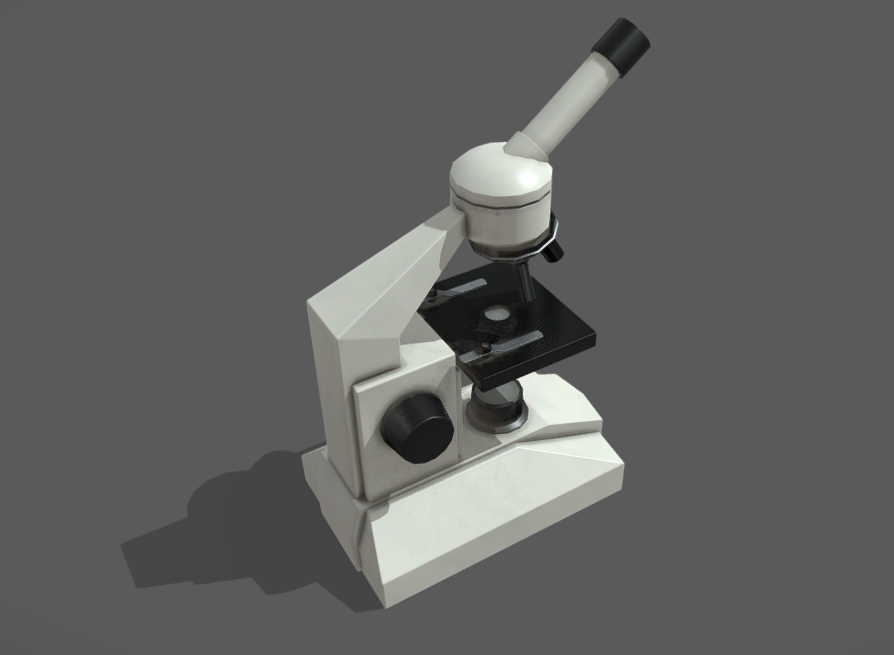
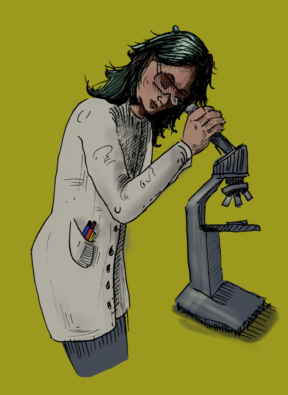
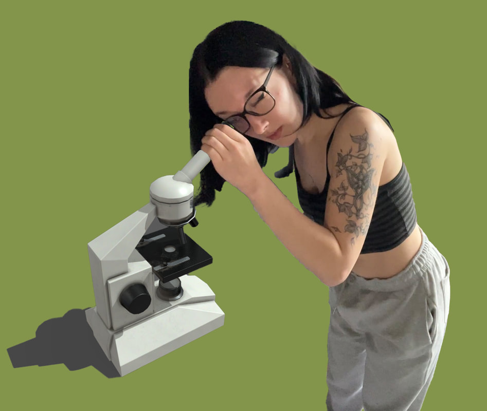
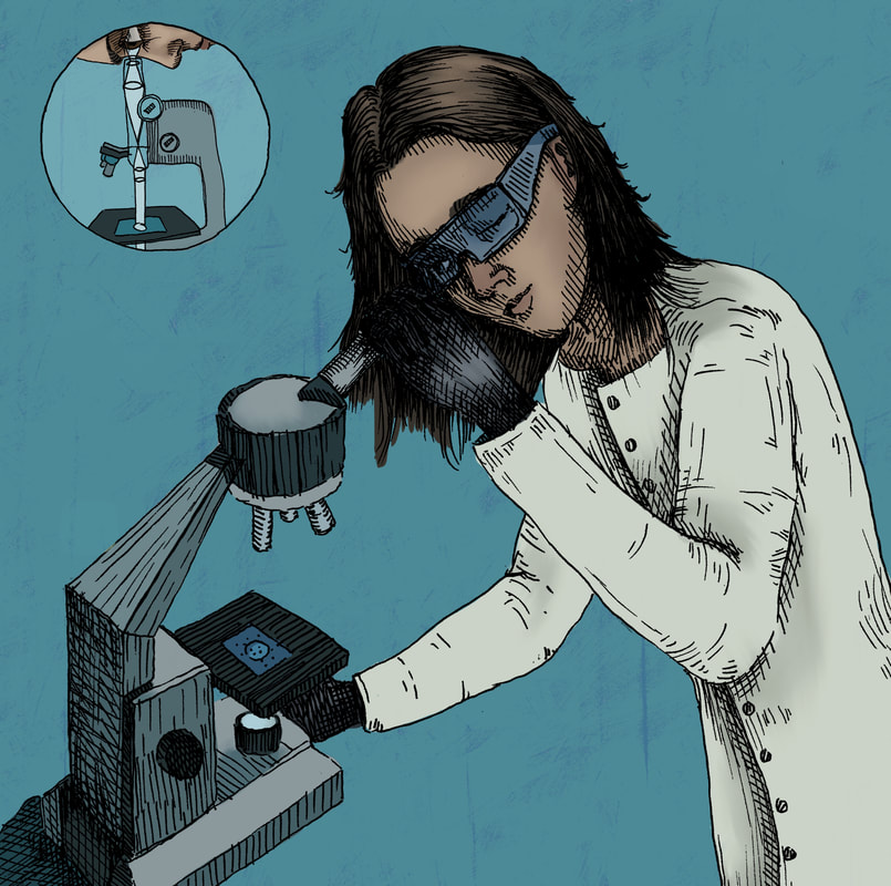
Microscope development
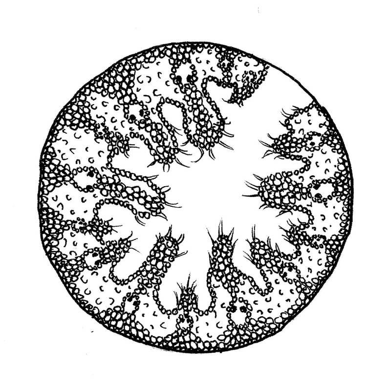
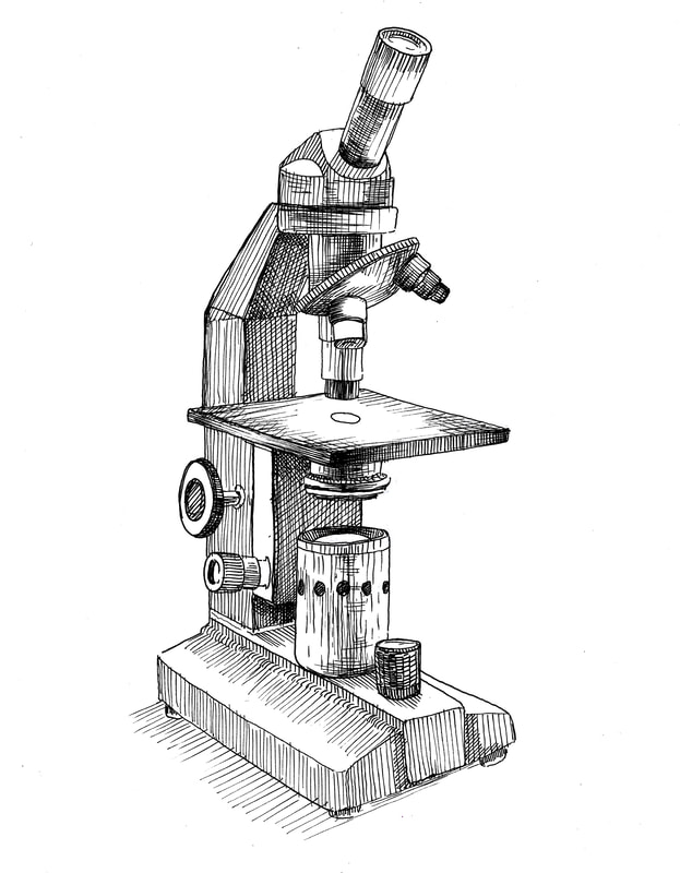
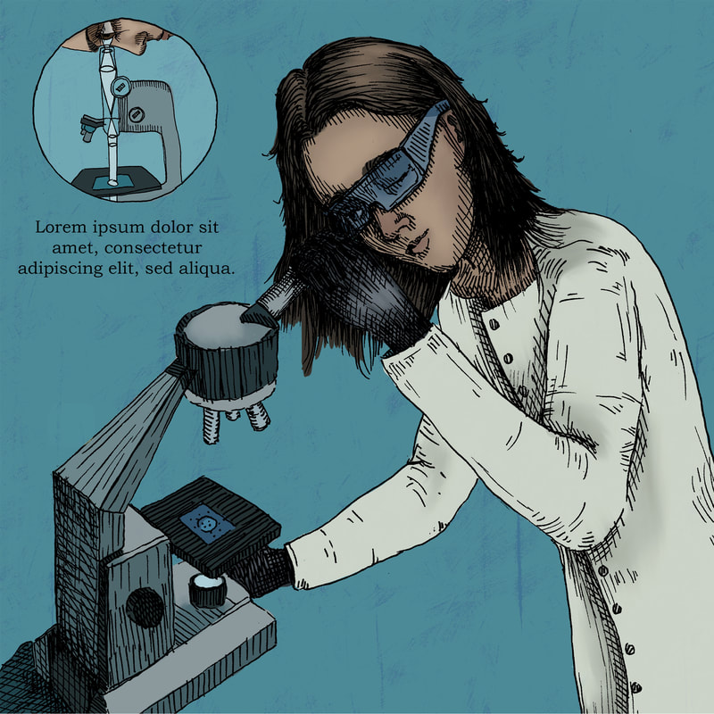
Finished Microscope Drawings
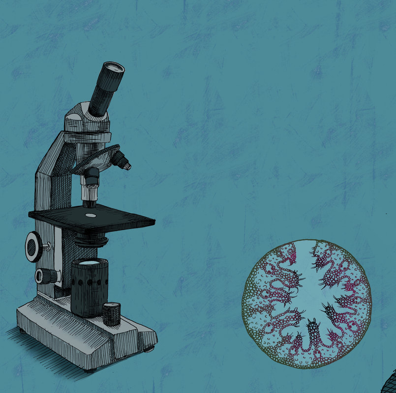
With Colour
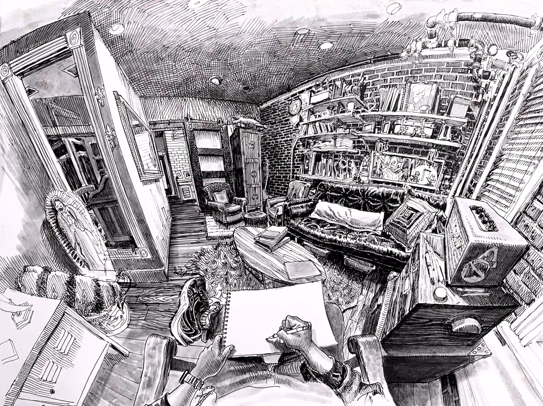
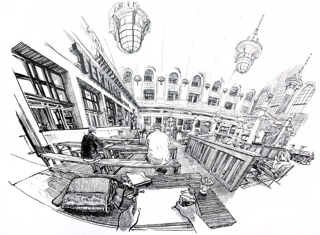
Paul Heaston 5 Point Examples
Practicing 5 Point
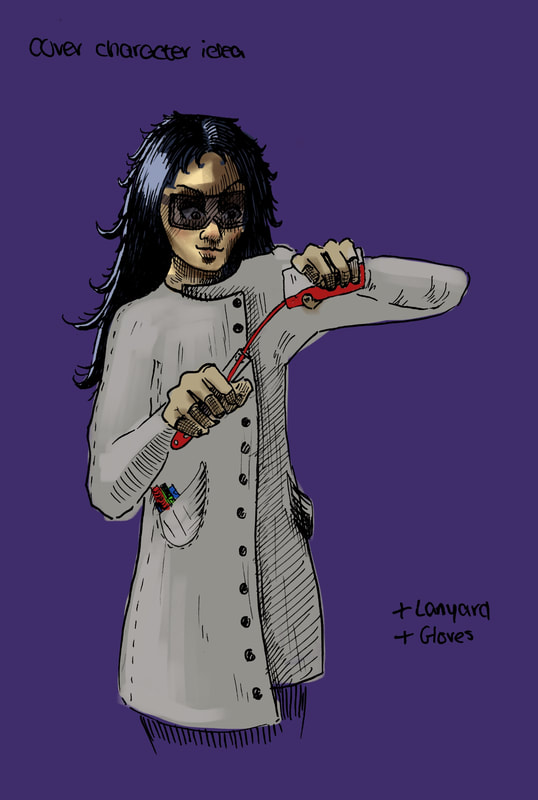
Cover development
Pen Drawing
Drawings with Colour (Pre-Formative)
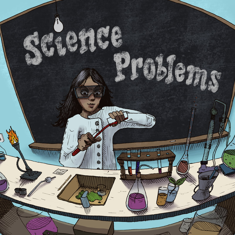
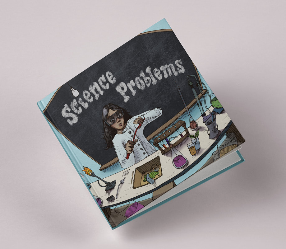
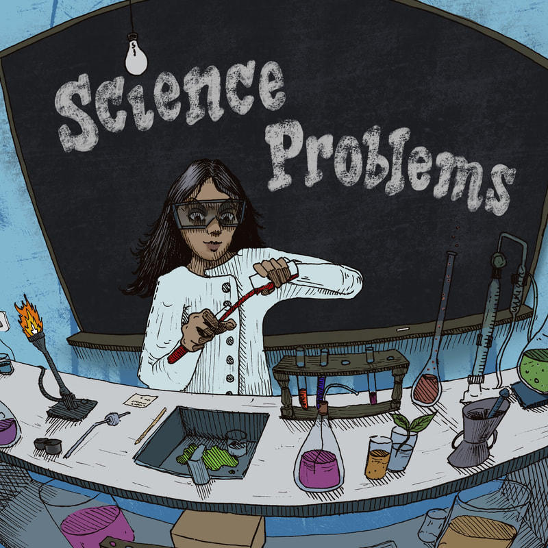
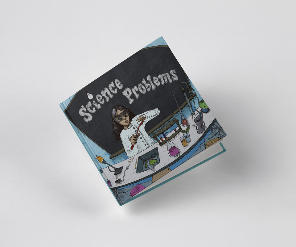
Cover
Microscope Spread
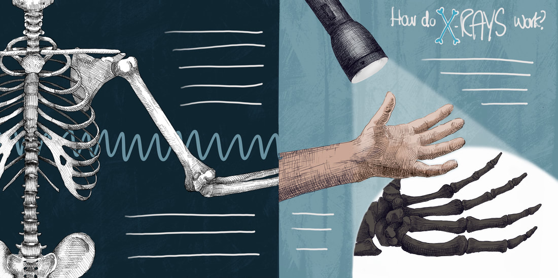
X-Ray Spread (not with text yet)
Mock-ups
Reflection:
While I'm happy with these outcomes, I still feel like I'm wrestling with the problem of colour. My colours always feel dull and I'm unsure when to crank up the saturation, or when drawings aren't standing out as they should. I want to continue this fight in my next project, and try to find a nice balance between ink and colour that doesn't result in desaturated drawings. Though I love drawing with ink, I do want to look at the possibility of using just digital colour for my next project. When I turn the ink off in these edits, the colours do look better and I like the quality the colour has.
Final Spreads & Cover (with changes post-formative)